Beginner Tutorials: Short Videos to get started

With these beginner-friendly tutorials, you will learn the basics of programming apps for Android.
App Inventor is a free, cloud-based service that you access using a web browser.
Log in with a Google account (Gmail or school email tied to Google) to start inventing right away!
To see your app on your phone as you build:
• Follow the instructions to connect your phone to App Inventor on your computer..
• If you hit any snags, we're here to help!
• If you are Android-less, never fear, you can use the on-screen emulator!
Teachers: Get support and tips for using App Inventor with your students.
Is YouTube blocked in your school? See these videos on Vimeo instead of YouTube
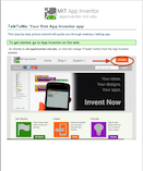
Making Mobile Apps with App Inventor
Follow these four short videos and you'll have three working apps to show for it! After building the starter apps, which will take around an hour, you can move on to extending them with more functionality, or you can start building apps of your own design. Get started now with Video 1 below.
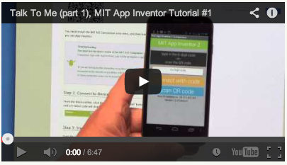
1. TalkToMe Text-to-Speech App |
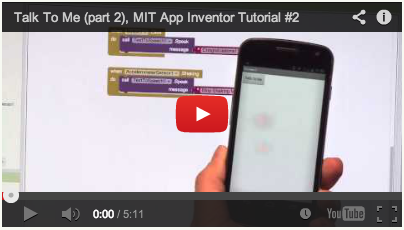
2. Extended TalkToMe App: Shake! |
|
|
|
Text to Speech is surprisingly fun. Find out for yourself with this starter app that talks. |
Make it do tricks! How about if the phone responds to shaking, and also speaks any phrase you give it? |
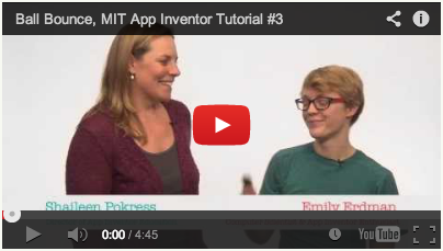
3. BallBounce Game App |
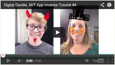
4. DigitalDoodle Drawing App |
|
|
|
Fling, Flang, Flung? Whatever you call it, bouncing the ball around the screen is pure fun. |
Who needs paper? Doodle all day on your phone's screen. |
|
Is YouTube blocked in your school? See these videos on Vimeo instead of YouTube
|
|
Trouble with the Text-To-Speech player on your phone? Get help here.
 |
 |
 |
 |
| TalkToMe Part 1 | TalkToMe Part 2 | BallBounce | Digital Doodle |
Extending Your Initial Apps
You just made some pretty cool apps! But now the real fun begins: try turning TalkToMe into a Magic 8 Ball; turn BallBounce into a Mini Golf game, take DigitalDoodle to the next level by adding colors and incorporating pictures as backgrounds in PaintPot. The possibilities really are endless!
See the full collection of Tutorials for more ideas.
Tutorial Version:
Tutorial Difficulty:
- Basic
Tutorial Type:
- Drawing Canvas
- Game
- Accelerometer
Hello Purr for App Inventor 2
Building your first app: HelloPurr
Now that you've set up your computer and device, and you've learned how the Designer and the Blocks Editor work, you are ready to build the HelloPurr app. At this point, you should have the Designer or Blocks Editor open in your browser, and either an Android device or an Android emulator connected to the Blocks Editor. (See Setup Instructions for App Inventor 2 if you do not have these things running.)
HelloPurr: tap the kitty, hear him meow
HelloPurr is a simple app that you can build in a very short time. You create a button that has a picture of a cat on it, and then program the button so that when it is clicked a "meow" sound plays.
To build HelloPurr, you'll need a image file of a cat and an audio file with a "meow" sound. Download these files to your computer by clicking the following links. To download: after clicking a link, right click on the image or sound bar and select "Save As." Save both files onto your desktop or downloads folder, or anywhere that you can easily find later.
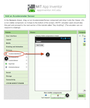
Select components to design your app

The App Inventor Components are located on the left hand side of the Designer Window under the title Palette. Components are the basic elements you use to make apps on the Android phone. They're like the ingredients in a recipe. Some components are very simple, like a Label component, which just shows text on the screen, or a Button component (#1 left) that you tap to initiate an action.
Other components are more elaborate: a drawing Canvas that can hold still images or animations, an Accelerometer sensor that works like a Wii controller and detects when you move or shake the phone, components that send text messages, components that play music and video, components that get information from Web sites, and so on.
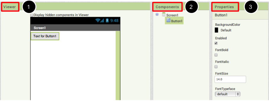
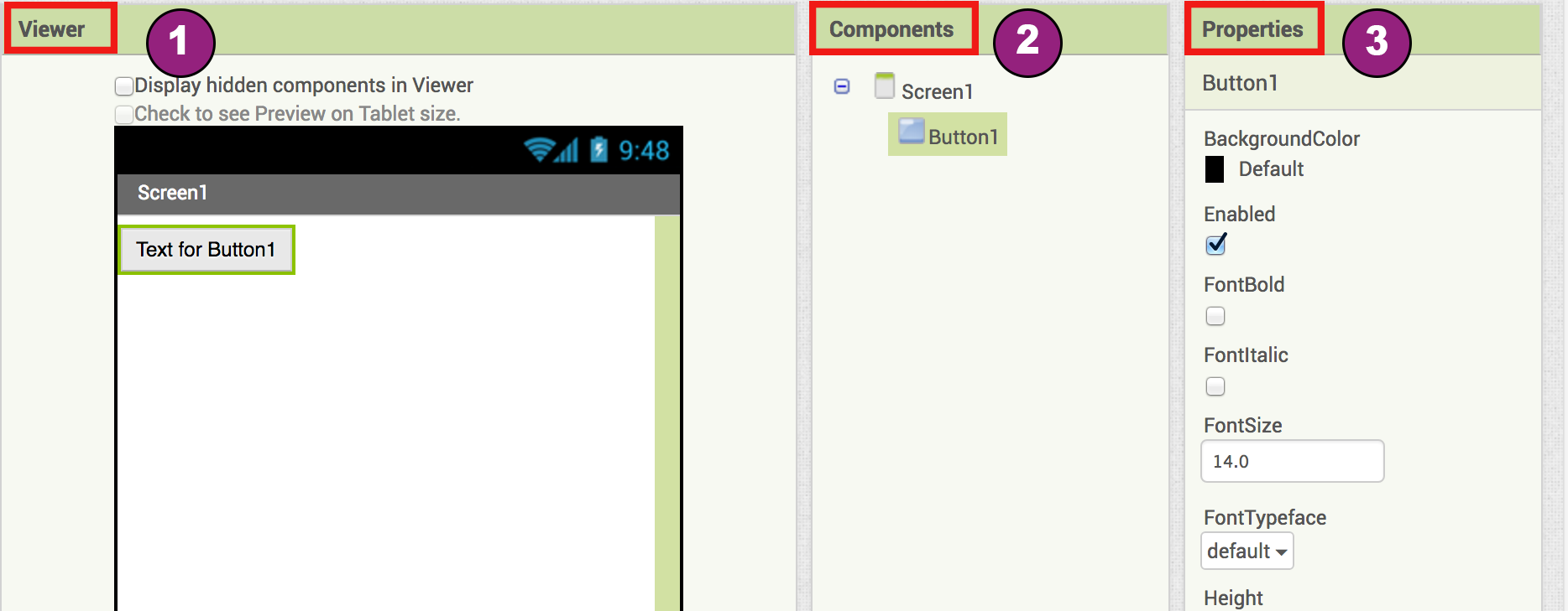
To use a component in your app, you need to click and drag it onto the viewer in the middle of the Designer. When you add a component to the Viewer (#1 below), it will also appear in the components list on the right hand side of the Viewer.
Components (#2 below) have properties that can be adjusted to change the way the component appears or behaves within the app. To view and change the properties of a component (#3 below), you must first select the desired component in your list of components.
Steps for selecting components and setting properties
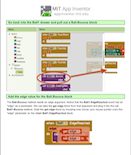
HelloPurr will have a Button component that displays the image of the kitty you downloaded earlier. To accomplish this:
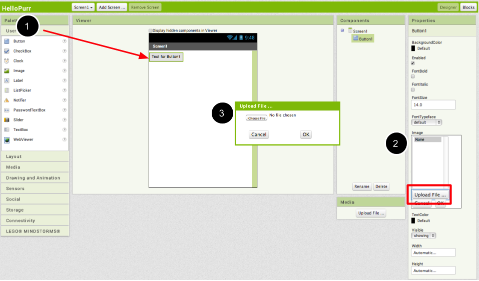
Step 1a. From the User Interface palette, drag and drop the Button component to Screen1 (#1).
Step 1b.To make the button have an image of a cat, in the Properties pane, under Image, click on the text "None..." and click "Upload New…" (#2). A window will pop up to let you choose the image file. Click "Browse" and then navigate to the location of the kitty.png file you downloaded earlier (#3). Click the kitty.png file, click "Open", and then click "OK".
Step 2. Change the Button's Text property: Delete "Text for Button1", leaving the Button's text property blank so that there is no writing over the kitty's face. Your Designer should look like this:
If the entire kitty picture is not showing up, you can fix this by setting the Height and Width properties of the button to "Fill Parent". To do this, click on the Button component, go to the right-hand Properties pane, scroll down to the very bottom to where it says Width and click on the word "Automatic..." to activate the drop down list. Choose "Fill Parent". Do the same for the Height property.

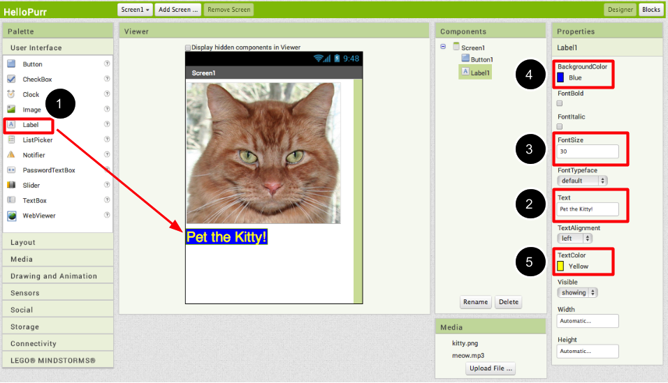
Step 3. From the User Interface palette, drag and drop the Label component to the Viewer (#1), placing it below the picture of the kitty. It will appear under your list of components as Label1.
Under the Properties pane, change the Text property of Label1 to read "Pet the Kitty" (#2). You'll see the text change in the Designer and on your device. Change the FontSize of Label1 to 30 (#3). Change the BackgroundColor of Label1 by clicking on the box (#4): you can change it to any color you like. Change the TextColor of Label1 (#5) to any color you like. Here, the background color is set to blue and the text color is set yellow.
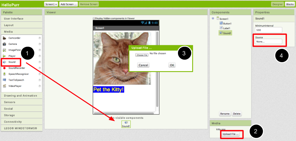
Step 4. Under Palette, click on the Media drawer and drag out a Sound component and place it in the Viewer (#1). Wherever you drop it, it will appear in the area at the bottom of the Viewer marked Non-visible components. Under the Media pane, Click Upload New... (#2) Browse to the location of the meow.mp3 file that you downloaded earlier and upload it to this project (#3). Under the Properties pane, see that the Source property currently says None.... Click the word None... to change the Sound1 component's Source to meow.mp3 (#4).
Programming with the Blocks Editor
So far you have been arranging your app's screen and components in the Designer, which is in a web browser window. To start programming the behavior of the app, you need to go to the Blocks Editor. Click the Blocks button to go to the Blocks Editor.

Once you have the Blocks Editor in front of you, continue to the next step to start programming your app with blocks.
Making the sound play
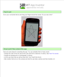
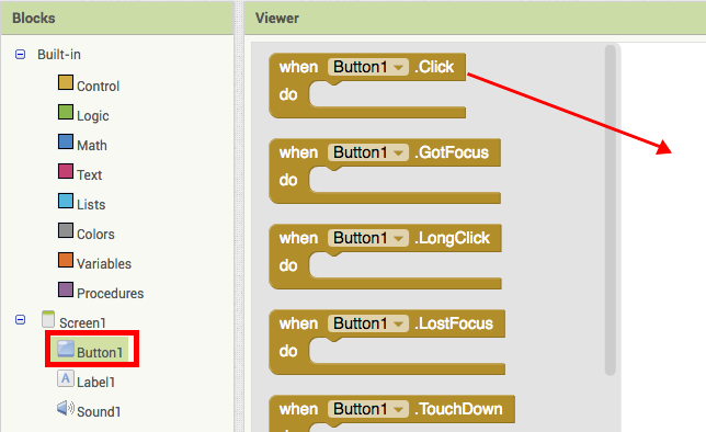
Step 1. On the left side of the Blocks Editor, click the Button1 drawer to open it. Drag and drop the Button1.Click block in the work area (the open area on the right).
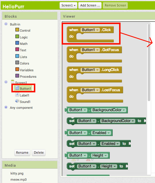
Those mustard yellow blocks are called event handler blocks. The event handler blocks specifiy how the phone should respond to certain events: a button has been pressed, the phone is being shaken, the user is dragging her finger over a canvas, etc. The event handler blocks are mustard yellow in color and use the word when. For example, when Button1.Click is an event handler
.
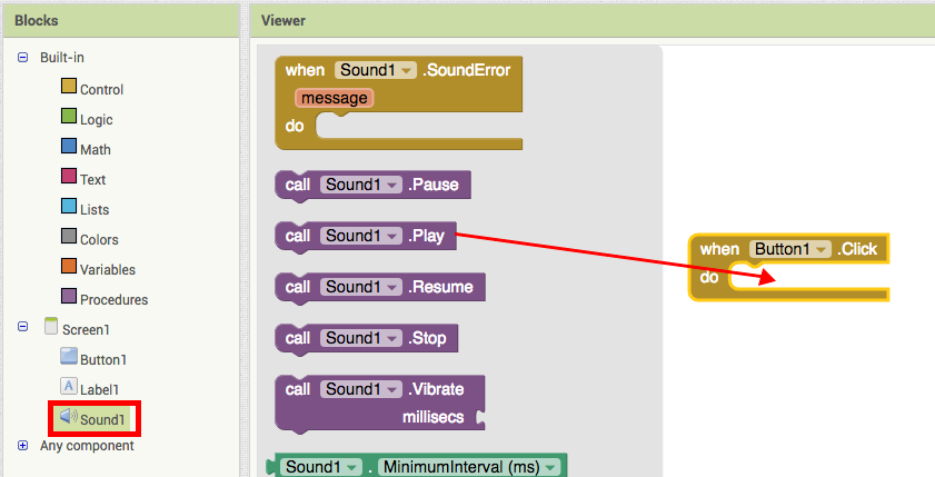
Step 2. Click the Sound1 drawer and drag the Sound1.Play block and connect it to the "do" section of the when Button1.Click block. The blocks connect together like puzzle pieces and you can hear a clicking sound when they connect.

The purple blocks are called command blocks, which are placed in the body of event handlers. When an event handler is executed, it runs the sequence of commands in its body. A command is a block that specifies an action to be performed (e.g., playing sound) when the event (e.g., pressing Button1) is triggered.
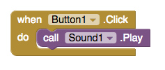
Your blocks should look like this at this point:
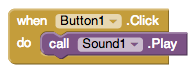
Now you can see that the command block is in the event handler. This set of blocks means; "when Button1 is clicked, Sound1 will play." The event handler is like a category of action (e.g., a button is being clicked), and the command specifies the type of action and the details of the action (e.g., playing sound a specified sound).
You can read more about the blocks and how they work here: Understanding Blocks in App Inventor 2.
Try It! When you click the button you should hear the kitty meow. Congratulations, your first app is running!
Note: there is a known issue with the Sound component on some devices. If you see an "OS Error" and the sound does not play - or is very delayed in playing, go back into the Designer and try using a Player component (found under Media) instead of the Sound component.
Packaging your app
While your device (emulator or phone/tablet) has been connected to App Inventor, your app has been running in real time on your device. If you disconnect the emulator/phone/tablet from the Blocks Editor, the app will vanish. You can always make it return by reconnecting the device. To have an app running without being connected to App Inventor, you must "package" the app to produce an application package (apk file).
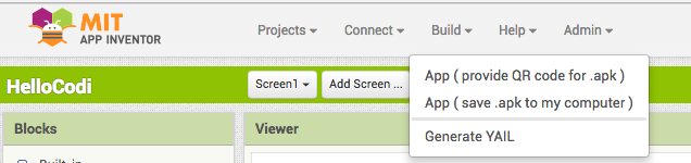
To "package" the app to your phone or to send to someone else, click the Build tab at the top of the screen. Under Build, here are two options available for you to choose from.:
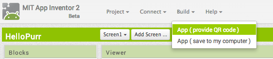
1. App (provide QR code): You can generate a Barcode (a QR Code), which you can use to install the app on a phone or tablet that has a camera, with the aid of a barcode scanner, like the ZXing barcode scanner (freely available in Google Play).
Note: this barcode works only for your own device because it is associated with your google account. If you want to share your app with others via barcode, you'll need to download the .apk file to your computer and use a third-party software to convert the file into a barcode. More information can be found here.
2. App (save to my computer): You can download the app to your computer as an apk file, which you can distribute and share as you like by manually installing it on other devices. (sometimes called "side loading".
Challenge! Make the cat purr
The challenge is to have the cat purr when the button is clicked. Go to the Blocks Editor and open the Sound1 drawer and drag the Sound1.Vibrate block and place it under the Sound1.Play block.
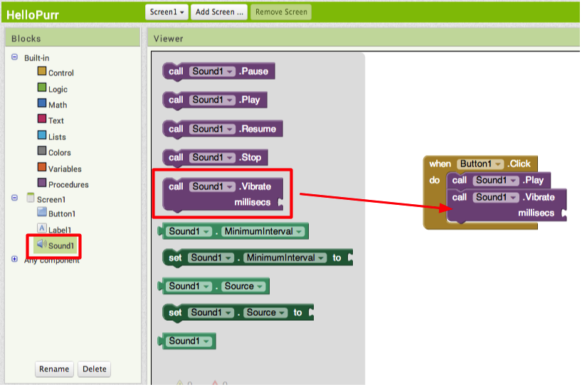
The Sound1.Vibrate block has an open slot, which means you need to plug something into it to specify more about how the behavior should work. Here, we want to specify the length of the vibration. Numbers are calculated in thousandths of a second (milliseconds): to make the phone vibrate for half a second, we need to plug in a value of 500 milliseconds.
In the Built-In palette, go to the Math drawer, drag the number block and place it at the socket of the Sound1.Vibrate.
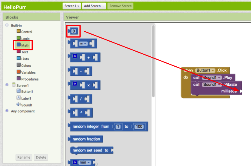
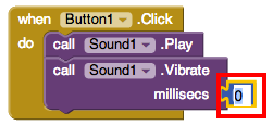
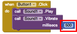
After you place the number block, click the number "0". It highlights the number in black: type "500" with your keyboard.
Done!
Now connect your phone and tap the image of the cat on the phone. The phone should vibrate and meow at the same time. If you packaged your app to your phone, this may not happen. Although it may appear that your phone is connected, it might not be in real time. To reconnect your phone, click the Connect button at the top of your screen, and select Reset Connection. If this does not work, close out of the app on your phone and restart the connection.
Review
Here are the key ideas covered so far:
- You build apps by selecting components (ingredients) and then telling them what to do and when to do it.
- You use the Designer to select components and set each component's properties. Some components are visible and some aren't.
- You can add media (sounds and images) to apps by uploading them from your computer.
- You use the Blocks Editor to assemble blocks that define the components' behavior
- when ... do ... blocks define event handlers, that tell components what to do when something happens.
- call ... blocks tell components to do things.
Scan the Sample App to your Phone
Scan the following barcode onto your phone to install and run the sample app.

Download Source Code
If you'd like to work with this sample in App Inventor, download the source code to your computer, then open App Inventor, click Projects, choose Import project (.aia) from my computer..., and select the source code you just downloaded.
Next steps
Now that you know the basics of how App Inventor works we recommend you:
- Complete additional Tutorials.
- Review the User Guide for App Inventor 2.
- Join the User Discussion Forum.
- Read the guide to Understanding Blocks.
- Or, if you've been using the emulator and want to start using your phone, you can set up your Android device to build apps.
Something not working right? Visit the troubleshooting page, or check the App Inventor User Forum for help.
Tutorial Version:
Tutorial Difficulty:
- Basic
Magic 8 Ball for App Inventor 2
Lesson One: Magic 8-Ball Predicts the Future
This introductory module will guide you through building a “Magic 8-Ball” app with App Inventor 2. When activated, your 8-ball will deliver one of its classic predictions, such as “It is decidedly so” or “Reply hazy, try again.”
Learning Goals
After completing this app, you will be able to:
- Navigate the App Inventor environment: designer, blocks editor, emulator and/or physical phone
- Correctly use the following App Inventor components: accelerometer sensor, button, player
- Correctly use the following App Inventor concepts: making and using a list, responding to an event
Materials
- A selection of images and sounds are available at the App Inventor Media Library.
Outline
- Set up computers and phones or emulators. (Suggestion: do this ahead of time)
- Part One: Click a Button, Hear a Sound
- Part Two: Click the Button, Get a Prediction + Hear a Sound
- Part Three: Shake the Phone, Get a Prediction + Hear a Sound
- Suggestions for further exploration: Text-to-Speech, Rotating image, Custom prediction lists
Part One: Click a Button, Hear a Sound
The final Magic 8-Ball App will deliver a prediction from a list that you have designed. To get started, first we'll make a button with a picture on it, and program it to play a sound when the button is clicked.
DESIGN: App Inventor Designer
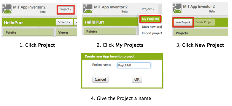
- To open the App Inventor Designer window, open a new tab or window in your browser and go to http://newblocks.appinventor.mit.edu. See setup instructions if you are not sure how to sign in.
- If you have already made an app (such as Hello Purr), you will automatically be directed to the Designer with the last project you worked on showing. Click "Project" in the upper left corner of the screen and then "My Projects", which will take you to your list of projects. Click "New Project" and name your project something like "Magic8Ball" (note: spaces are not allowed).
- Download one image and one sound file from below to be used in your app. Right click (control-click) on the link of the image or sound, then choose "Download" or "Save As". Save the media files to a convenient location that you will remember.
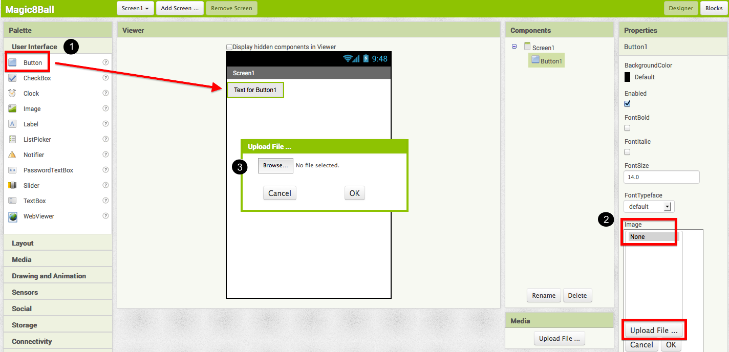
- On the left column of the Designer, the User Interface palette should be open. If it is not, click to open it. Drag a Button component over to the Viewer (#1).
- Set the button image to an 8-Ball image:
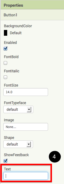
Click on your newly added button to see its properties in the Properties pane on the right. Under "Image" click on the word "None..." and a small selection window will pop up (#2). Click the "Upload File" button and browse to where you saved the 8-Ball image. Select the file, then click “OK” to close the selection window. Click “OK” again on the properties pane to close the small popup window (#3). - Go to the text field in the Properties pane and delete the display text of your button component (#4).
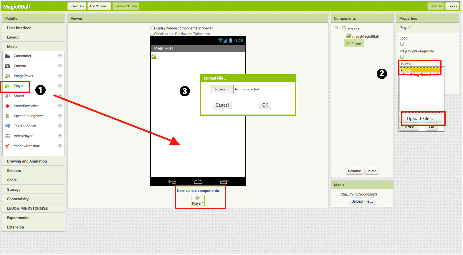
- From the Media palette, drag over a Player component onto the Viewer pane (#1). The Player component plays sound files. Notice that since the player will not be a visible part of the app, it appears at the bottom of the Viewer pane, as a “Non-visible component”.
- Set the Player component's source file:
Click on your newly added Player component to see its properties in the Properties pane on the right. Under "Source" click in the small box on the word "None..." and a small selection window will pop up (#2). Click the "Upload File" button and browse to where you saved the sound file. Select the sound file, then click “OK” to close the selection window. Click “OK” again on the properties pane to close the small popup window (#3). - You have now completed the work in the Designer for Part One of this app. It's time now to go over to the Blocks Editor to program the behavior of these components.
BUILD: Blocks Editor
In the upper right corner of the Designer, click on the Blocks button.
Now you are going to tell your app how to behave when the button is clicked. This is actually very simple in App Inventor, because the "code" for the program only consists of two blocks!
Once the Blocks Editor is open, there are several options running along the left side of the screen. We refer to these as "Palettes" with “Drawers.”
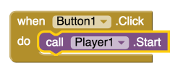
From the blocks palette located under Screen1, click on the Button1 drawer. Drag the when Button1.Click block into the work area (#1). From the blocks palette, click on the Player1 drawer, drag the Player1.Play block into the work area and insert it into the when Button1.Click block (#2). They will click together like magnetic puzzle pieces.
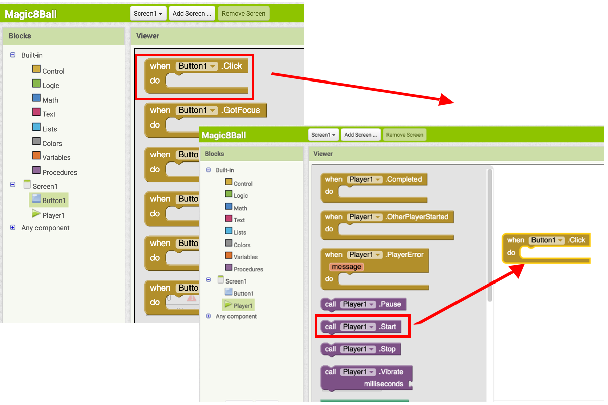
Your blocks should now look like this:
That's it! You've written the program for Part One of Magic 8-Ball. Now it's time to test that it's working right.
TEST: Phone/Emulator
You have now built an app! To test that it works, you either have to launch an emulator, or connect to a phone. Go back to the Setup Instructions if you do not have a phone or an emulator running.
Emulator: click on the picture, you will hear the sound play.
Phone: tap the picture, you will hear the sound play.
Note: If you don't hear the sound, first be sure you have the volume turned up on your device (or computer if using emulator). Also, make sure your device has an SD card. App Inventor stores media files to the SD card.
Part Two: Click the Button, Get a Prediction + Hear a Sound
Now that we've gotten the button to perform an action (play a sound), we want to extend that action to include giving the user a prediction. First we'll need two labels: Label1 will display the instructions, and Label2 will display the chosen prediction. We'll use blocks to program a "list picker" to choose from a list of predictions. Each time the button is clicked, the app will change the text of Label2 to display the chosen prediction.
DESIGN: App Inventor
Go back to the Designer window in your browser and add some new things to your app.
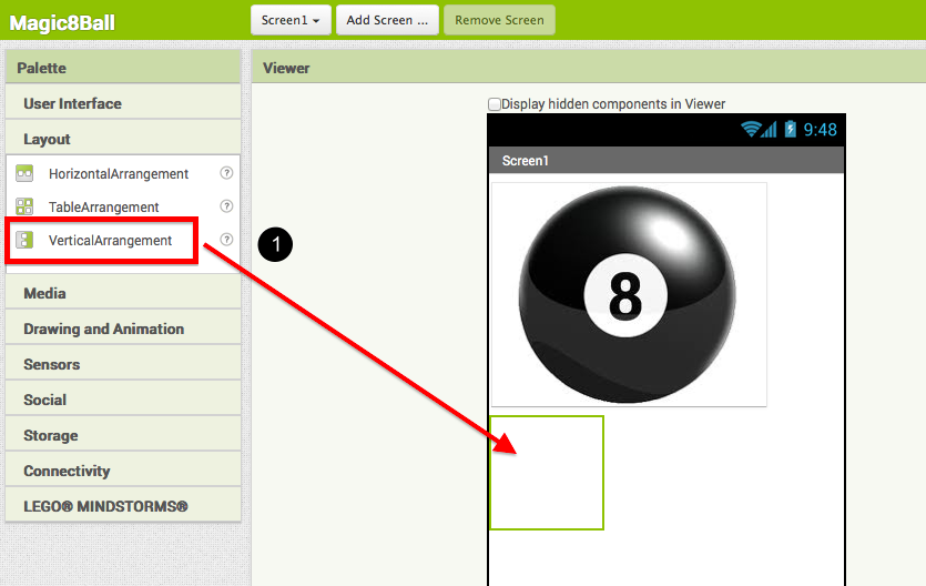
- From the Screen Arrangement palette, drag over the Vertical Arrangement component (#1). At first it will just look like an empty box, but when you put things in it, App Inventor will know that you want to line them up vertically (one on top of the other).
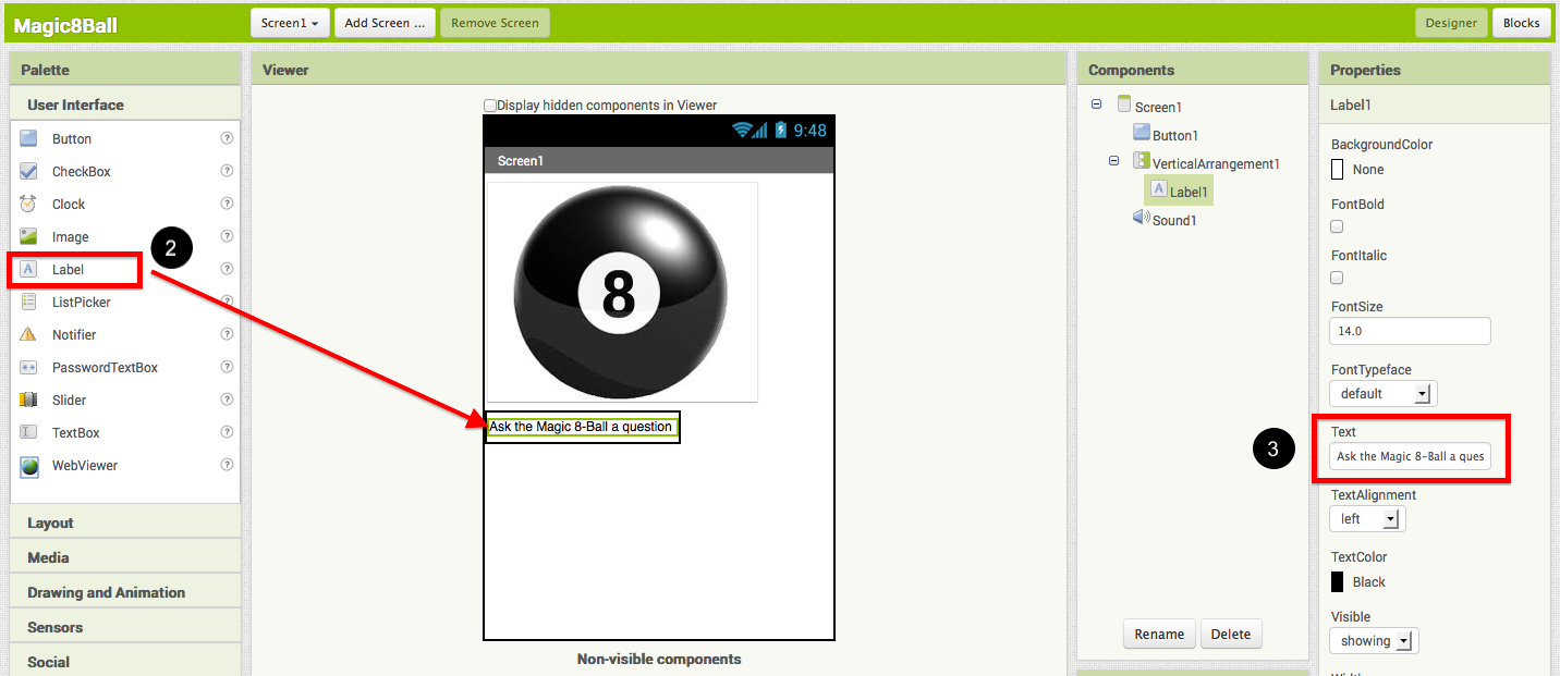
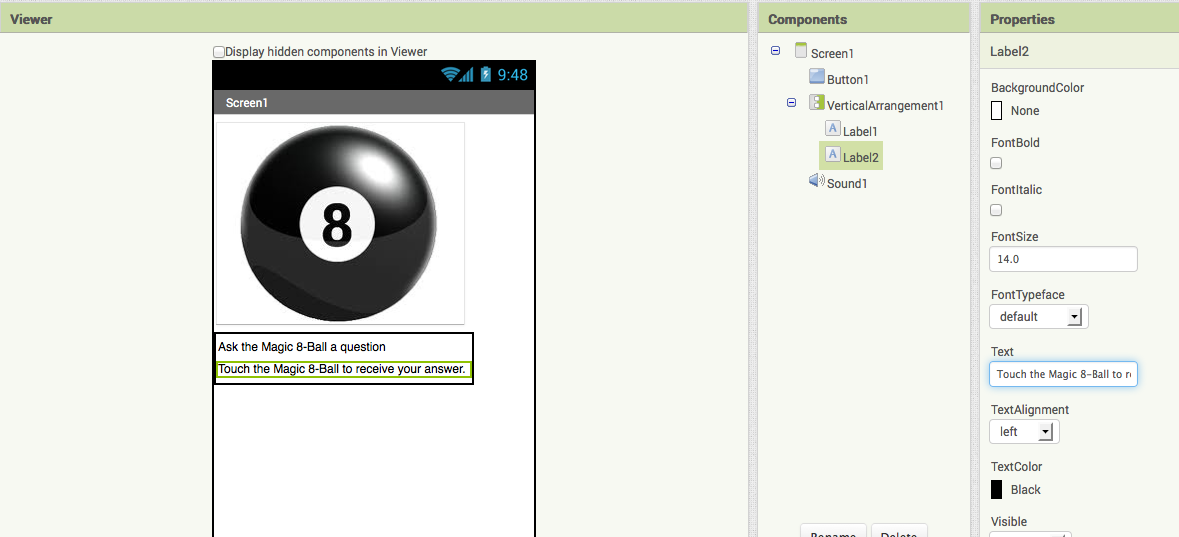
- From the Basic palette, drag over a Label component (#2) and drop it inside of the vertical arrangement component. In the Properties pane, change the "Text" property of Label1 to “Ask the Magic 8-Ball a question”.(#3)
- From the Basic palette, drag over another Label component (Label2) into the Vertical Arrangement box so that it sits right below Label1. Change the "Text" property of the Label2 to “Touch the Magic 8-Ball to receive your answer.” Now drag the 8-Ball image so that it is also inside the Vertical Arrangement component on top of the two labels. This will cause them to line up with each other in a vertical line. (Note: this can be tricky mouse work, but get them in there just right and the vertical arrangement will resize itself to fit everything.)
Now it’s time to go back into the Blocks Editor to program the components you just added to your project.
BUILD: Blocks Editor
Now for the fun part! You're going to make a list of predictions and program the button to pick one item from the list and display it inside Label2. The button will also still play the sound that you programmed in Part One. Here's how to do it...
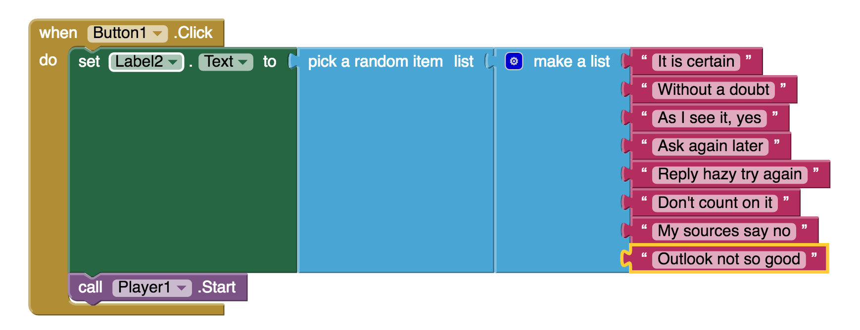
- From the blocks palette, click on Label2 drawer to see all of its associated blocks. Drag over the green set Label2.BackgroundColor and insert it just above the Player1.Start block. Notice that the when Button1.Click block automatically gets bigger to accomodate the new block.
- Clicking on the word "BackgroundColor" will allow you to change the property that is being set. We want to change the Text so our block will look like set Label2.Text.
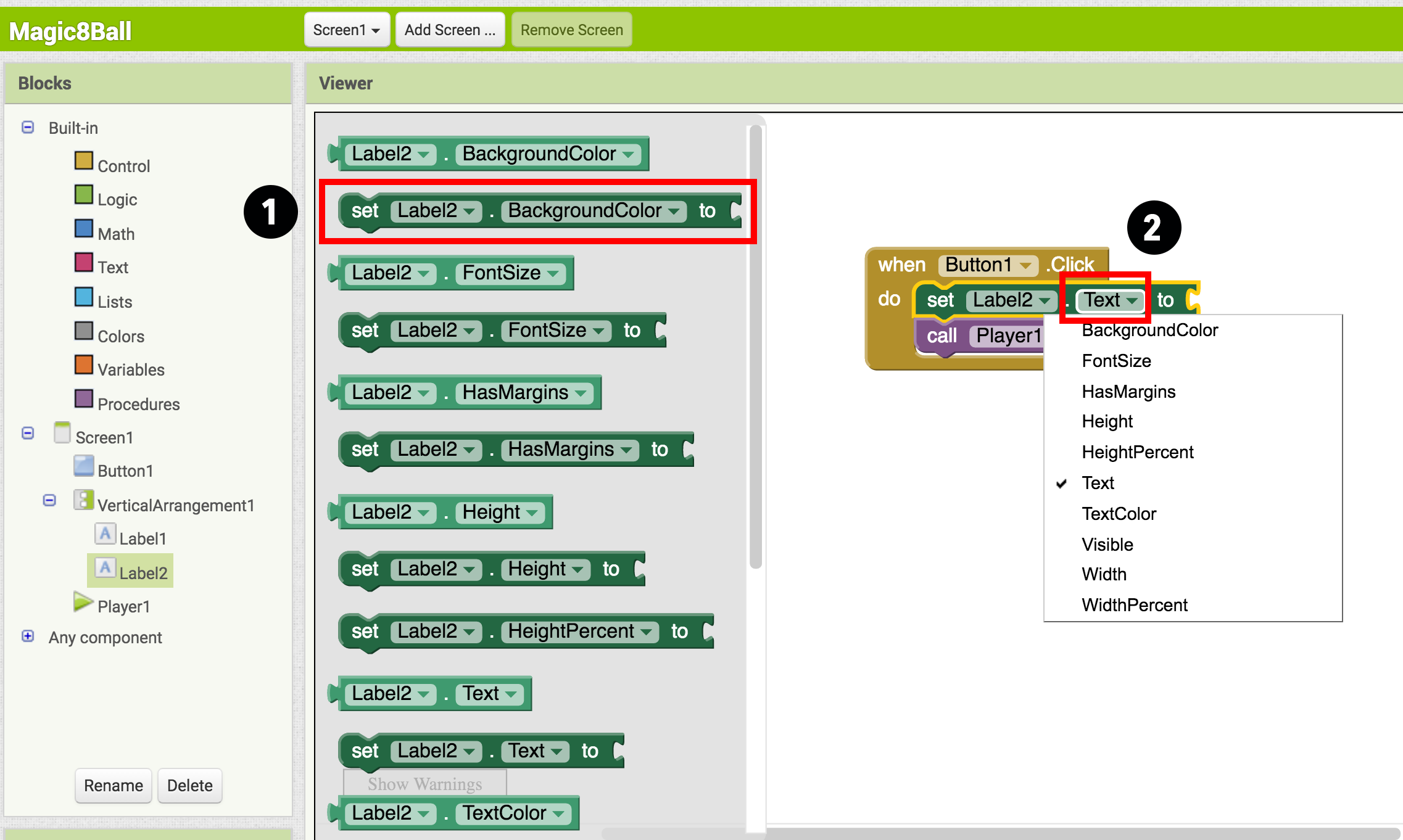
- From the Built-In palette, click on the Lists drawer. Drag over the pick random item block and connect it to the open socket of the set Label2.Text block.
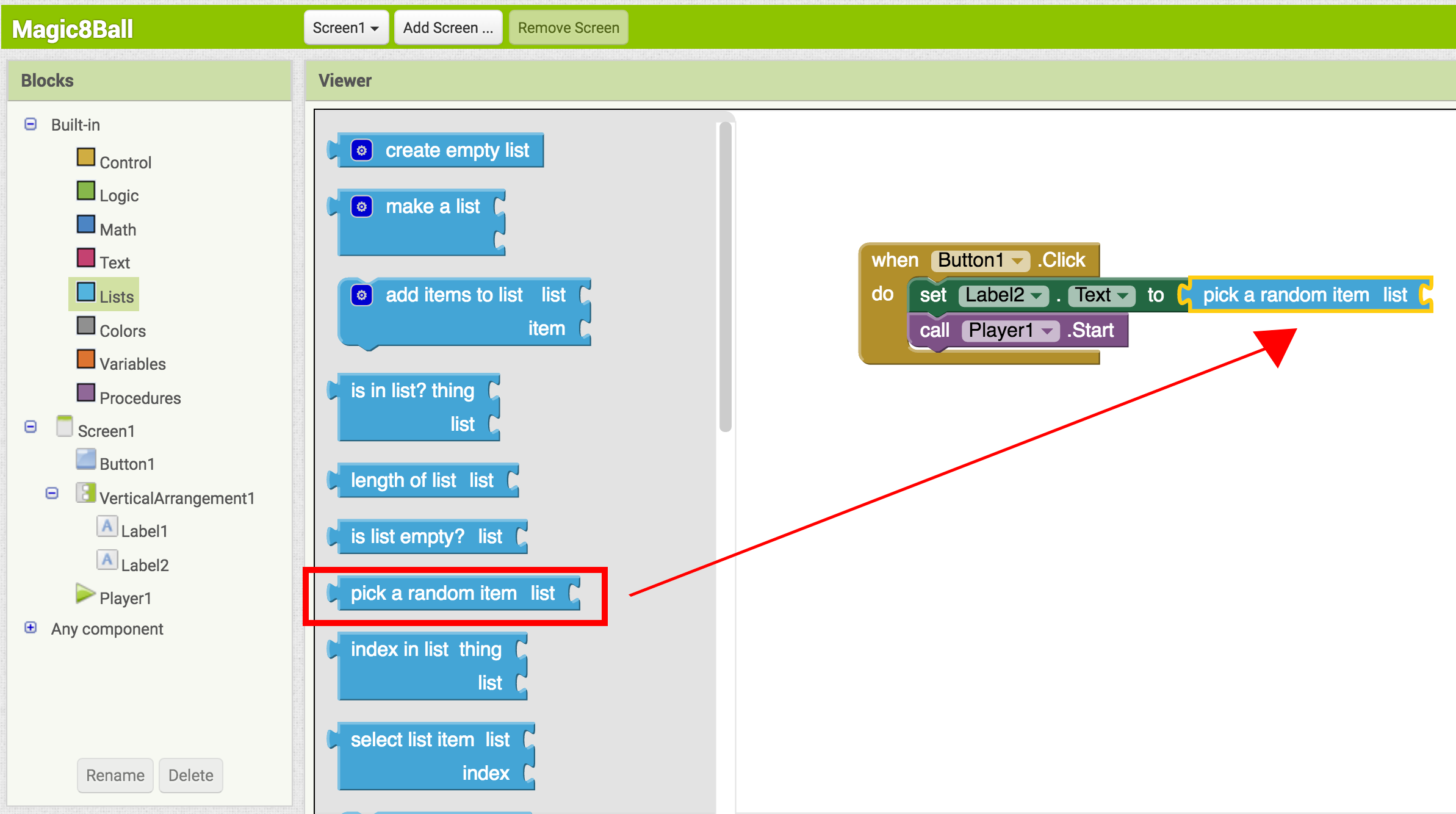
- From the Built-In palette, click on Lists again, then drag out the make a list block and plug it into the "list" socket on the right side of the pick random item block.
- From the Built-In palette, click on the Text drawer, drag out a " " block and connect it to the item socket of the make a list block. Click directly on the space in the block. You can then type in text there. Think about the sayings you want in your list of predictions for the Magic 8-Ball. Type the first prediction into this new text block.
- Notice after you plug in two text blocks, there are no more sockets to add more responses. To create more sockets, you need to click the dark blue button on the block. Make a list is called a mutator block and thus can be expanded or shrunk by clicking the blue button in the upper left corner. For a summary of mutators, check out the Mutators page
- Plug each text block into the pick random item block. (Ideas for answers: http://en.wikipedia.org/wiki/Magic_8-Ball)
Blocks should look something like this:
You've got a Magic 8-Ball App! Now your app is fully functional and will predict the future with absolute certainty. Test out that this works, and then come back for some challenge tasks to make the app even more fun.
TEST: Emulator or Phone
Emulator: Click on the picture of the 8-Ball, you should see one of your answers displayed in the Label2.Text field, followed by the sound.
Phone: Tap on the picture of the 8-Ball, you should see one of your answers displayed in the Label2.Text field, followed by the sound.
Part Three: Shake the Phone, Get a Prediction + Hear a Sound
Even though you have a working Magic 8-Ball app, there is a way to make it even more fun. You can use the accelerometer component to make the phone respond to shaking instead of responding to a button click. This will make the app much more like a real Magic 8-Ball toy. Note: This part can only be done with an actual phone or tablet equipped with an accelerometer. If you are using an emulator, skip this part and go to Challenge 1 instead.
DESIGN: App Inventor
From the Sensors palette, drag over an AccelerometerSensor sensor component. Notice that it automatically drops down to the “Non-visible components” area of the Viewer window. This is the only new component you need, so go on over to the Blocks Editor to change your program.
BUILD: Blocks Editor
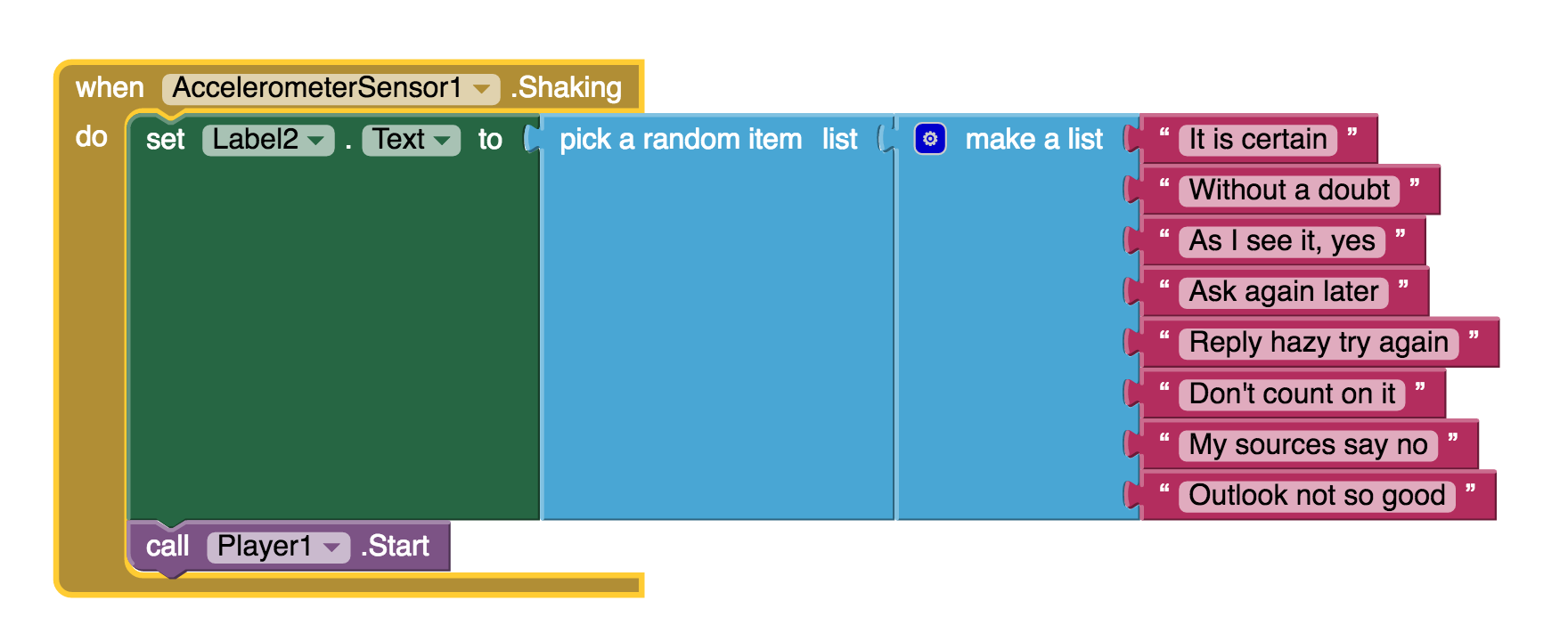
- From the blocks drawer, click on AccelerometerSensor, then drag out the block for when AccelerometerSensor.Shaking.
- Disconnect all of the blocks from inside the Button1.Click block and move them inside the AccelerometerSensor.Shaking block. NOTE: you can move whole sections of connected blocks by clicking on the uppermost or leftmost block and dragging it. The connected blocks will come with it.
- Delete the Button1.Click block to keep your work area tidy.
The blocks should look something like this:
TEST: Phone/Emulator
Phone: When you shake the phone it should show an answer and play a sound.
Emulator: unfortunately, you can not simulate shaking the phone when using the emulator.
Package the App to Your Phone!
Your app would disappear if you were to disconnect your phone from the Blocks Editor. This is because the app is still stored on the App Inventor server and not on your phone. Follow these instructions to package your app to your phone or to make an ".apk" file that can be installed on any android phone. Or, if you want to make your app even cooler, try the challenges below.
Challenge 1: Make the Magic 8-Ball Speak
Instead of (or in addition to) making the prediction appear as text, can you make the 8-Ball speak it aloud? Hint: the text-to-speech component is under the Media palette in the Designer. Note: Most Android devices have the text-to-speech (TTS) capability, but if you have trouble getting the TTS component in App Inventor to work, you may need to find out how to install TTS and/or enable TTS on your device.
Suggestions for Further Exploration
- Make the image rotate when the phone is shaken or have several images that the app rotates through while the phone is shaken. You could use this technique to make it look like the triangle piece inside the 8-ball window is surfacing. You could also make different images for different predictions and display the correct image for each prediction.
- Make a similar app but for a different purpose. The phone could be used in place of dice or yahtzee letters. It could simulate a coin toss or a random number or color generator for investigating probability.
- Ask end users to add choices to the list of predictions (See Make Quiz tutorial).
- "Crowd source" for prediction choices: allow people to send text messages and have the app add them to the list.
- Make the 8 Ball app a "server" so that anyone who sends a text to it will receive a text message prediction in return.
- Complete change the list to humorous choices (e.g. an app for teacher to use when a student has an excuse for not doing homework), or for useful purposes like randomly selecting a name from amongst people in the class.
Done with Magic 8-Ball? Return to Curriculum (Teacher Resources) or Tutorials.
Scan the Sample App to your Phone
Scan the following barcode onto your phone to install and run the sample app.

Download Source Code
If you'd like to work with this sample in App Inventor, download the source code to your computer, then open App Inventor, click Projects, choose Import project (.aia) from my computer..., and select the source code you just downloaded.
Tutorial Version:
Tutorial Difficulty:
- Basic
Tutorial Type:
- Game
- Accelerometer
MoleMash for App Inventor 2
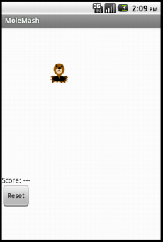
In the game MoleMash, a mole pops up at random positions on a playing field, and the player scores points by hitting the mole before it jumps away. This tutorial shows how to build MoleMash as an example of a simple game that uses animation.
View the NEW book chapter from the App Inventor Book by Wolber, et al. (Includes VIDEO tutorial)
Getting Started
Connect to the App Inventor web site and start a new project. Name it "MoleMash", and also set the screen's Title to "MoleMash". Open the Blocks Editor and connect to the phone.
Also download this picture of a mole and save it on your computer.
Introduction
You'll design the game so that the mole moves once every half-second. If it is touched, the score increases by one, and the phone vibrates. Pressing restart resets the score to zero.
This tutorial introduces:
- image sprites
- timers and the Clock component
- procedures
- picking random numbers between 0 and 1
- text blocks
- typeblocking
The first components
Several components should be familiar from previous tutorials:
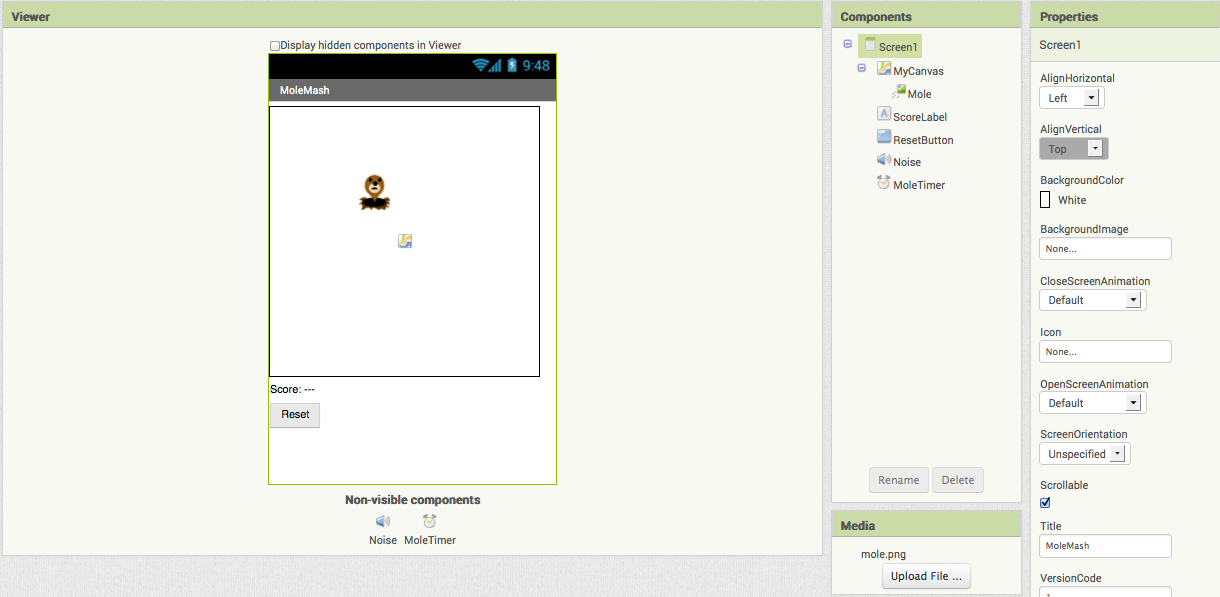
- A Canvas named "MyCanvas". This is the area where the mole moves.
- A Label named "ScoreLabel" that shows the score, i.e., the number of times the player has hit the mole.
- A Button named "ResetButton".
Drag these components from the Palette onto the Viewer and assign their names. Put MyCanvas on top and set its dimensions to 300 pixels wide by 300 pixels high. Set the Text of ScoreLabel to "Score: ---". Set the Text of ResetButton to "Reset". Also add a Sound component and name it "Noise". You'll use Noise to make the phone vibrate when the mole is hit, similar to the way you made the kitty purr in HelloPurr.
Timers and the Clock component
You need to arrange for the mole to jump periodically, and you'll do this with the aid of a Clock component. The Clock component provides various operations dealing with time, like telling you what the date is. Here, you'll use the component as a timer that fires at regular internals. The firing interval is determined by the Clock 's TimerInterval property. Drag out a Clock component; it will go into the non-visible components area. Name it "MoleTimer". Set its TimeInterval to 500 milliseconds to make the mole move every half second. Make sure that TimerEnabled is checked.
Adding an Image Sprite
To add the moving mole we'll use a sprite.
Sprites are images that can move on the screen within a Canvas. Each sprite has a Speed and a Heading, and also an Interval that determines how often the sprite moves at its designated speed. Sprites can also detect when they are touched. In MoleMash, the mole has a speed zero, so it won't move by itself. Instead, you'll be setting the mole's position each time the timer fires. Drag an ImageSprite component onto the Viewer. You'll find this component in the Drawing and Animation category of the Palette. Place it within MyCanvas area. Set these properties for the Mole sprite:
- Picture: Use mole.png, which you downloaded to your computer at the beginning of this tutorial.
- Enabled: checked
- Interval: 500 (The interval doesn't matter here, because the mole's speed is zero: it's not moving by itself.)
- Heading: 0 The heading doesn't matter here either, because the speed is 0.
- Speed: 0.0
- Visible: checked
- Width: Automatic
- Height: Automatic
You should see the x and y properties already filled in. They were determined by where you placed the mole when you dragged it onto MyCanvas. Go ahead and drag the mole some more. You should see x and y change. You should also see the mole on your connected phone, and the mole moving around on the phone as you drag it around in the Designer. You've now specified all the components. The Designer should look like this. Notice how Mole is indented under MyCanvas in the component structure list, indicating that the sprite is a sub-component of the canvas.
Component Behavior and Event Handlers
Now you'll specify the component behavior. This introduces some new App Inventor ideas. The first is the idea of a procedure. For an overview and explanation of procedures, check out the Procedures page.
A procedure is a sequence of statements that you can refer to all at once as single command. If you have a sequence that you need to use more than once in a program, you can define that as a procedure, and then you don't have to repeat the sequence each time you use it. Procedures in App Inventor can take arguments and return values. This tutorial covers only the simplest case: procedures that take no arguments and return no values.
Define Procedures
Define two procedures:
- MoveMole moves the Mole sprite to a new random position on the canvas.
- UpdateScore shows the score, by changing the text of the ScoreLabel
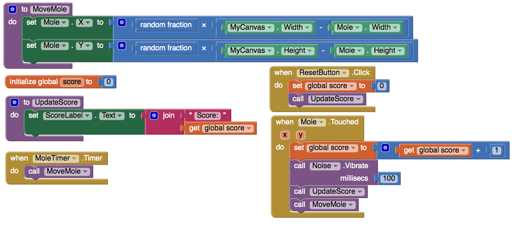
Start with MoveMole:
- In the Blocks Editor, under Built-In, open the Procedures drawer. Drag out a to procedure block and change the label "procedure" to "MoveMole".
Note: There are two similar blocks: procedure then do and procedure then resu;t. Here you should use procedure then do.
The to MoveMole block has a slot labeled "do". That's where you put the statements for the procedure. In this case there will be two statements: one to set the mole's x position and one to set its y position. In each case, you'll set the position to be a random fraction, between 0 and 1, of the difference between the size of the canvas and the size of the mole. You create that value using blocks for random fraction and multiplication and subtraction. You can find these in the Math drawer.
- Build the MoveMole procedure. The completed definition should look like this:
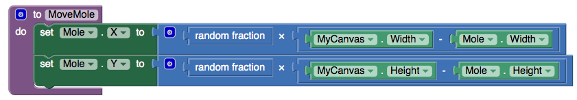
MoveMole does not take any arguments so you don't have to use the mutator function of the procedure block. Observe how the blocks connect together: the first statement uses the Mole.X set block to set mole's horizontal position. The value plugged into the block's socket is the result of multiplying:- The result of the call random fraction block, which a value between 0 and 1
- The result of subtracting the mole's width from the canvas width
The vertical position is handled similarly.
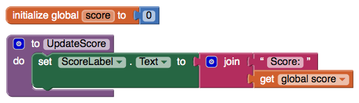
With MoveMole done, the next step is to define a variable called score to hold the score (number of hits) and give it initial value 0. Also define a procedure UpdateScore that shows the score in ScoreLabel. The actual contents to be shown in ScoreLabel will be the text "Score: " joined to the value of score.
- To create the "Score: " part of the label, drag out a text block from the Text drawer. Change the block to read "Score: " rather than " ".
- Use a join block to attach this to a block that gives the value of the score variable. You can find the join block in the Text drawer.
Here's how score and UpdateScore should look:
Add a Timer
The next step is to make the mole keep moving. Here's where you'll use MoleTimer. Clock components have an event handler called when ... Timer that triggers repeatedly at a rate determined by the TimerInterval.
Set up MoleTimer to call MoveMole each time the timer fires, by building the event handler like this:
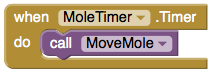
Notice how the mole starts jumping around on the phone as soon as you define the event handler. This is an example of how things in App Inventor start happening instantaneously, as soon as you define them.
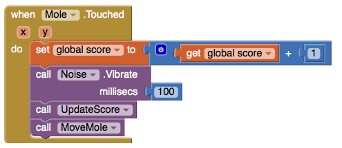
Add a Mole Touch Handler
The program should increment the score each time the mole is touched. Sprites, like canvases, respond to touch events. So create a touch event handler for Mole that:
- Increments the score.
- Calls UpdateScore to show the new score.
- Makes the phone vibrate for 1/10 second (100 milliseconds).
- Calls MoveMole so that the mole moves right away, rather than waiting for the timer.
Here's what this looks like in blocks. Go ahead and assemble the when Mole.Touched blocks as shown.
Here's a tip: You can use typeblocking: typing to quickly create blocks.
- To create a value block containing 100, just type 100 and press return.
- To create a MoveMole block, just type MoveMole and select the block you want from the list
Reset the Score
One final detail is resetting the score. That's simply a matter of making the ResetButton change the score to 0 and calling UpdateScore.
Complete Program
Here's the complete MoleMash program:
Variations
Once you get the game working, you might want to explore some variations. For example:
- Make the game vary the speed of the mole in response to how well the player is doing. To vary how quickly the mole moves, you'll need to change the MoleTimer's Interval property.
- Keep track of when the player hits the mole and when the player misses the mole, and show a score with both hits and misses. To do this, you'll need do define touched handlers both for Mole, same as now, and for MyCanvas. One subtle issue, if the player touches the mole, does that also count as a touch for MyCanvas? The answer is yes. Both touch events will register.
Review
Here are some of the ideas covered in this project:
- Sprites are touch-sensitive shapes that you can program to move around on a Canvas.
- The Clock component can be used as a timer to make events that happen at regular intervals.
- Procedures are defined using to blocks.
- For each procedure you define, App Inventor automatically creates an associated call block and places it in the My Definitions drawer.
- Making a random-fraction block produces a number between 0 and 1.
- Text blocks specify literal text, similar to the way that number blocks specify literal numbers.
- Typeblocking is a way to create blocks quickly, by typing a block's name.
Scan the Sample App to your Phone
Scan the following barcode onto your phone to install and run the sample app.

Download Source Code
If you'd like to work with this sample in App Inventor, download the source code to your computer, then open App Inventor, click Projects, choose Import project (.aia) from my computer..., and select the source code you just downloaded.
Done with MoleMash? Return to the other tutorials here.
Tutorial Version:
Tutorial Difficulty:
- Basic
Tutorial Type:
- Sprites
- Clock Timer
- Game
PaintPot (Part 1) for App Inventor 2
This tutorial has two parts: Part 1 | Part 2
This tutorial introduces the Canvas component for creating simple two-dimensional graphics. You'll build an app that lets you draw on the phone screen in different colors.
Historical note: PaintPot was one of the first programs developed to demonstrate the potential of personal computers, as far back as the 1970s.
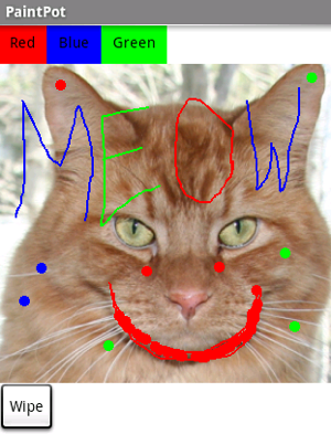
With the PaintPot app, you can:
- Dip your finger into a virtual paint pot to draw in that color.
- Drag your finger along the screen to draw a line.
- Tap the screen to make dots.
- Use the button at the bottom to wipe the screen clean.
- Include an image as a drawing background.
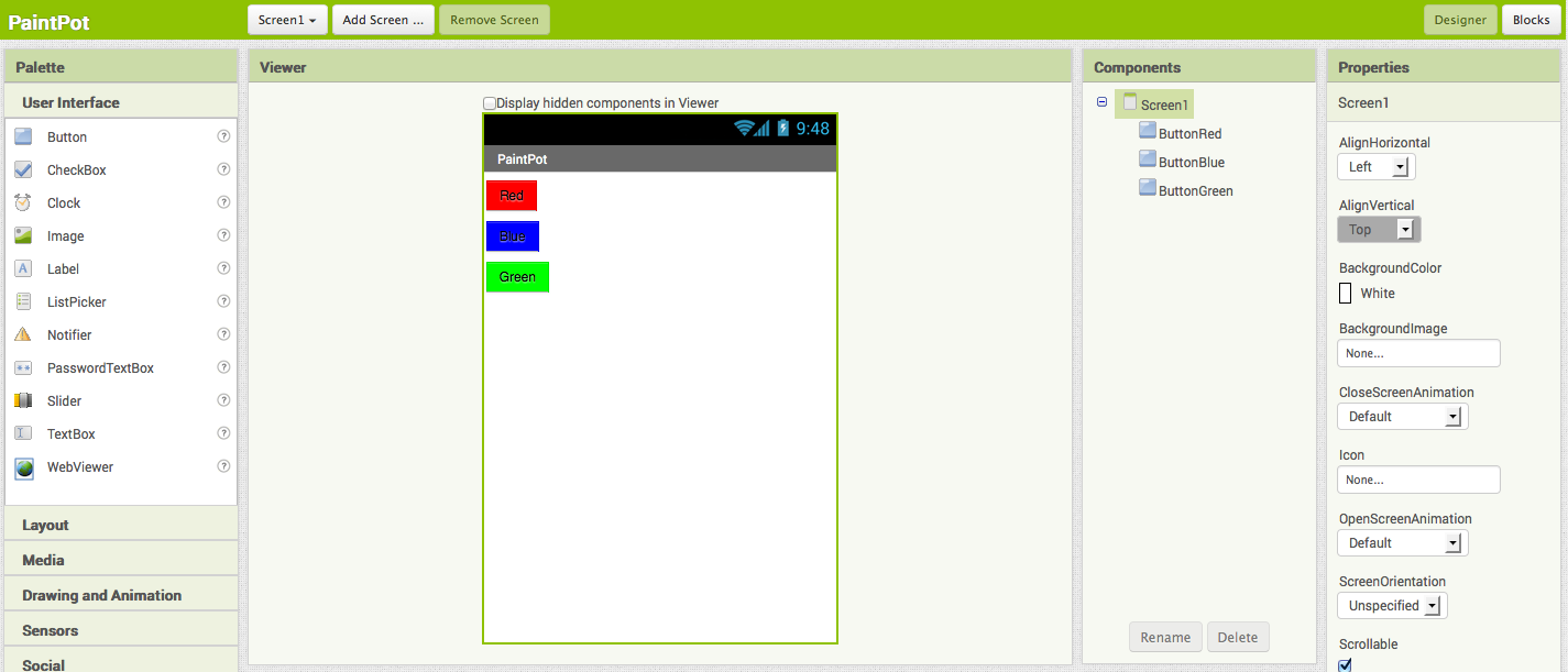
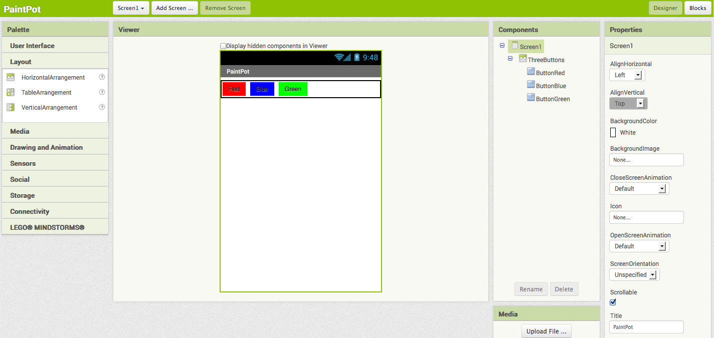
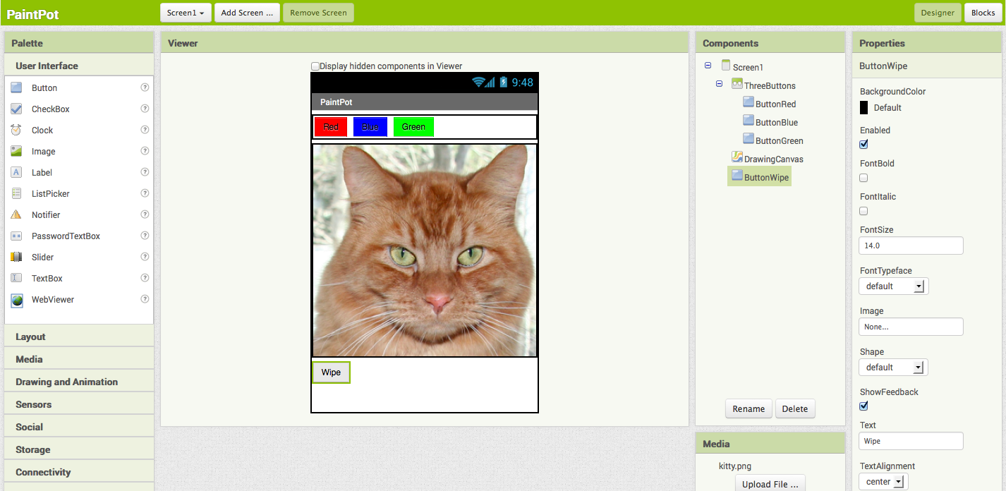
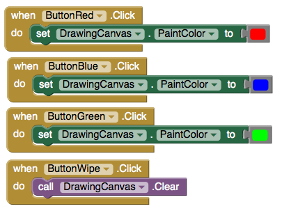
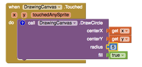
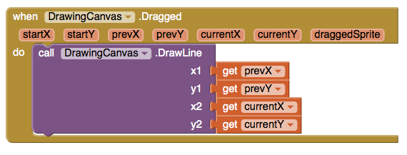
This tutorial assumes that you have completed the HelloPurr tutorial. This tutorial introduces the following App Inventor concepts: Make sure your computer and your phone are set up to use App Inventor. Start a new project in the Designer window, and name it "PaintPot". Open the Blocks Editor, click Connect to Phone, and make sure the phone has started the App Inventor app. To get started, go to the Properties panel on the right of the Designer and change the screen Title to "PaintPot". You should see this change on phone, with the new title showing in the title bar. There are three names in App Inventor, and it's easy to confuse them: You'll use these components to make PaintPot: That makes five components in all. Let's get them and build the app. Here's how this should look in the designer, with the button names appearing in the list of project components. In this project, you're changing the names of the components rather than leaving them as the default names as you did with HelloPurr. Using meaningful names makes your projects more readable to yourself and others. You should also see the three buttons on the phone screen. You should now have three buttons, one above the other. The next step is to make them line up horizontally. You do this using a HorizontalArrangement component. If you look in the list of project components, you'll see the three buttons indented under the ThreeButtons to show that they are now its subcomponents. Notice that all the components are indented under Screen1. You should also see your three buttons line up in a row on the phone screen, although things might not look exactly as on the Designer. For example, the Arrangement's outline shows in the Designer but not on the phone. In general, you use Screen Arrangement to create simple vertical or horizontal layouts. You can create more complex layouts by nesting Screen Arrangement components. There is also a TableArrangement component (not covered in this tutorial). The final two components are the canvas and the wipe button. You've now completed the steps to set the appearance of your app. Here's how this should look in the Designer. Next, you'll define how the components behave. Click the Blocks button to switch to the Blocks Editor. First you will set up the buttons that change the paint color. Later you will add blocks to decide what happens when someone touches or drags the screen. In the Blocks Editor: The blocks for the buttons should look like this: Now for the next step: drawing on the Canvas. You'll arrange things so that when you touch the canvas, you get a dot at the spot where you touch. If you drag your finger slowly along the canvas, it draws a line. You've already seen button click events. Clicks are simple, because there's nothing to know about the click other than that it happened. Other event handlers such as when ... Touched need information about the event. In App Inventor, this information is expressed as the value of arguments associated with the event handler. For the when ... Touched event, the first two arguments stand for the x and y coordinates of where the touch happened. We'll save touchedSprite for a later tutorial. On the right side of the call DrawingCanvas.DrawCircle block are four sockets where you must specify values for the x and y coordinates where the circle should be drawn, r, which is the radius of the circle, and fill, which is true to draw a filled circle, or false to draw an outlined circle. For x and y, you'll use values of the arguments that were supplied to the Touched handler: Here's how the touch event handler should look: Try out what you have so far on the phone. Touch a color button. Now touch the canvas, and your finger should leave a spot at each place you touch. Touching the Wipe button should clear your drawing. Finally, add the drag event handler. Here's the difference between a touch and a drag: When you drag your finger across the screen, it appears to draw a giant, curved line where you moved your finger. What you're actually doing is drawing hundreds of tiny straight lines: each time you move your finger, even a little bit, you extend the line from your finger's immediate last position to its new position. A drag event comes with 6 arguments. These are three pairs of x and y coordinates that show: There's also a sprite, which we'll ignore for this tutorial. Now make dragging draw a line between the previous position and the current position by creating a drag handler: Here's the result: Test your work by trying it on the phone: drag your finger around on the screen to draw lines and curves. Touch the screen to make spots. Use the Wipe button to clear the screen. In PaintPot Part 2, you'll see how to use global variables to create dots of different sizes. Here are some of the ideas covered in this tutorial: Scan the following barcode onto your phone to install and run the sample app.
If you'd like to work with this sample in App Inventor, download the source code to your computer, then open App Inventor, click Projects, choose Import project (.aia) from my computer..., and select the source code you just downloaded.Before starting
Screen title
Set up the Components
Color Buttons
Layout with Screen Arrangement
Canvas and wipe button
You can use any image you like, but you'll get the best results if the size of the image (in pixels) is close to the size at which you'll be showing it on the phone. Also, large images will take a long time to load, and might exceed the memory capacity of the phone allocates for applications.
Add behaviors to the components
Add button event handlers
Add Touch-event Handlers
Add Drag Events
Review
Scan the Sample App to your Phone

Download Source Code
Tutorial Version:
Tutorial Difficulty:
- Basic
Tutorial Type:
- Drawing Canvas
PaintPot (Part 2) for App Inventor 2
This tutorial has two parts: Part 1 | Part 2
Part 2 extends Part 1 of the tutorial to create both large and small dots, as a demonstration of how to use global variables.
Starting
Make sure you've completed the Set Up process and you have your completed project from PaintPot Part 1 loaded.
Start where you left off at the end of Part 1, with the project open in App Inventor. Use the Save As button to make a copy of PaintPot so you can work on the new version without affecting the original version. Name the copy "PaintPotV2" (with no spaces). After saving a copy, you should see PaintPotV2 in the Designer.
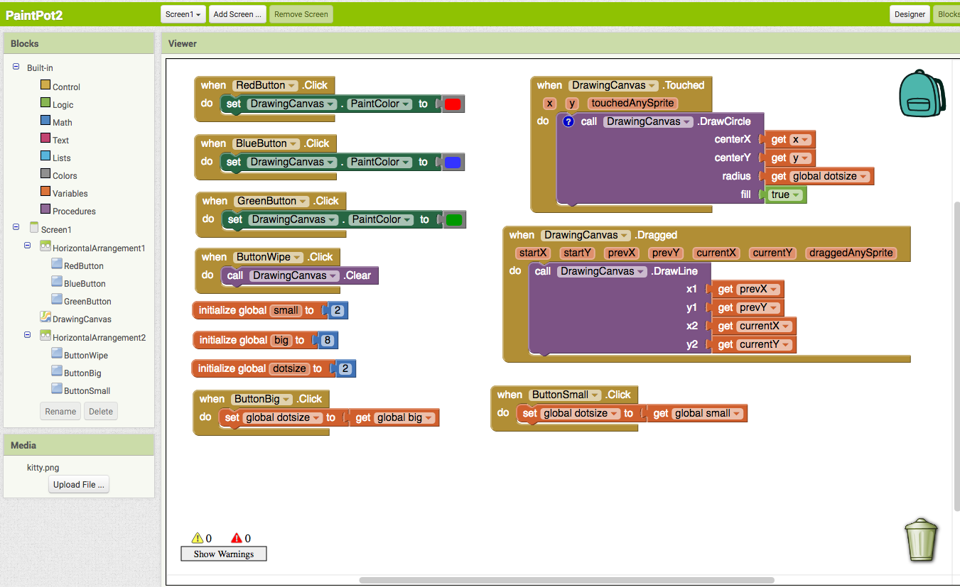
Creating variables
The size of the dots drawn on the canvas is determined in the when DrawingCanvas.Touched event handler where call Drawing.DrawCircle is called with r, the radius of the circle, equal to 5. To change the thickness, all we need to do is use different values for r. Use r = 2 for small dots and r = 8 for large dots.
Start by creating names for these values:
- Open the Blocks Editor if it isn't already open and connect the phone. Your phone should show the buttons and the canvas you built previously.
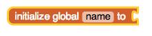
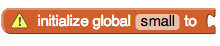
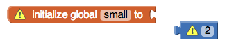
- In the Blocks Editor, in the Built-In column, open the Variables drawer. Drag out a initialize global name to block. Change the text that reads "name" to read "small". A yellow warning exclamation mark might appear on the block. If you mouse over this you'll see a warning message explaining that the block has an empty socket.
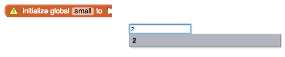
- You need to fill in the socket with a number block that specifies the value for "small" -- use 2 as the value. To create the number block, type the number 2. A menu will appear, showing you all the possible blocks that include "2" in their name. Click on the first one, which is the number 2 itself, and a number block with the value 2 should appear. Plug that in to the initialize global small to block. The yellow warning mark will disappear, because the empty socket has been filled. (The second value listed in the menu is the math block atan2 which you won't use here.)
Here are the steps in the sequence:
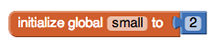
You've now defined a global variable named small whose value is the number 2.
Similar to small, define a global variable big, whose value is 8.
Finally, define a global variable dotsize and give it an initial value of 2.
You might wonder whether it would be better programming style to make the initial value of dotsize be the value of small rather than 2. That would be true, except for a subtle programming point: Doing that would be relying on the assumption that small will already have a value at the point in time when dotsize is assigned its value. In App Inventor, you can't make assumptions about the order in which different def blocks will be processed. In general, of course, you really would like to specify the order in which variables are assigned. You can do this by assigning all values when the application is initialized, using the Screen initialize event. The Quiz Me tutorial gives an example of initialization.
Using variables
Now go back to the touch event handler you set up in Part 1 and change the call to DrawCircle block so that it uses the value of dotsize rather than always using 5.
In the Blocks Editor, open the Variables drawer. Pull out a get block and click on the dropdown. You should see three new variables in the dropdown: small, big, and dotsize
These blocks were automatically created and put in the dropdown of get and set variable blocks, similarly to the way that x and y were created in the dropdown when you defined the when DrawingCanvas.Touched event handler in the part 1 of this tutorial. "Global" means "global variable", in contrast to the event-handler arguments, which are considered "local variables". The difference is that the argument values are accessible only within the body of the event handler, while global variables are accessible throughout the entire program.
- Go to the when MyCanvas.Touched event handler and replace the number 5 block in call DrawCircle with the get dotsize block from the Variables drawer.
Changing the values of variables
Now set up a way to change dotsize to be small (2) or big (8). Do this with buttons.
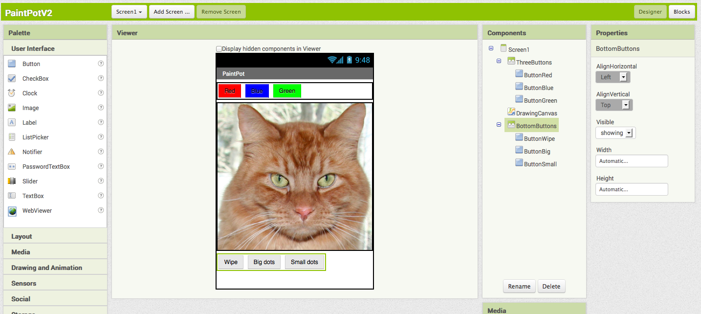
- In the Designer, drag a HorizontalArrangement component into the Viewer pane below the DrawingCanvas component. Name the component "BottomButtons".
- Drag the existing ButtonWipe into BottomButtons.
- Drag two more button components from the Palette into BottomButtons, placing them next to ButtonWipe.
- Name the buttons "ButtonBig" and "ButtonSmall", and set their Text to read "Big dots" and "Small dots", respectively.
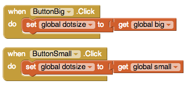
- In the Blocks Editor, create a when ... Clicked event handler for ButtonSmall that changes dotsize to be the value of small. To change dotsize use the set global dotsize to block from the MyDefinitions drawer and plug in the global small block.
- Make a similar event handler for ButtonBig.
The two click event handlers should look like this:
You're done! You can draw in PaintPot and use the new buttons to draw either big dots or small dots. Notice that dragging your finger still produces a thin line. That's because the changes we just made don't affect how DrawLine is called.
Here's the finished program in the Designer:
and in the Blocks Editor:
A bug for you to work on: The program you just built has a slight bug. If you start drawing before pressing any of the paint buttons, the paint color will be black; however, after you choose a color, there's no way to get back to black. Think about how you could fix that.
Review
You create global variables by using def blocks from the Variables drawer.
For each global variable you define, App Inventor automatically supplies a global block that gives the value of the variable, and a set global ... to block for changing the value of the variable. These blocks can be found in the Variables drawer.
Scan the Sample App to your Phone
Scan the following barcode onto your phone to install and run the sample app.

Download Source Code
If you'd like to work with this sample in App Inventor, download the source code to your computer, then open App Inventor, click Projects, choose Import project (.aia) from my computer..., and select the source code you just downloaded.
Done with PaintPot? Return to the other tutorials here.
Tutorial Version:
Tutorial Difficulty:
- Basic
Tutorial Type:
- Drawing Canvas
PicCall for App Inventor 2
PicCall shows you how you can use App Inventor to make apps that do actual things, like calling friends.
This tutorial assumes that you have completed the Set Up process.
Before starting
To run PicCall, your phone must be set up and activated for making phone calls. If it isn't you can still build PicCall for practice, but the phone won't actually make the calls.
Warning: PicCall does not work on all Android phones in the current implementation of App Inventor: you'll get an error notice on some phones when you try to pick a phone number. Also, you won't see all your contacts — only those created from Gmail. These limitations will be removed in the future.In this tutorial, unlike HelloPurr, you'll give names to components, rather than just using the default names that App Inventor provides (like "Button1"). Using meaningful names is good programming practice: it helps you keep your programs straight in your own mind, and it helps others understand your programs.
Your phone should also contain a few contacts with pictures. You can use the Contacts app to save pictures for your contacts. You can also click on Contacts in your Gmail account on your computer and add pictures there.
Make sure your computer and your phone are set up to use App Inventor. Start a new project in the Designer window. Name it "PicCall" and change the screen Title to PicCall. Open the Blocks Editor, click Connect to Companion, and check that the phone has started the App Inventor app.
Getting started
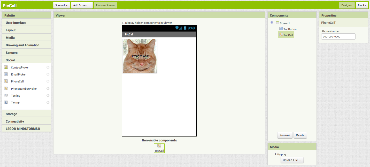
Start out just like in HelloPurr by placing a button on the screen. Make the button 150 pixels wide and 150 pixels high. Set button's Image to a picture. You may as well use the picture of the kitty if it's handy -- you'll be changing the picture soon. Set the Text of the button to "Press to Call", although you'll be changing that soon as well.
Change the name of the Button component to "TopButton" (you'll make one called "BottomButton" later in the tutorial). To change a component's Name, click the Rename button in the Components panel and enter the new name.
In this tutorial, unlike HelloPurr, you'll give names to components, rather than just using the default names that App Inventor provides (like "Button1"). Using meaningful names is good programming practice: it helps you keep your programs straight in your own mind, and it helps others understand your programs.Don't confuse the Name of a component with the Text of a component. The Text is what appears on the screen. The Name is the name your program uses to refer to the component. You'll see the name in the Components structure list in the Designer and on the drawers in the Blocks editor.Making phone calls
In HelloPurr, you made the phone play a sound when the button was clicked. PicCall in almost the same, except that instead of playing a sound, the phone makes a call.
App Inventor's PhoneCall component makes phone calls. You can find PhoneCall in the Social section of the Palette. Open that section and drag out a PhoneCall into the viewer. It will go into the Non-visible components area. Name it "TopCall". The PhoneCall's PhoneNumber property determines the number to call. Set that to some 10-digit phone number you'd like to call. Here's how the Designer should look:
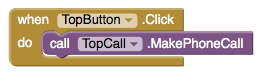
Now switch to the Blocks Editor and pull out the when TopButton.Click do block. In the do slot, place a call TopCall.MakePhoneCall block from the TopCall drawer, so that the event handler looks like this:
Go ahead and test what you have so far on the phone: Press the button and make the call. You could package this up as an app right now. It would be a pretty limited app, always calling the same fixed number, some people might find that useful.
Phone contact information
In addition to making phone calls, App Inventor apps can also get information from the phone's contact list. You do this with the PhoneNumberPicker component.
Pull out a PhoneNumberPicker component from the Social section of the Palette, place it under TopButton. A PhoneNumberPicker is a kind of button: when you press it, it brings up your phone contacts list and lets you pick someone. Change the name of the PhoneNumberPicker to "TopPick", and change its Text to "Press to pick a number to call". Try it by pressing the picker on your phone: you should see your contacts come up, and you can pick one. Nothing will happen after you pick, because you haven't yet told the components to do anything. You'll do that next.
Using the picker
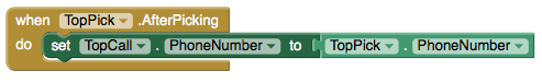
Switch to the Blocks window and open the drawer for TopPick. Drag out the when TopPick.AfterPicking do block. This lets you define an event handler that says what to do after you've picked a number from your contacts.
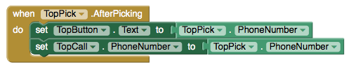
Now open the TopCall drawer and drag out set TopCall.PhoneNumber to and fit it into the slot in the when TopPick.AfterPicking do block. Now drag out TopPick.PhoneNumber from the TopPick drawer and plug it into the empty socket. Here's how your event handler should look:
Try it on the phone: Press the picker, choose a contact and a phone number. Then press the phone call button to make the call. Add a command to the event handler to set TopButton's Text property to TopPick.PhoneNumber:
Pictures
If you have a picture stored with your contacts, you can make the button show that along with the phone number, rather than always using the picture of the kitty. To do this, add an command to the event handler, to set the Image property of TopButton to be the the Picture property of TopPick:
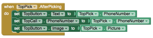
PhoneNumberPicker has two properties that are easy to confuse: Picture and Image. Picture is the picture associated with the contact that's picked. Image is the image of the PhoneNumberPicker component as it appears in the Designer and on the phone.
Enhancements
Here are some variations for you to try:
- Add a second button, BottomButton, and a second PhoneNumberPicker, so that your app gives you the choice of two numbers.
- Add a label with instructions on how to use the app.
- Show the name of the person being called in addition to the phone number. Use an extra label to show the additional information.
Using PicCall
You can package PicCall and download it to the phone so you can use it when you're not connected to the computer. But there's a big limitation: Every time you restart PicCall, it starts fresh and does not remember what you picked last time. Later, we'll see how to use the TinyDB component to create apps that can remember information from one time to the next. Such information is called persistent data.
Review
Here are the key ideas covered in this tutorial:
- You can name components by means of the Rename button.
- App Inventor has components that can use information stored on the phone. The PhoneNumberPicker can get phone numbers and pictures for your contacts, and PhoneCall can make calls.
Tip: The list that comes up when you run the phone number picker does not show the pictures associated with your contacts, on some Android systems. Even though the image isn't shown, the "Picture" property will still return a picture that will show up when you run the app, provided that the phone has a picture for that contact.
Scan the following barcode onto your phone to install and run the sample app.

Download Source Code
If you'd like to work with this sample in App Inventor, download the source code to your computer, then open App Inventor, click Projects, choose Import project (.aia) from my computer..., and select the source code you just downloaded.
Done with PicCall? Return to the other tutorials here.
Tutorial Version:
Tutorial Difficulty:
- Basic
Hello Codi!
Building your first app: HelloCodi
Now that you've set up your computer and device, and you've learned how the Designer and the Blocks Editor work, you are ready to build the HelloCodi app. At this point, you should have the Designer or Blocks Editor open in your browser, and either an Android device or an Android emulator connected to the Blocks Editor. (See Setup Instructions for App Inventor 2 if you do not have these things running.) Choose “Start a New Project” from the Projects menu and name it HelloCodi.
HelloCodi: tap the bee, hear the bee buzz!
HelloCodi is a simple app that you can build in a very short time. You create a button that has a picture of Codi the bee on it, and then program the button so that when it is clicked the phone will make a buzzing sound.
To build HelloCodi, you'll need an image file of Codi the bee. Download these files to your computer by clicking the following links. To download: after clicking a link, right click on the image and select "Save As." Save the file onto your desktop or downloads folder, or anywhere that you can easily find it later.
- Code picture: codi.jpg (Right-click and Save)
- Bee sound: Bee-Sound.mp3 (Right-click and Save)
Select components to design your app
The App Inventor Components are located on the left hand side of the Designer Window under the title Palette. Components are the basic elements you use to make apps on the Android phone. They're like the ingredients in a recipe. Some components are very simple, like a Label component, which just shows text on the screen, or a Button component (#1 left) that you tap to initiate an action.
Other components are more elaborate: a drawing Canvas that can hold still images or animations, an Accelerometer sensor that works like a Wii controller and detects when you move or shake the phone, components that send text messages, components that play music and video, components that get information from Web sites, and so on.
To use a component in your app, you need to click and drag it onto the viewer in the middle of the Designer. When you add a component to the Viewer (#1 below), it will also appear in the components list on the right hand side of the Viewer.
Components (#2 below) have adjustable properties. These properties change the way the component appears or behaves within the app. To view and change the Properties of a component (#3 below), you must first select the desired component in your list of components.
Steps for selecting components and setting properties
HelloCodi will have a Button component that displays the image of the bee you downloaded earlier. To accomplish this:
Step 1a. From the User Interface palette, drag and drop the Button component to Screen1 (#1).
Step 1b.To give the button the image of the bee, in the Properties pane, under Image, click on the text "None..." and click "Upload File..." (#2). A window will pop up to let you choose the image file. Click "Browse" and then navigate to the location of the codi.jpg file you downloaded earlier (#3). Click the codi.jpg file, click "Open", and then click "OK".
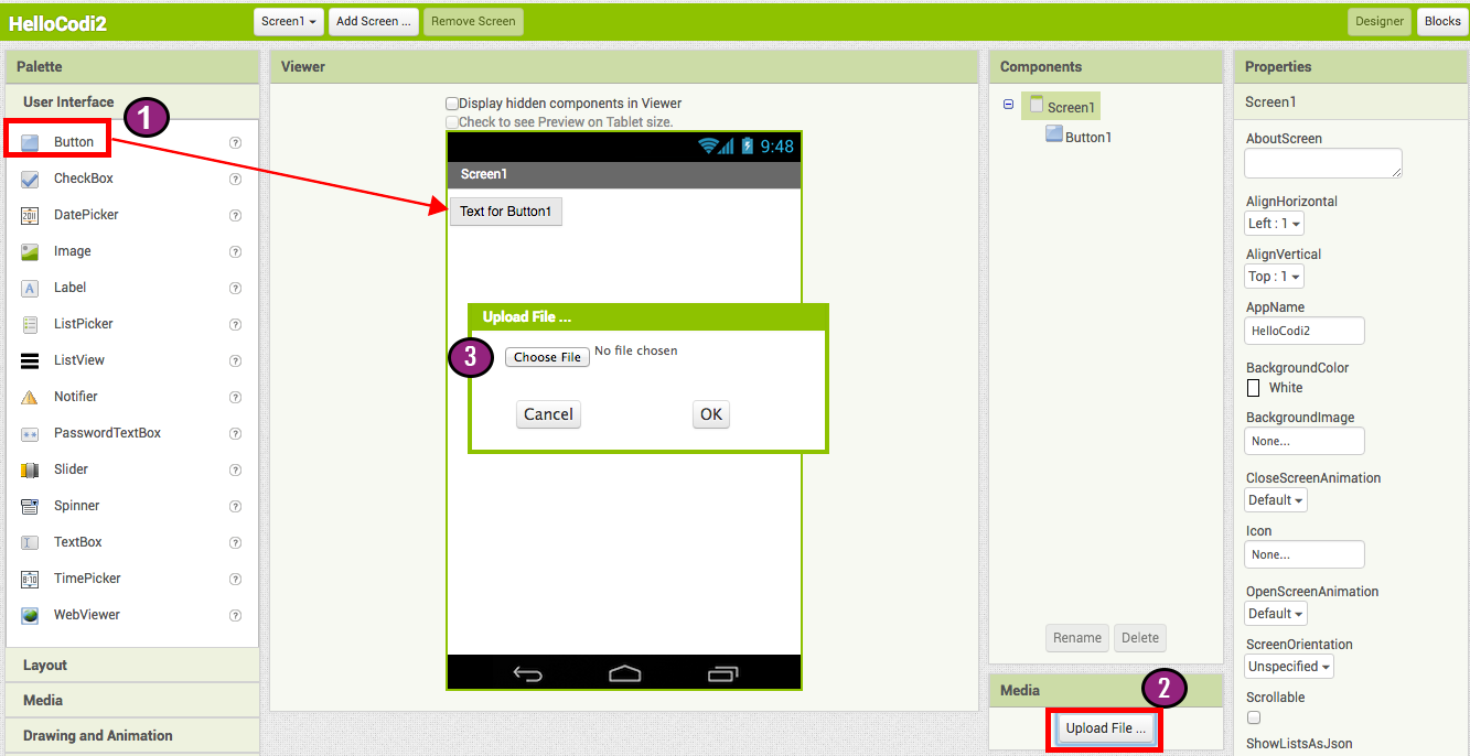
 Step 2. Change the Button's Text property:
Delete "Text for Button1", leaving the Button's text property blank so that there is no writing over the bee image.
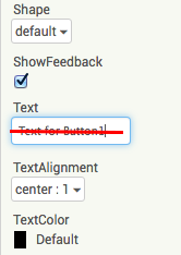
Step 3. From the User Interface palette, drag and drop the Label component to the Viewer (#1), placing it below the picture of the bee. It will appear under your list of components as Label1.
Under the Properties pane, change the
- (2) Text property of Label1 to read "Touch the Bee". You'll see the text change in the Designer and on your device.
- (3) FontSize to 30.
- (4) BackgroundColor of Label1 by clicking on the box. You can change it to any color you like.
- (5) TextColor to any color you like. (Note: if BackgroundColor and TextColor are the same, you will not be able to read your text!)
Here, the background color is set to aqua and the text color is set blue.
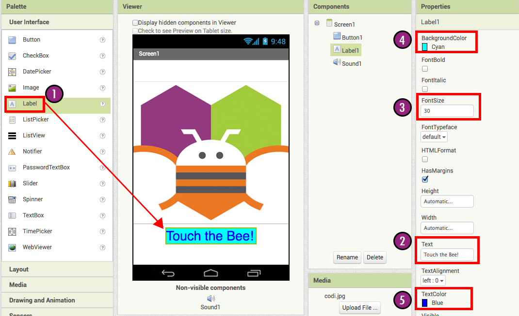
Step 4. Under Palette, click on the Media drawer and drag out a Sound component and place it in the Viewer (#1). Wherever you drop it, it will appear in the area at the bottom of the Viewer marked Non-visible components. Under the Media pane, Click Upload File... (#2) Browse to the location of the Bee-Sound.mp3 file that you downloaded earlier and upload it to this project (#3). Under the Properties pane, see that the Source property currently says None.... Click the word None... to change the Sound1 component's Source to Bee-Sound.mp3 (#4).
Programming with the Blocks Editor
So far you have been arranging your app's screen and components in the Designer, which is in a web browser window. To start programming the behavior of the app, you need to go to the Blocks Editor. Click the Blocks button in the upper right of your screen to go to the Blocks Editor.

Once you have the Blocks Editor in front of you, continue to the next step to start programming your app with blocks.
Playing the Sound
Step 1. On the left side of the Blocks Editor, click the Button1 drawer to open it. Drag and drop the Button1.Click block in the work area (the open area on the right).
Those mustard yellow blocks are called event handler blocks. The event handler blocks specifiy how the phone should respond to certain events: a button has been pressed, the phone is being shaken, the user is dragging her finger over a canvas, etc. when Button1.Click is an event handler.
Step 2a. Click the Sound1 drawer and drag the Sound1.Play block and connect it to the "do" section of the when Button1.Click block. The blocks connect together like puzzle pieces and you can hear a clicking sound when they connect.
The purple blocks are called command blocks, which are placed in the body of event handlers. When an event handler is executed, it runs the sequence of commands in its body. A command is a block that specifies an action to be performed (e.g., playing sound) when the event (e.g., pressing Button1) is triggered.
Your blocks should look like this at this point:
Now you can see that the command block is in the event handler. This set of blocks means; "when Button1 is clicked, Sound1 will play." The event handler is like a category of action (e.g., a button is being clicked), and the command specifies the type of action and the details of the action (e.g., playing a sound).
You can read more about the blocks and how they work here: Understanding Blocks in App Inventor 2.
Try It! When you click the button you should hear Codi buzz. Congratulations, your first app is running!
Note: there is a known issue with the Sound component on some devices. If you see an "OS Error" and the sound does not play - or is very delayed in playing, go back into the Designer and try using a Player component (found under Media) instead of the Sound component.
Packaging your app
While your device (emulator or phone/tablet) has been connected to App Inventor, your app has been running in real time on your device. If you disconnect the emulator/phone/tablet from the Blocks Editor, the app will vanish. You can always make it return by reconnecting the device. To have an app running without being connected to App Inventor, you must "package" the app to produce an application package (apk file).
To "package" the app to your phone or to send to someone else, click the Build tab at the top of the screen. Under Build, here are two options available for you to choose from:
1. App (provide QR code): You can generate a Barcode (a QR Code), which you can use to install the app on a phone or tablet that has a camera, with the aid of a barcode scanner, like the ZXing barcode scanner (freely available in Google Play).
Note: this barcode works only for your own device because it is associated with your Google account. If you want to share your app with others via barcode, you'll need to download the .apk file to your computer and use a third-party software to convert the file into a barcode. More information can be found here.
2. App (save to my computer): You can download the app to your computer as an apk file, which you can distribute and share as you like by manually installing it on other devices. (sometimes called "side loading".
Review
Here are the key ideas covered so far:
- You build apps by selecting components (ingredients) and then telling them what to do and when to do it.
- You use the Designer to select components and set each component's properties. Some components are visible and some aren't.
- You can add media (sounds and images) to apps by uploading them from your computer.
- You use the Blocks Editor to assemble blocks that define the components' behavior
- when ... do ... blocks define event handlers, that tell components what to do when something happens.
- call ... blocks tell components to do things.
Scan the Sample App to your Phone
Scan the following barcode onto your phone to install and run the sample app.

Download Source Code
If you'd like to work with this sample in App Inventor, download the source code to your computer, then open App Inventor, click Projects, choose Import project (.aia) from my computer..., and select the source code you just downloaded.
Next steps
Now that you know the basics of how App Inventor works we recommend you:
- Complete additional Tutorials.
- Review the User Guide for App Inventor 2.
- Join the User Discussion Forum.
- Read the guide to Understanding Blocks.
- Or, if you've been using the emulator and want to start using your phone, you can set up your Android device to build apps.
Something not working right? Visit the troubleshooting page, or check the App Inventor User Forum for help.
Tutorial Version:
Tutorial Difficulty:
- Basic
Get the Gold for App Inventor 2
What You're Building
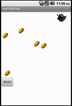
By building the Get The Gold App you will get practice with setting visibility, using Clock components and Timers, and detecting collisions in App Inventor. You'll program an application that has a pirate ship whose goal is to collect all the gold on the screen.
Getting Started
Connect to the App Inventor web site and start a new project. Name it GetTheGold, and also set the screen's Title to "GetTheGold". Switch to the Blocks view and connect to a device or emulator.
Introduction
This tutorial introduces the following skills, useful for future game development:
- Using the Clock component
- Using Clock.Timer to move sprites
- Using Sprite.Flung to move a sprite
- Using collision detection
Getting Ready
For this game, you will have two types of imagesprites: pirate and gold coin. Click below to download the image file for your sprites.


Set up the Components
Use the component designer to create the interface for GetTheGold. When you finish, it should look something like the snapshot below (more detailed instructions below the snapshot).
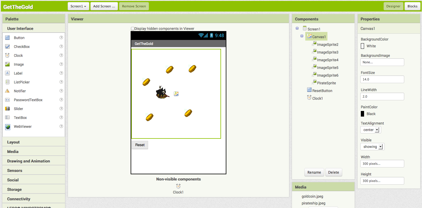
To create this interface, put the following components into the Designer by dragging them from the Component Palette into the Viewer.
| Component Type | Palette Group | What you'll name it | Purpose of Component |
| Canvas | Drawing and Animation | Canvas1 | The background that we will be putting our imagesprites on |
| ImageSprite | Drawing and Animation | PirateSprite | The pirate ship in our game |
| ImageSprite | Drawing and Animation | ImageSprite2 | One of the gold coins in the game |
| ImageSprite | Drawing and Animation | ImageSprite3 | One of the gold coins in the game |
| ImageSprite | Drawing and Animation | ImageSprite4 | One of the gold coins in the game |
| ImageSprite | Drawing and Animation | ImageSprite5 | One of the gold coins in the game |
| ImageSprite | Drawing and Animation | ImageSprite6 | One of the gold coins in the game |
| Clock | User Interface | Clock1 | We use the Clock for its Timer method to move the coins |
| Button | User Interface | ResetButton | To reset the game so the player can play again |
Set the properties of the components as described below:
| Component | Action | |
| ResetButton | Change Text property to "Reset". | |
| PirateSprite | Change Speed property to 6. | Upload the pirateship image and set Picture property to pirateship. |
| ImageSprite(2,3,4,5,6) | Upload the goldcoin image and set Picture property to goldcoin. | |
| Clock | Change TimerInterval property to 2000. |
Moving the Pirate
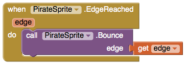
To move the PirateSprite, we want the user to be able to "fling" the sprite in the direction that they choose. To do this, we will use the PirateSprite.Flung event handler.
You may notice that PirateSprite.Flung takes in 6 attributes: x, y, xvel, yvel, speed, and heading. We want to reassign PirateSprite's current heading to the heading given to us from PirateSprite.Flung. This means that the user can now control the direction of the pirate ship with their fingers by flinging on the screen.
To prevent the pirate from moving off the screen, we will also use PirateSprite.Bounce when an edge is reached.
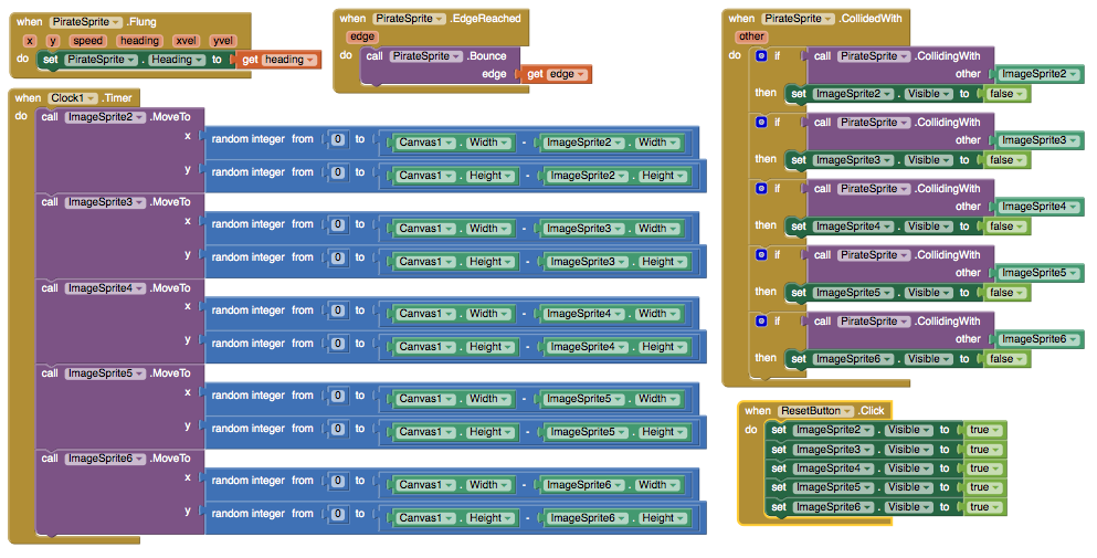
Moving the Coins
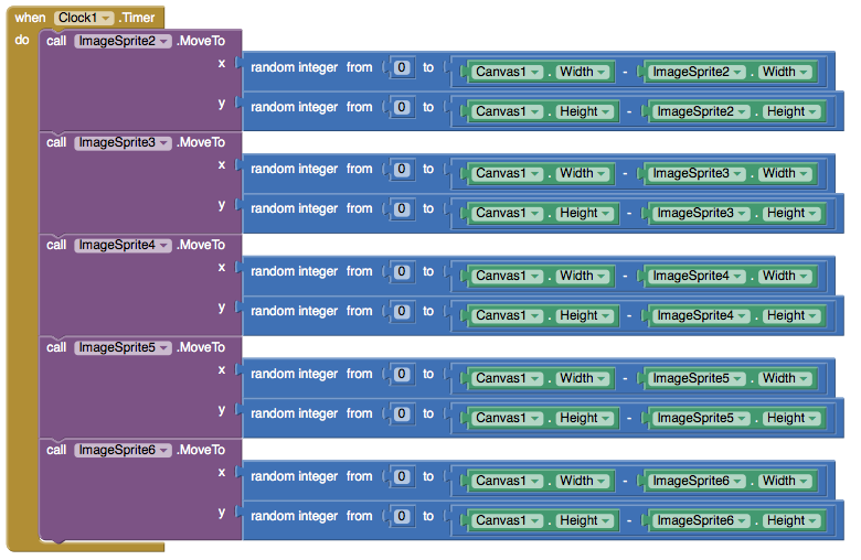
We want the coins to move to random positions on the screen. We will use Clock1.Timer and the ImageSprite's MoveTo method to do this.
When the Clock1.Timer goes off, we want all of our gold coin ImageSprites to move to a new random location on the Canvas. We will do this by using the Sprite.MoveTo block.
MoveTo takes in two arguments: the x and y coordinates on the canvas of the new position we want the sprite to move to. We want the Sprite to move to a new random location so we will use the random integer block found in the Math box. Since we want each Gold ImageSprite to move to a new location, we repeat this process for each sprite's MoveTo function.
For ImageSprite2, we want x to be a random integer from 0 to Canvas1.Width-ImageSprite2.Width and y to be a random integer from 0 to Canvas1.Height-ImageSprite2.Height. This is to be repeated for all the Gold Image Sprites.
Remember that sprites are measured at the upper left corner as (0,0) so if we don't want them to go off the screen, we need to take the sprite's height/width into account when setting the range for our random numbers.
We will do this by setting up our blocks as in the image below:
Detecting Collisions
App Inventor detects collisions by checking for an intersection between the bounding rectangles of each ImageSprite. We call this rectangle-based collision detection. As you can see in the image below, sprites with circular or polygon shape will appear to collide because of the rectangular bounds around them when they might not actually be colliding.
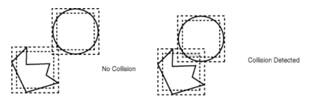
We can use the PirateSprite.CollidedWith event handler to detect whenever the pirate ship collides with another sprite or gold coin. You may notice that PirateSprite.CollidedWith takes in an argument. This argument is the object that PirateSprite just collided with. We will be testing inside the handler for which object so the name of this argument is not significant. You can name it other.
Whenever the pirate collides with a gold coin, we want the coin to disappear. We can do this by setting the coin's visibility to false. To find which coin the pirate collided with, we will use the PirateSprite.CollidingWith.
We can use PirateSprite.CollidingWith to take in a component (each of the gold coin sprites) to detect which sprite was hit. This is a component block and NOT a text block with the words ImageSprite inside. The component block can be found in the drawer for each component. If a sprite was hit, we will set its visibility to false.
Reset Button
After the user hits all of the gold sprites with the pirate ship, none of them will be visible. The reset button should set all of the gold sprites' visibility to true.

Complete Program
Here's the complete GetTheGold program.
Package the final version of the app by choosing Package For Phone | Barcode from the Component Designer menu. When the barcode appears, use the barcode scanner on your phone to download and install the app.
Variations
Once you get this program running, you may want to do the following additional features to extend it. For example,
- Create a label to display the time that it took you to get all the gold
- Change the speed of the ship or gold coins
- Add an enemy sprite that when collided with, causes your pirate to lose speed
- Use one of the phone's sensors to control movement of the pirate ship
Scan the Sample App to your Phone
Scan the following barcode onto your phone to install and run the sample app.

Download Source Code
If you'd like to work with this sample in App Inventor, download the source code to your computer, then open App Inventor, click Projects, choose Import project (.aia) from my computer..., and select the source code you just downloaded.
Done with GetTheGold? Return to to the other App Inventor 2 tutorials here.
Tutorial Version:
Tutorial Difficulty:
- Intermediate
Tutorial Type:
- Sprites
- Clock Timer
- Game
Paint Pot Extended with Camera (AI2)
This version of Paintpot allows you to draw circles and lines on a picture you take with your camera. You'll learn about the Canvas component, drawing, color, and the Camera component
Note: This tutorial will open a new window and take you off of MIT's App Inventor site, bringing you over to our partner site at AppInventor.org.
Go to Paint Pot Extended now
Tutorial Version:
Tutorial Difficulty:
- Intermediate
Tutorial Type:
- Drawing Canvas
- Camera
Mole Mash 2 with Sprite Layering for App Inventor 2
What You're Building
This tutorial shows you how to build a game similar to the Whac-A-MoleTM arcade game. Specifically, your goal is to tap a mole that randomly pops out of one of five fixed holes. Every time you succeed, your score is increased by one point.
In order to highlight new App Inventor features — the Advanced tab and Sprite Z-layering — this app takes a different approach than the original Mole Mash tutorial, which you do not need to have completed in order to do this one. You should, however, be familiar with the basics of App Inventor — using the Component Designer to build a user interface and using the Blocks Editor to specify event handlers. If you are not familiar with the basics, try stepping through some of the basic tutorials before continuing.
Introduction
This tutorial includes:
- Creating a list of components
- Using functionality from the Advanced section of the Blocks Editor to get and set properties of arbitrary components
- Having game events controlled by the Clock component
- Using Sprite Z-layering to ensure that one sprite (ImageSprite or Ball) appears in front of another
Getting Started
Connect to the App Inventor web site and start a new project. Set the screen's Title property to an appropriate name, such as "Mole Mash". Open the Blocks Editor and connect it to the phone. Download these image files (created by Yun Miao) by right-clicking on them, then add them to the project by pressing the "Add..." button in the Media pane.


Set up the Components
The user interface will contain a total of 6 ImageSprites: 5 unmoving holes and 1 mole, which will move on top of the holes. Use the component designer to create the user interface. When you are done, it should look something like the picture below. Don't worry about lining up the holes evenly. You will specify their locations through their X and Y properties. Additional instructions are below the picture.
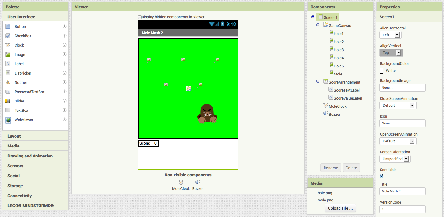
Create the following components by dragging them from the Palette into the Viewer.
| Component Type | Palette Group | What you'll name it | Purpose of Component |
| Canvas | Drawing and Animation | GameCanvas | The game field |
| ImageSprite (5) | Drawing and Animation | Hole1 ... Hole5 | Holes from which the mole can appear |
| ImageSprite | Drawing and Animation | Mole | The mole |
| HorizontalArrangement | Layout | ScoreArrangement | To display the score |
| Label | User Interface | ScoreTextLabel | To hold "Score: " |
| Label | User Interface | ScoreValueLabel | To hold the score (# of times the mole was hit) |
| Clock | User Interface | MoleClock | To control the mole's movement |
| Sound | Media | Buzzer | To vibrate when the mole is touched |
Make the following changes to the components' properties:
| Component | Action |
| Canvas1 | Set BackgroundColor to Green. Set Width to 320 pixels. Set Height to 320 pixels. |
| Hole1 | Set X to 20 and Y to 60 (upper left). |
| Hole2 | Set X to 130 and Y to 60 (upper center). |
| Hole3 | Set X to 240 and Y to 60 (upper right) |
| Hole4 | Set X to 75 and Y to 140 (lower left). |
| Hole5 | Set X to 185 and Y to 140 (lower right). |
| Mole | Set Picture to "mole.png". Set Z to 2 so the mole appears in front of the other ImageSprite s, which have the default Z value of 1. |
| ScoreTextLabel | Set Text to "Score: ". |
| ScoreTextValue | Set Text to "0". |
Don't worry now about setting the Picture property for the holes; we'll set the property in the Blocks Editor.
Add Behaviors to the Components
Here is an overview of what we need to create blocks to do:
- Create global variable:
- holes: a list of holes
- When the app starts:
- Populate the list of holes.
- Set each hole's Picture property to "hole.png".
- Call procedure MoveMole (below).
- Create a procedure MoveMole to:
- Set local variable currentHole to a random hole from the list holes.
- Move the mole to the location of currentHole.
- Make MoleClock call MoveMole whenever its timer goes off (every second).
- Implement a handler that does the following when the mole is touched:
- Add one to the score.
- Make the phone briefly vibrate.
- Call MoveMole.
To proceed, switch to the Blocks Editor.
Creating Variables
Create the variable holes. For now, we will give it a "dummy" initial value of an empty list; we'll set the real initial value in the Screen1.Initialize event handler, which gets executed each time the app loads the screen. (For technical reasons, components cannot be referred to in variable initialize blocks, which are run before the app has started.) Here is a picture and list of the blocks you will need:
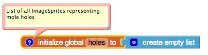
| Block type | Drawer | Purpose |
| initialize global holes to | Variables | Hold a list of holes. |
| create empty list | Lists | Create an empty list, to be filled in when the program starts. |
As always, comments (created by right-clicking on a block) are encouraged but not required.
Starting the App
The first event to occur in any program in Screen1.Initialize, so we will put start-up code in that handler. Specifically, we will add the hole components to the list holes, set each hole's Picture property to "hole.png", and call MoveMole. Since we have not yet written MoveMole, we will create an empty procedure with that name, which we will fill in later.
Below are a picture and table of the blocks you need to create. Note that the "Any ImageSprite" drawer is found under the "Any component" tab at the bottom of the list of Blocks in the Blocks Editor.
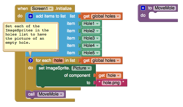
| Block type | Drawer | Purpose |
| Screen1.Initialize | Screen1 | Specify what should happen when the app starts. |
| add items to list | Lists | Add the following values to... |
| get global holes | Variables | ...the list of holes: |
| Hole1 | Hole1 | -the upper left hole |
| Hole2 | Hole2 | -the upper center hole |
| Hole3 | Hole3 | -the upper right hole |
| Hole4 | Hole4 | -the lower left hole |
| Hole5 | Hole5 | -the lower right hole |
| for each hole in list | Control | Specify that we would like a variable named "hole".... |
| get global holes | Variables | ...to take on each of the values in the list holes . |
| set ImageSprite.Picture of component ... to | Any ImageSprite | Set the Picture property of... |
| get global hole | Variables | ...the ImageSprite referred to by the variable hole ... |
| " " (hole.png) | Text | ...to the picture of the empty hole. |
| to procedure (MoveMole) | Procedures | Create an procedure, to be filled in later, for moving the mole. |
| call MoveMole | Procedures | Call MoveMole to make the first placement of the mole. |
Compare the for each block to the equivalent blocks that would be necessary without it:
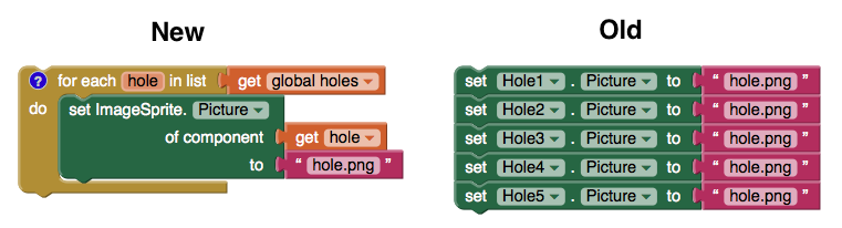
Not only is the left set of blocks shorter, it is less repetitious, sparing the programmer from semi-mindless copy-and-pasting and making it easier to modify, for example, if the name of the picture is changed.
Moving the Mole
Now let's fill in the body of the procedure MoveMole, which we'll call when the program starts, when the mole gets touched, and when our timer goes off every second. What we want it to do is to pick a random hole and move the mole on top of it. Here are a picture and list of the new blocks:
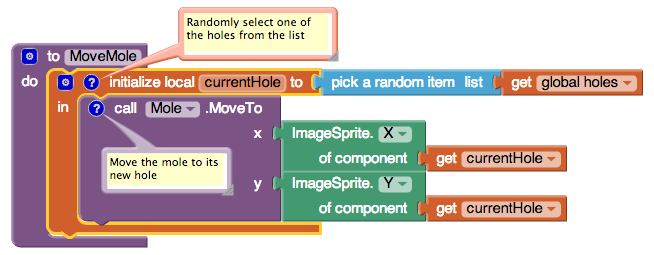
| Block type | Drawer | Purpose |
| initialize local currentHole to (there are two types of 'initialize local': take the one that fits the procedure block) |
Variables | Save the... |
| pick a random item | Lists | ...randomly selected... |
| get global holes | Variables | ...hole. |
| call Mole.MoveTo | Mole | Move the mole to the... |
| ImageSprite.X | Any ImageSprite | ..x-coordinate of... |
| get local currentHole | Variables | ...the chosen hole... |
| ImageSprite.Y | Any ImageSprite | ...and the y-coordinate of... |
| get local currentHole | Variables | ...the chosen hole. |
We now need to specify that MoveMole should be called whenever MoleClock's Timer goes off. We just need two blocks to accomplish that:
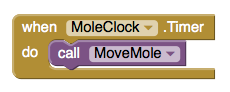
| Block type | Drawer | Purpose |
| MoleClock.Timer | MoleClock | When the timer goes off... |
| call MoveMole | Procedures | ...move the mole. |
Registering Touches
Finally, we need to specify what happens when the mole is touched. Specifically, we want to:
- Increment the score.
- Make the phone vibrate briefly.
- Move the mole.
We can easily translate these to blocks:
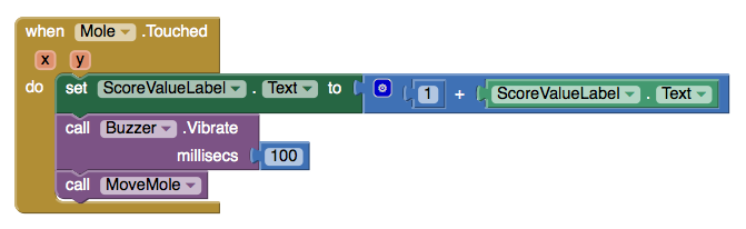
| Block type | Drawer | Purpose |
| Mole.Touched | Mole | When the mole is touched... |
| set ScoreValueLabel.Text to | ScoreValueLabel | ...update the visible score to... |
| + | Math | ...the result of adding... |
| 1 | Math | ...1 [and]... |
| ScoreValueLabel.Text | ScoreValueLabel | ...the previous score. |
| call Buzzer.Vibrate | Buzzer | Make the phone vibrate for... |
| 100 | Math | ...100 milliseconds. |
| call MoveMole | Procedures | Move the mole to a new location. |
Final Program
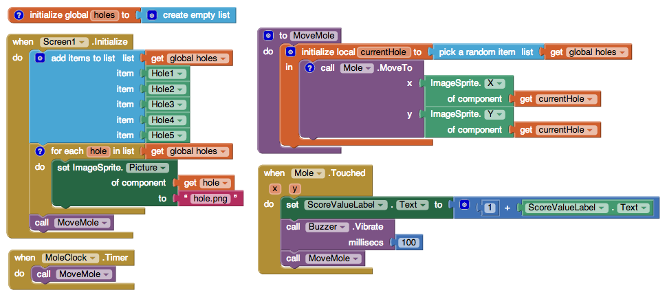
Variations
Here are some variations you might want to implement:
- Adding a Reset button to set the score back to 0.
- Having the score depend not just on the number of hits but also the number of misses and escaped moles.
- Increasing the speed of the game of mole movement if the player is doing well and decreasing it if the player is doing poorly.
- Adding a second mole on a different timer.
You can see how to implement the first two variations in the original Mole Mash tutorial.
Review
Here are some of the ideas covered in this tutorial:
- Putting components in a List.
- Performing an operation on every component in a List using the for each block and Advanced features.
- Placing an ImageSprite on top of another, using their Z properties to control which goes in front.
- Using the Clock component to control game play.
- Creating a procedure and calling it from multiple places.
Looking for more information about Mole Mash? Check out the Book Chapter for more explanation and background information.
Done with MoleMash 2? Return to the other tutorials here.
Scan the Sample App to your Phone
Scan the following barcode onto your phone to install and run the sample app.

Download Source Code
If you'd like to work with this sample in App Inventor, download the source code to your computer, then open App Inventor, click Projects, choose Import project (.aia) from my computer..., and select the source code you just downloaded.
Tutorial Version:
Tutorial Difficulty:
- Intermediate
Tutorial Type:
- Sprites
- Clock Timer
- Game
VideoWall for App Inventor 2
What you're building
The VideoWall app tutorial demonstrates how you can control the size of a video playing in an app by using the Video Player component's Width, Height, and FullScreen features. The VideoWall uses media assets (videos stored in the app itself), but you can use the app to display videos from the internet as well.
This tutorial assumes you are familiar with the basics of App Inventor-- using the Component Designer to build a user interface, and using the Blocks Editor to specify the app's behavior. If you are not familiar with the basics, try stepping through some of the basic tutorials before continuing.
Getting Started
Connect to the App Inventor web site and start a new project. Name the new project VideoWall and set the screen's Orientation to Landscape.
Download the following video files* for use later on (right click and choose "Save Link As..."):
*Attributions for these videos are included at the end of this tutorial.
Introduction
The finished VideoWall app will display a wall of three videos that can be expanded to their true size and then shrunk back down again. The app will also allow you to display the videos in fullscreen. This tutorial assumes you have followed earlier tutorials to learn how the following blocks work:
- Variables
- Procedures
- Button.Click blocks
- Control (if-else) blocks
This tutorial introduces the following:
- Resizing the VideoPlayer
- Showing the VideoPlayer video in fullscreen mode
Set up the Components
Use the component designer to create the interface for the VideoWall. When completed, the designer should look similar to the snapshot below.
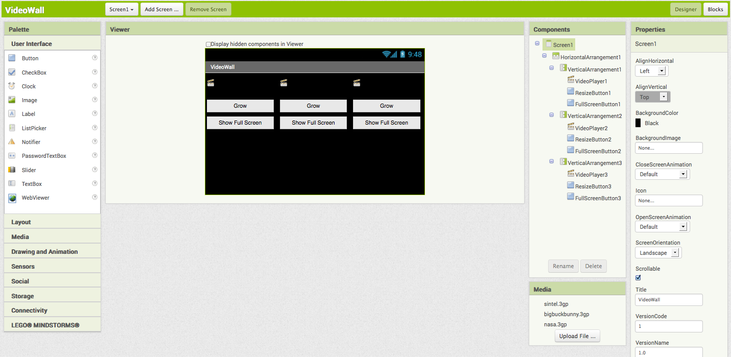
First, you need to upload the video files. Click on the Upload File... button and select a video file downloaded earlier. Repeat this step to add the other two video files.
In the properties of Screen1, set the BackgroundColor to Black, the ScreenOrientation to Landscape, and the Title to VideoWall. Now create the interface by dragging and dropping the components from the Palette to the Viewer.
| Component Type | Palette Group | What you'll name it | Purpose of Component | Action |
| HorizontalArrangement | Layout | HorizontalArrangement1 | Holds all other components: makes the three vertical arrangements line up side by side | Set Width to Fill parent... |
| VerticalArrangement | Layout | VerticalArrangement1 | Holds the left-most VideoPlayer and controls (VideoPlayer1, ResizeButton1, and FullScreenButton1) | Set Width to Fill parent... |
| VerticalArrangement | Layout | VerticalArrangement2 | Holds the middle VideoPlayer and controls (VideoPlayer2, ResizeButton2, and FullScreenButton2) | Set Width to Fill parent... |
| VerticalArrangement | Layout | VerticalArrangement3 | Holds the right-most VideoPlayer and controls (VideoPlayer3, ResizeButton3, and FullScreenButton3) | Set Width to Fill parent... |
| VideoPlayer | Media | VideoPlayer1 | Displays the BigBuckBunny video | Set Source to bigbuckbunny.3gp , set Width to Fill parent... , and set Height to 36 pixels |
| VideoPlayer | Media | VideoPlayer2 | Displays the NASA video | Set Source to nasa.3gp , set Width to Fill parent... , and set Height to 36 pixels |
| VideoPlayer | Media | VideoPlayer3 | Displays the Sintel video | Set Source to sintel.3gp , set Width to Fill parent... , and set Height to 36 pixels |
| Button | User Interface | ResizeButton1 | Resizes VideoPlayer1 | Set Text to "Grow" and set Width to Fill parent... |
| Button | User Interface | ResizeButton2 | Resizes VideoPlayer2 | Set Text to "Grow" and set Width to Fill parent... |
| Button | User Interface | ResizeButton3 | Resizes VideoPlayer3 | Set Text to "Grow" and set Width to Fill parent... |
| Button | User Interface | FullScreenButton1 | Shows the VideoPlayer1 video in fullscreen | Set Text to "Show Full Screen" and set Width to Fill parent... |
| Button | User Interface | FullScreenButton2 | Shows the VideoPlayer2 video in fullscreen | Set Text to "Show Full Screen" and set Width to Fill parent... |
| Button | User Interface | FullScreenButton3 | Shows the VideoPlayer3 video in fullscreen | Set Text to "Show Full Screen" and set Width to Fill parent... |
Add Behaviors to the Components
The interface is complete, but the buttons don't resize the videos yet. Open the Blocks Editor to add the behavior to the buttons. First, you'll define three variable blocks to keep track of the size of the VideoPlayers:
| Block Type | Drawer | Purpose |
| initialize global name to | Variables | Defines the vid1_zoomed variable (rename it) |
| initialize global name to | Variables | Defines the vid2_zoomed variable (rename it) |
| initialize global name to | Variables | Defines the vid3_zoomed variable (rename it) |
The three variables should like this:
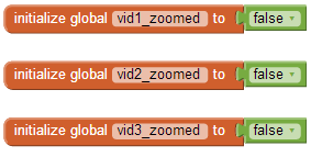
Create the resizeVideoPlayer Procedure block. There are three VideoPlayers in the app, but you'll use one Procedure block to resize all three. To accomplish this simplicity, you will use the Any Component blocks component Any VideoPlayer blocks. To find the Any VideoPlayer drawer, scroll to the bottom of the block drawers on the left of your screen. Next to Any Component, click on the + sign and scroll down further to find the Any VideoPlayer drawer. Create the resizeVideoPlayer Procedure block using the following blocks:
| Block Type | Drawer | Purpose |
| Procedure | Procedures | Defines the resizeVideoPlayer procedure. Use the mutator ability of the procedure to add three arguments: x, x2, x3. (Change the names of these arguments to VideoPlayer, zoomed, and button.) |
| if then | Control | Defines the block that chooses whether the VideoPlayer is shrunk or expanded. Use the mutator to add in an else statement. |
| = block | Logic | Defines the equals block for testing if the zoomed block is true |
| true | Logic | Defines the block that zoomed is compared to |
| set VideoPlayer.Width (x2) | Any VideoPlayer | Sets the VideoPlayer Width to a number |
| 0 (x2), change to -1 | Math | Width to set VideoPlayer to |
| set VideoPlayer.Height (x2) | Any VideoPlayer | Sets the VideoPlayer Height to a number |
| 0 (x2), change to 36 and 144 | Math | Height to set VideoPlayer to |
| set Button.text | Any Button | Changes the button text |
| " " (x2) | Text | Text to set button to. Make one text block text's Shrink and the other's Grow. |
The resizeVideoPlayer block should look like the following:
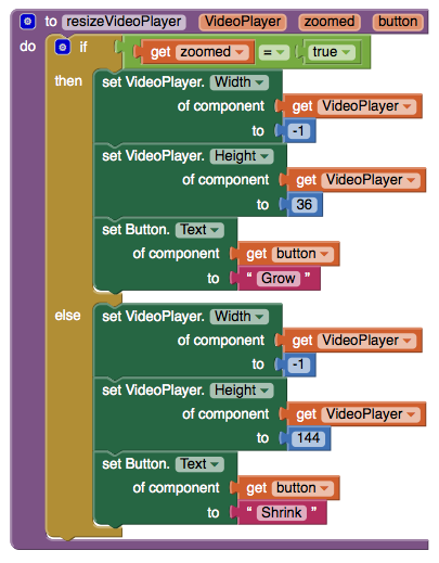
The resizeVideoPlayer block will be explained later after you create the blocks for responding to button clicks.
Create the Click Blocks
The blocks you will create respond to clicks on the ResizeButton buttons. To build the three blocks, you will need the following blocks:
| Block Type | Drawer | Purpose |
| ResizeButton1.Click | ResizeButton1 | Defines the block for responding to clicks on ResizeButton1 |
| ResizeButton2.Click | ResizeButton2 | Defines the block for responding to clicks on ResizeButton2 |
| ResizeButton3.Click | ResizeButton3 | Defines the block for responding to clicks on ResizeButton3 |
| resizeVideoPlayer (x3) | Procedures | Starts the resizeVideoPlayer block for resizing a VideoPlayer |
| not (x3) | Logic | Defines the block for switching the various zoomed block values |
| set global vid1_zoomed | Variables | Sets the vid1_zoomed block to a different value |
| set global vid2_zoomed | Variables | Sets the vid2_zoomed block to a different value |
| set global vid3_zoomed | Variables | Sets the vid3_zoomed block to a different value |
| get global vid1_zoomed (x2) | Variables | Used to change the vid1_zoomed value. |
| get global vid2_zoomed (x2) | Variables | Used to change the vid2_zoomed value. |
| get global vid3_zoomed (x2) | Variables | Used to change the vid3_zoomed value. |
| ResizeButton1 | ResizeButton1 | Passed to the resizeVideoPlayer procedure |
| ResizeButton2 | ResizeButton2 | Passed to the resizeVideoPlayer procedure |
| ResizeButton3 | ResizeButton3 | Passed to the resizeVideoPlayer procedure |
| VideoPlayer1 | VideoPlayer1 | Passed to the resizeVideoPlayer procedure |
| VideoPlayer2 | VideoPlayer2 | Passed to the resizeVideoPlayer procedure |
| VideoPlayer3 | VideoPlayer3 | Passed to the resizeVideoPlayer procedure |
The blocks should look like the following:
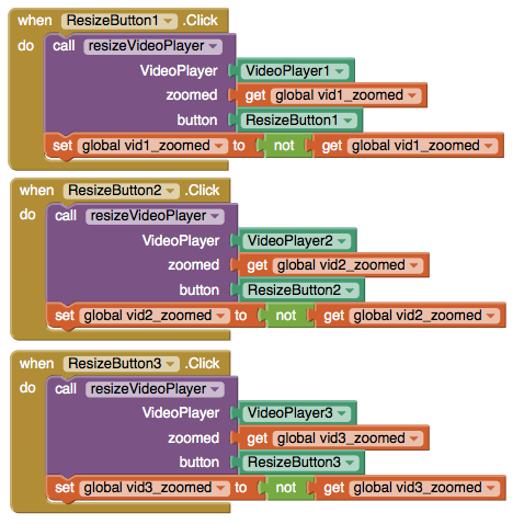
Most blocks in App Inventor require you to know exactly what component your app will manipulate when you design the app. For some apps, you will have several of the same type of component and you want to program the same behavior for all of the similar components (like the VideoPlayer blocks in this app). The blocks in the Any component section allow you to build some general manipulation on some type of component. When you built the resizeVideoPlayer procedure block, you didn't know specifically which VideoPlayer would be used in the procedure. The resizeVideoPlayer works on VideoPlayers; but not until the resizeVideoPlayer block is used in the ResizeButton1.Click block (for example) is the specific VideoPlayer known.
Note: The VideoWall app could have been designed with a specific resizing procedure for each VideoPlayer. By using the Advanced blocks in a single resizing procedure, the app is much simpler.
How the Blocks Work
Setting the Width and Height property for a VideoPlayer works exactly the same way as setting the Width and Height of a Button. For whatever positive number is set, the video playing will resize its appearance to fit that value. There are two values that are exceptions to the using positive values rule: -1 and -2. Setting VideoPlayer.Width or VideoPlayer.Height to -1 is like setting the Width or Height to Fill parent in the designer. Setting VideoPlayer.Width or VideoPlayer.Height to -2 is like setting the Width or Height to Automatic in the designer.
Warning: You can set the VideoPlayer Width and Height to any positive number you want. The VideoPlayer will change its size to match the values you set; but on some devices, the VideoPlayer does not change its size correctly. The behavior on such devices is usually unpredictable.
Test this behavior. Click on the Grow button below the BigBuckBunny video. The video's size should expand, and the text of the button should change to "Shrink". Click on the Shrink button below the BigBuckBunny video. The video's size should shrink back to its original size and the text should change back to "Grow".
Create the blocks for showing fullscreen video
You will now add the blocks for showing the videos in fullscreen mode. Use the following blocks:
| Block Type | Drawer | Purpose |
| true (x3) | Logic | Value to set FullScreen as |
| FullScreenButton1.Click | FullScreenButton1 | Responds to clicks on FullScreenButton1 |
| set VideoPlayer1.FullScreen | VideoPlayer1 | Used to show fullscreen video |
| FullScreenButton2.Click | FullScreenButton2 | Responds to clicks on FullScreenButton2 |
| set VideoPlayer2.FullScreen | VideoPlayer2 | Used to show fullscreen video |
| FullScreenButton3.Click | FullScreenButton3 | Responds to clicks on FullScreenButton3 |
| set VideoPlayer3.FullScreen | VideoPlayer3 | Used to show fullscreen video |
The blocks should look like the following:
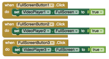
How the Blocks Work
The VideoPlayer.FullScreen block takes a true/false value (also called a boolean) to tell it whether to go full screen or not. Setting a VideoPlayer.FullScreen block to true causes that VideoPlayer to be displayed in fullscreen mode. If there is another VideoPlayer in fullscreen mode, that VideoPlayer's .FullScreen value is set to false and it is replaced with the current VideoPlayer. If a VideoPlayer.FullScreen is true, setting a VideoPlayer.FullScreen block to false causes the fullscreen mode to be exited and the app's interface to display. Test this behavior. Start playing the BigBuckVideo, and click on the Show FullScreen button below the BigBuckBunny video. The app's interface should disappear and some media controls with the BigBuckBunny video should appear. Use the Back button on your device or the emulator to exit fullscreen. The app's interface should appear.
Final Program
VideoWall Final Version
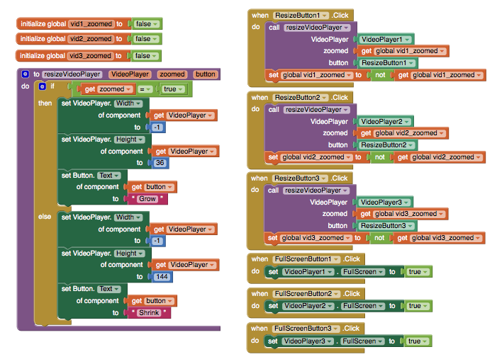
Package the final version of the app by choosing Build | App (provide QR code for .apk) from the Component Designer menu. When the barcode appears, use the barcode scanner on your phone to download and install the app. For more information on sharing and packaging apps, click here.
Variations
Now that you have finished the first VideoWall app, you might want to build some variations. For example:
- Get more video files and add a second row to create a real VideoWall
- Use videos from an online server.
- Expand the resizeVideoPlayer procedure to resize VideoPlayers by small increments to create an animation effect. You could use multiple Clocks to start the resizeVideoPlayer procedure and animate multiple VideoPlayers at once.
If you distribute your app to others, make sure you respect any license requirements for the videos you use.
Below are the attributions to the video files included in this demo app. The creators of the source videos that these clips are from do not endorse App Inventor.
| Video File | Information | Attribution |
| bigbuckbunny.3gp | A clip from the full length film | (c) copyright 2008, Blender Foundation / http://www.bigbuckbunny.org |
| nasa.3gp | A formatted version of the Mars' Whirling Dust Devil clip. | Here is the original video. |
| sintel.3gp | A clip from the full length film | (c) copyright Blender Foundation | http://durian.blender.org |
Scan the Sample App to your Phone
Scan the following barcode onto your phone to install and run the sample app.

Download Source Code
If you'd like to work with this sample in App Inventor, download the source code to your computer, then open App Inventor, click Projects, choose Import project (.aia) from my computer..., and select the source code you just downloaded.
MIT is grateful to Vance Turnewitsch for developing this tutorial.

Done with VideoWall? Return to the other App Inventor 2 tutorials here.
Tutorial Version:
Tutorial Difficulty:
- Intermediate
Tutorial Type:
- Video
StockQuotes for App Inventor 2
StockQuotes
What You're Building
Just like you can access web pages from your phone -- for example, to look up a stock price -- so can App Inventor. This app enables the user to enter a stock symbol, then looks up the price of the stock on Yahoo! Finance and displays the price on the phone.
This tutorial assumes that you are familiar with the basics of App Inventor -- using the Component Designer to build a user interface and using the Blocks Editor to specify event handlers. If you are not familiar with the basics, try stepping through some of the basic tutorials before continuing.
Introduction
This tutorial includes
- Accepting text input from the user to specify the stock symbol.
- Using the Web component to ask Yahoo! Finance for the latest price for the stock.
- Displaying the result.
Getting Started
Connect to the App Inventor web site and start a new project. Name it StockQuotes, and also set the screen’s Title to “Stock Quotes”. Open the Blocks Editor and connect it to the phone.
Set up the Components
Use the component designer to create the user interface. When you are done, it should look something like the picture below. Additional instructions are below the picture.

Create the following components by dragging them from the Palette into the Viewer.
| Component Type | Palette Group | What you'll name it | Purpose of Component |
| TextBox | User Interface | StockSymbolTextBox | Where the user enters the stock symbol |
| Button | User Interface | GetQuoteButton | To request the stock quote |
| Label | User Interface | ValueLabel | To display the stock quote |
| Web | Connectivity | Web1 | To request and receive the stock quote |
Stick with the default properties except for the following changes:
| Component | Action |
| StockSymbolTextBox | Set its Hint property to "Enter a stock symbol". |
| GetQuoteButton | Set its Text property to "Get Stock Quote". |
| ValueLabel | Clear its Text property. |
The Yahoo! Finance API
Many web services provide an application programmer interface (API) for developers to enable their programs to access the service. Some ways to discover APIs are through the website http://programmableweb.com or just by doing a web search for the service name and “API”.
For example, you can use the Yahoo! Finance API to get the latest price for the stock with the symbol "GOOG", for example, with the URL http://download.finance.yahoo.com/d/quotes.csv?f=nl1c1&e=.csv&s=GOOG . The section "f=l1" (lower-case letter L, followed by the number 1) says we would like the latest price, and the section “s=GOOG” says we would like information about the stock whose symbol is “GOOG”. The result is returned in comma-separated value (CSV) format, which you may be familiar with from spreadsheets. Since only one value will be returned for our query, the result will be a plain old number, such as “511.5”, without any commas. (Commas would be used if we requested multiple pieces of data from Yahoo!, such as the name of the company and the daily trade volume. To get data for multiple stocks, chain together the stock symbols with commas).
Add Behaviors to the Components
Requesting the Data
The blocks to make the web request are shown here and detailed below:
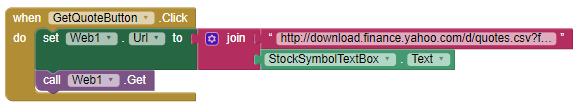
| Block type | Drawer | Purpose |
| GetQuoteButton.Click | GetQuoteButton | Handle a click of the "Get Quote" button. |
| set Web1.Url to | Web1 | Specify the URL to request. |
| join | Text | Concatenate the parts of the URL. |
| " " (http://download.finance.yahoo.com/d/quotes.csv?f=nl1c1&e=.csv&s=) | Text | Specify the first unchanging part of the URL. |
| StockSymbolTextBox.Text | StockSymbolTextBox | Get the stock symbol from the text box. |
| call Web1.Get | Web1 | Make the web request. |
The meaning is: When GetQuoteButton is clicked:
- Build the Web component’s URL by concatenating “http://download.finance.yahoo.com/d/quotes.csv?f=nl1c1&e=.csv&s=” (which you should copy and paste into the text block) and the symbol entered by the user (StockSymbolTextBox.Text).
- Request the page specified by the URL. (This is like pressing return after entering a URL in your web browser.)
Receiving the Data
When the response to the web request arrives, the Web.GotText event is raised with four parameters (only some of which we’ll use in this app):
- url: the URL of the original request (which is useful if requests are made with many different URLs).
- responseCode: the HTTP status code, which indicates whether the web request succeeded or how it failed; for example, 200 means that the request succeeded, 404 that the page could not be found, etc.
- responseType: the MIME type of the response, such as “text/csv” in this app, “image/jpeg”, etc.
- responseContent: the data being returned, such as “511.5”.
Here are a picture and table of the blocks you need to create:
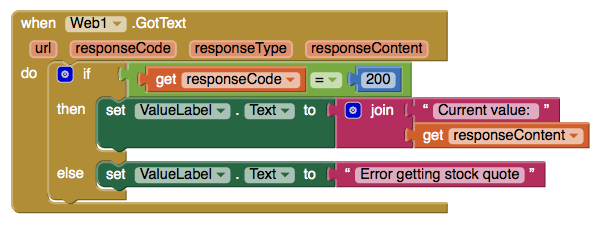
| Block type | Drawer | Purpose |
| Web1.GotText | Web1 | Specify what to do when the reply comes back from the web. |
| if then | Control | Provide different behavior depending on whether the request succeeded. Use the mutator to add an else statement. |
| get responseCode | Variables | Gets the response code returned for the web request, which... |
| = (equals) block | Logic | ...is checked for equality with... |
| number (200) | Math | ...200, the code for valid web responses. |
| set ValueLabel.Text to | ValueLabel | Display the result on the screen. |
| join | Text | Build the result by concatenating... |
| " " ("Current value: ") | Text | ...the text “Current value: “ and... |
| get responseContent | Variables | Gets the value returned from the web. |
| set ValueLabel.Text to | ValueLabel | Display an error message. |
| " " ("Error getting stock quote") | Text | The error message |
Here's a description of the block's behavior:
- If the response code indicates that the web request succeeded (= 200), set the label to the concatenation of “Current value: “ and the returned data (e.g., 511.5).
- Otherwise, set the label to “Error getting stock quote”.
Invalid Stock Symbol
What happens if you misspell a stock symbol? The app says that the Current Value is N/A! N/A stands for “not applicable”--or, that the API doesn’t know what that stock symbol is, so it can’t find a current value. Below is a picture and a table of the blocks required to tell the user they have entered an invalid stock symbol.
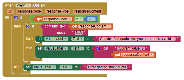
| Block type | Drawer | Purpose |
| Web1.GotText | Web1 | Specify what to do when the reply comes back from the web. |
| if then | Control | Provide different behavior depending on whether the request succeeded. Use the mutator to add an else statement. |
| get responseCode | Variables | Gets the response code returned for the web request, which... |
| = (equals) block | Logic | ...is checked for equality with... |
| number (200) | Math | ...200, the code for valid web responses. |
| if then | Control | Provide different behavior depending on whether the symbol was valid. use the mutator to add an else statement. |
| contains | Text | Checks whether a piece of text exists within another piece of text |
| get responseContent | Variables | Gets the value returned from the web, which contains “N/A” if the symbol was not found. |
| " " ("N/A") | Text | The text "N/A" |
| span class="setcomponent-ai2">set ValueLabel.Text to | ValueLabel | Display an error message. |
| " " ("Couldn't find quote. Are you sure that's a valid symbol?") | Text | An error message. |
| set ValueLabel.Text to | ValueLabel | Display the result on the screen. |
| join | Text | Build the result by concatenating... |
| " " ("Current value: $") | Text | ...the text “Current value: $“ and... |
| get responseContent | Variables | Gets the value returned from the web. |
| set ValueLabel.Text to | ValueLabel | Display an error message. |
| " " ("Error getting stock quote") | Text | An error message |
Here's a description of the block's behavior:
- Check whether the response code indicates that the web request succeeded (=200); if it did not, set the label to "Error getting stock quote".
- If it did, check if the stock symbol was found. If it was not found, set the label to "Couldn't find quote. Are you sure that's a valid symbol?".
- If the stock symbol was found, set the label to the concatenation of "Current Value: $" and the returned data (e.g., 511.5).
Review
Here are some ideas introduced in this tutorial:
- Using an application programmer interface (API)
- Making a request with the Web component
- Checking whether a web request was successful
- Displaying information returned from the web
Scan the Sample App to your Phone
Scan the following barcode onto your phone to install and run the sample app.

Download Source Code
If you'd like to work with this sample in App Inventor, download the source code to your computer, then open App Inventor, click Projects, choose Import project (.aia) from my computer..., and select the source code you just downloaded.
Credits
This tutorial is based on an app created by Prof. David Wolber and relies on the Yahoo! Finance API.

Done with StockQuotes? Return to the other tutorials here.
Tutorial Version:
Tutorial Difficulty:
- Intermediate
Tutorial Type:
- External API
Mini Golf: Fling, TouchUp, TouchDown Gestures for App Inventor 2
This Mini Golf App demonstrates how to use the Fling, TouchUp, and TouchDown gestures for Sprites
Note that these event handlers are also available for the Canvas.
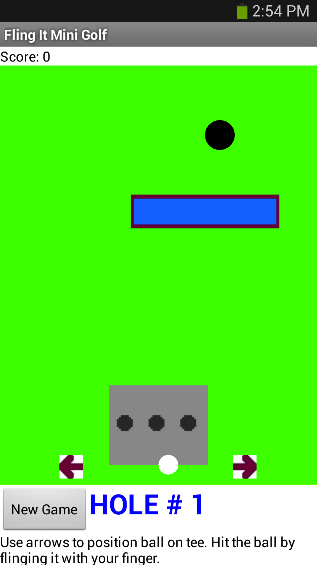
To play this mini golf app, the player first positions his/her ball within the confines of the tee, and then flings the ball toward the hole. The ball will bounce off of the rectangular obstacle and the sides of the course. For each fling of the ball, the stroke count goes up by one. The total score is the number of strokes it takes to complete the entire course.
This tutorial covers:
- Using the Sprite component and the TouchUp, TouchDown, and Flung events
- Using a Clock component
- Dynamic Positioning of sprites on a canvas, based on the size of the screen
- Sprite Collisions
This tutorial assumes you are familiar with the basics of App Inventor-- using the Component Designer to build a user interface, and using the Blocks Editor to specify the app's behavior. If you are not familiar with the basics, try stepping through some of the basic tutorials before continuing.

Part I: Start a new app and make a ball that responds to fling events
We'll build this app in stages, adding a little bit of the game at a time. Log into App Inventor and start a new project. Name it "MiniGolf". When the Design window opens notice that App Inventor automatically names the screen "Screen1", but you can set the Title of the screen, which will show up in the top bar of the app. Think of a title related to Mini Golf, or feel free to use the suggested title "Fling It Mini Golf", and type it into the Properties pane on the right side of the Designer.
In the Screen Properties (shown in right-hand pane): Uncheck the checkbox labeled "Scrollable" so that the screen will not scroll when the app is running. Screens that are set to scroll do not have a height. We’ll need our screen to have a defined height in order to set up the golf course properly.
Add the following components in the Designer:
|
Component Type |
Palette Group |
What You'll Name It |
Purpose |
Properties |
|
Canvas |
Drawing and Animation |
Canvas1 |
The canvas serves as the golf course |
Height: 300 |
|
Ball |
Drawing and Animation |
GolfBall |
This is the ball the player will fling to try to hit the Hole |
Radius = 10 Z = 2 (when sprites are overlapping, the one with the higher z will appear on top) |
|
Ball |
Drawing and Animation |
Hole |
This will be the target for the GolfBall |
Radius = 15 |
|
Clock |
Sensors |
Clock1 |
The clock will fire continuously to control the movement of the ball |
Timer Always Fires Timer Enabled TimerInterval: 100 |
Open the Blocks Editor
Program the behavior of the Ball:
First, use the GolfBall.Flung event handler to move the golf ball when it is flung. Notice how this event handler takes in 6 different arguments:
- x, the x position on the Canvas grid of the user's finger
- y, the y position on the Canvas grid of the user's finger
- speed, the speed of the user's flinging gesture
- heading, the direction (in degrees) of the user's fling gesture
- xvel, the speed in the x direction of the user's fling
- yvel, the speed in the y direction of the user's fling
Essentially, you want to set the GolfBall’s speed and heading to match the speed and heading of the player’s fling gesture. You may want to scale up the speed a little bit because the speed of the fling is a little slower than how a golf ball would move. You can play with this "scaling factor" to make the ball more or less responsive to a fling.
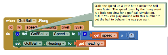
Program the behavior of the clock:
Use timer event to slow ball down so it doesn’t bounce around forever.
Each time the clock fires, it will reduce the speed of the ball slightly. Notice that if the ball is not moving then these blocks will do nothing. If you don’t have this then the ball will just bounce forever.
You'll need to use the if mutator function to change the if block into an if-else block. For a summary of mutators, check out the Mutators page
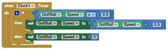
Program a new procedure called SetupNewHole:
This procedure will be called when a hole is scored and the ball has to be placed back at the starting point. Note that the Hole.MoveTo block sets the hole up in a new random location for the next play.
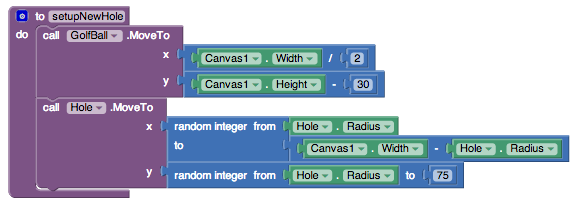
Program the Behavior of the Hole: When the ball collides with the hole, the ball disappears and resets at the bottom of the screen.
Note: When you first drag out the GolfBall.CollidedWith event handler, the named parameter is called "other". Notice that the if then block tests to see if the object involved in the collision with the golf ball (other) is the black ball sprite representing the hole. You can't just put a text block with the word "Hole" in it, you must use the Hole block, that can be found in the drawer for the Hole image sprite. Do not use a text block here.
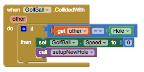
Test this Behavior. Connect your device to AppInventor, or start the emulator to load your app. When you fling the ball it should move in the direction of your fling, with a speed similar to the strength of your fling. The ball should slow down as it moves, eventually stopping. When the ball hits the hole, the ball should reset at the bottom of the screen and the hole should move to a new random location.
Does your ball get stuck if it hits the edge?
This is easy to fix with the when EdgeReached event. Note that you can find the "edge" value block by using a get block and selecting "edge" from the dropdown.
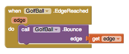
Double check to make sure your code is right: fling the ball a few times and see that that ball now bounces off the edges of the course.
Part II: Keeping Score
Games are more fun if you have a way to see how you’re doing. Let’s add a stroke counter. In mini golf your score goes up as you take more strokes. The goal is to have the lowest score possible. Let’s show the player how many strokes she or he has taken on this hole. Let’s also show the number of strokes taken during the whole game.
Go back to the Designer and set up the following components:
|
Component Type |
Palette Group |
What You’ll Name It |
Purpose |
Properties |
|
Horizontal Arrangement |
Layout |
HorizontalArrangement1 |
Contains LabelScore and LabelStroke |
Place at top of screen |
|
Label |
User Interface |
LabelScore |
Displays the total stroke count for the entire game |
|
|
Label |
User Interface |
LabelStroke |
Displays the stroke count for the hole the player is currently on |
In the Blocks Editor, you can program updates to the Score and Stroke labels. First, set two new global variables called StrokeCount and Score, and set their initial values to 0.
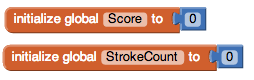
Then add the following blocks to the GolfBall.Flung event (red rectangle indicates new blocks):
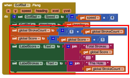
Next add the following blocks to the Event that handles the ball hitting the hole:
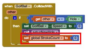
Test the behavior. With these new changes, you should have a "Total Strokes" count and "This Hole" count at the top of the screen. When you fling the ball, the "This Hole" count and "Total Strokes" count should both increase by one, and when you make the ball go into the hole the "This Hole" count should reset to 0.
Part III: Positioning Ball on Tee using TouchUp and TouchDown events
Ok, so now you’ve got a working game! Now let’s make it a little more interesting and fun. First we’ll add a Tee and let the player position the golf ball on the tee before they fling the ball.
Go back to the Designer and add three new image sprite components:
|
Component Type |
Palette Group |
What You’ll Name It |
Purpose |
Properties |
|
ImageSprite |
Drawing and Animation |
Tee |
A rectangular area in which the player can position their ball before teeing off. |
Upload the Tee image (right click on this link, or see below). |
|
ImageSprite |
Drawing and Animation |
LeftSprite |
This is a left pointing arrow that the player will use to move the ball to the left on the tee |
Upload the left arrow graphic (right click on this link |
|
ImageSprite |
Drawing and Animation |
RightSprite |
This is a right pointing arrow that the player will use to move the ball to the left on the tee |
Upload the right arrow graphic (right click on this link |
Program the size of the canvas, and the placement of the ball and image sprites on the canvas:
First, program the setup of these components on the screen. It’s best to accommodate all different screen sizes by placing the sprites on the screen relative to the size of the screen. The blocks below show how to set up the screen dynamically so that everything fits the right way. We start off by making the canvas size based on the screen size, and then we place each sprite in relation to the width and height of the canvas. We'll make a procedure to do this for us. Try to understand all of these blocks before you move on.
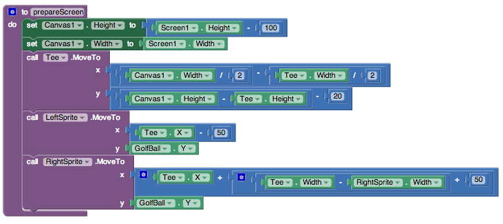
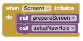
Position the Golf Ball on the Tee using TouchUp and TouchDown on the Arrow sprites:
To handle this, first set up two global variables that are toggled each time an arrow is pressed.
Program the behavior of the Right and Left Arrows
The left and right arrows are image sprites, so they come equipped with the ability to know when the player is is holding his/her finger down on them. The following blocks toggle the global variables based on whether the user is pressing either of these arrows.
Procedure MoveBallOnTee:
Make a new procedure moveBallOnTee that makes the golf ball move left or right on the tee depending on the global variables. Although the math here looks complicated, it’s pretty simple. If the ball is supposed to move left, you first check to make sure that moving the ball 2 pixels left will not exceed the left-most coordinate of the Tee. If moving the golf ball to the right, you first check that moving the ball right 2 pixels will not move it past the right-most coordinate of the Tee.
Note: if blocks look different in this image than on your own screen, this is because they were aligned differently. If you right click on the blocks, a list of options will appear and one of them is external inputs. When you select this, it will change how the blocks are configured. It does not change how the blocks function. If you want to change this, right click again and select internal inputs.
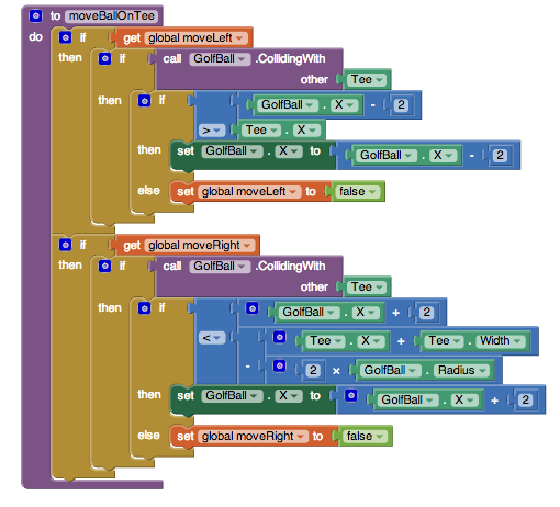
MoveBallOnCourse Procedure
Note that the blocks that we had inside the Clock1.Timer event are now moved over to a new procedure called moveBallOnCourse:
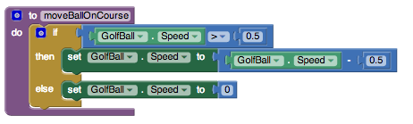
On each new course, players can position the ball on the tee before attempting to fling the ball toward the hole. To program this, you first have to check to make sure this is a new course and the ball has not been flung yet. If StrokeCount = 0 then we know this course is brand new and the player has not yet attempted to get the ball into the hole.
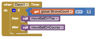
As the blocks above show, after verifying that the StrokeCount is 0, you then want to proceed to move the golf ball left or right depending on which arrow is being pressed.
Test the behavior. Make sure your app is doing what you expect: play the game on your device or emulator. Before you tee off, are you able to move the ball left and right on the tee by using the left and right arrows? After you tee off, you should no longer be able to use the left and right arrows (pressing them will do nothing). After the ball goes into the hole and the screen resets, you should then be able to move the ball left and right on the tee before teeing off again.
Keep track of the number of holes played, and allow a game reset
The game is working pretty well now, but what about giving the player a way to reset the game? Also, it would be nice to give the player some instructions so they know how to play the game. While we’re at it, let’s also give an indication of how many holes the player has completed. Add the following components in the Designer:
|
Component Type |
Palette Group |
What You’ll Name It |
Purpose |
Properties |
|
Horizontal Arrangement |
Layout |
Horizontal Arrangement2 |
Contains the NewGame button and the HoleNum label |
|
|
Button |
User Interface |
ButtonNewGame |
Resets the game to Hole #1 with a score of 0. |
Text: "New Game" |
|
Label |
User Interface |
LabelHoleNum |
Displays the current hole number, increments by one each time a hole is completed. |
Text = "Hole # 1" |
|
Label |
User Interface |
LabelInstruct |
Displays instructions |
Text = "Use arrows to position ball on tee. Hit the ball by flinging it with your finger." |
Define a new global variable to keep track of the Hole Number:
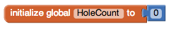
Add the following blocks to the setupNewHole procedure: set global HoleCount and set LabelHoleNum.Text...
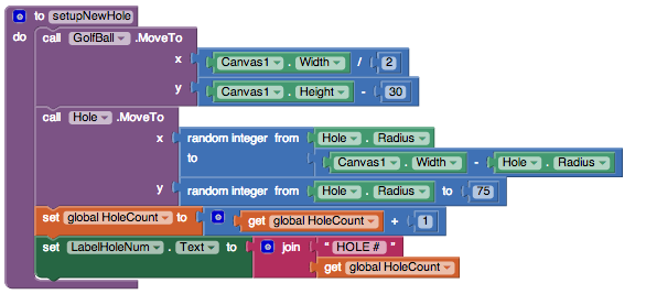
Program the "New Game" button’s behavior, which is pretty simple. When the button is pressed, set up a new course and reset both the hole stroke counter and total stroke counter to zero. Also set the hole number back to 1, by displaying "Hole #1" in LabelHoleNum. The blocks look like this:
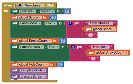
Test the behavior.Go back to your device or emulator and play the game some more. Now you should see the Hole # displayed in the lower right. Hitting "New Game" button should reset the game, returning both scores to 0, resetting the screen, and setting the Hole number to #1.
Part IV: Introduce an Obstacle
Most mini golf courses have obstacles on them. Let’s add a simple rectangular obstacle that will randomly position itself on the course somewhere between the Tee and the Hole. Each time a new course is presented, the obstacle will move, just the same way the Hole moves each time a new course is set up.
Add the following component in the Designer:
|
Component Type |
Palette Group |
What You’ll Name It |
Purpose |
Properties |
|
ImageSprite |
Drawing and Animation |
ObstacleSprite1 |
This sprite will be somewhere between the golf ball and hole and will make it harder to get the ball into the hole |
Upload the obstacle (rectangle) graphic (right click on this link, or see below). |
Program the behavior of the obstacle in the blocks editor. First, set the behavior for when the ball hits the obstacle. *Note: Using Heading = 0 - heading works because we are dealing with bouncing off of horizonal surfaces, this will not work for bouncing off of vertical or inclined surfaces. For our purposes, it works all right. See Challenge #2 below for more information.
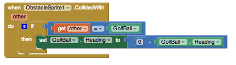
Each time the course is reset, position the obstacle will be positioned randomly. Add these blocks to the setupNewHole procedure:
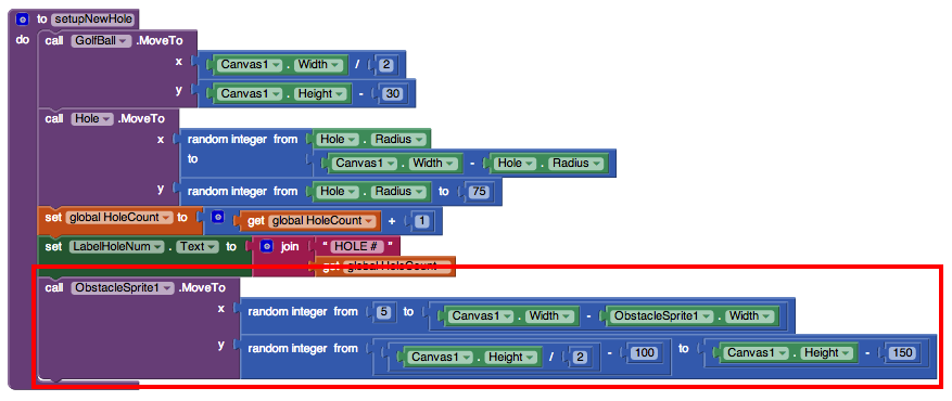
Test the behavior. Play the game again. Notice that the ball bounces off when it hits the obstacle. When the ball goes into the hole, or when the New Game button is pressed, the obstacle appears in a new location somewhere between the tee and the hole.
That’s it! Share your game with friends by building an APK or by downloading the source and sharing the zip file with other App Inventors!
Part V: Challenges
Here are some extra challenges to make your game better.
Challenge 1: Program the Ball to Hole collision so that the ball only goes into the hole if the golf ball’s speed is not too fast. In real mini golf, the ball will bounce right over the hole if you hit the ball too hard.
Challenge 2: There is a slight bug when the ball hits the vertical sides of obstacle. Figure out how to program the ball to obstacle collision so that it bounces the way you would expect when the ball hits the vertical sides.
Challenge 3: Limit the number of holes per game. Keep track of the number of holes and end the game after a set number. (A typical mini golf course has 18 holes.)
Below is a summary of all of the components:
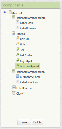
Scan the following barcode onto your phone to install and run the sample app.

Download Source Code
If you'd like to work with this sample in App Inventor, download the source code to your computer, then open App Inventor, click Projects, choose Import project (.aia) from my computer..., and select the source code you just downloaded.
Done with Mini Golf? Return to the other tutorials.
Tutorial Version:
Tutorial Difficulty:
- Intermediate
Tutorial Type:
- Sprites
- Clock Timer
- Game
Space Invaders
What You're Building
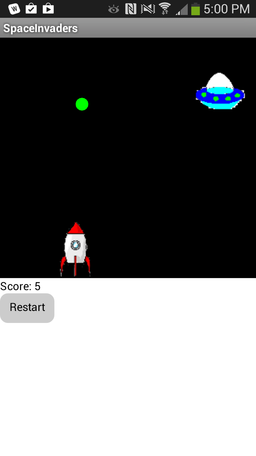
By building the Space Invaders App you will get practice with using Clock components and Timers, using Animation components such as Image Sprites and the Canvas, setting visibility, and detecting collisions in App Inventor. You'll program an application that has a shooter ship whose goal is to shoot all the flying saucers on the screen.
Getting Started
Connect to the App Inventor web site and start a new project. Name it SpaceInvaders, and also set the screen's Title to "SpaceInvaders". Connect to a device or emulator.
Introduction
This tutorial introduces the following skills, useful for future game development:
- Using the Clock component
- Using Clock.Timer to move sprites
- Using Sprite.Flung to move a sprite
- Using collision detection
- Setting visibility of sprites
Getting Ready
For this game, you will have two types of sprites: an imagesprite represented by a shooter ship and flying saucers represented by a ball sprite. Click below to download the image files for your rocket ship sprite and flying saucer sprite.


Set up the Components
Use the component designer to create the interface for SpaceInvaders. When you finish, it should look something like the snapshot below (more detailed instructions below the snapshot).
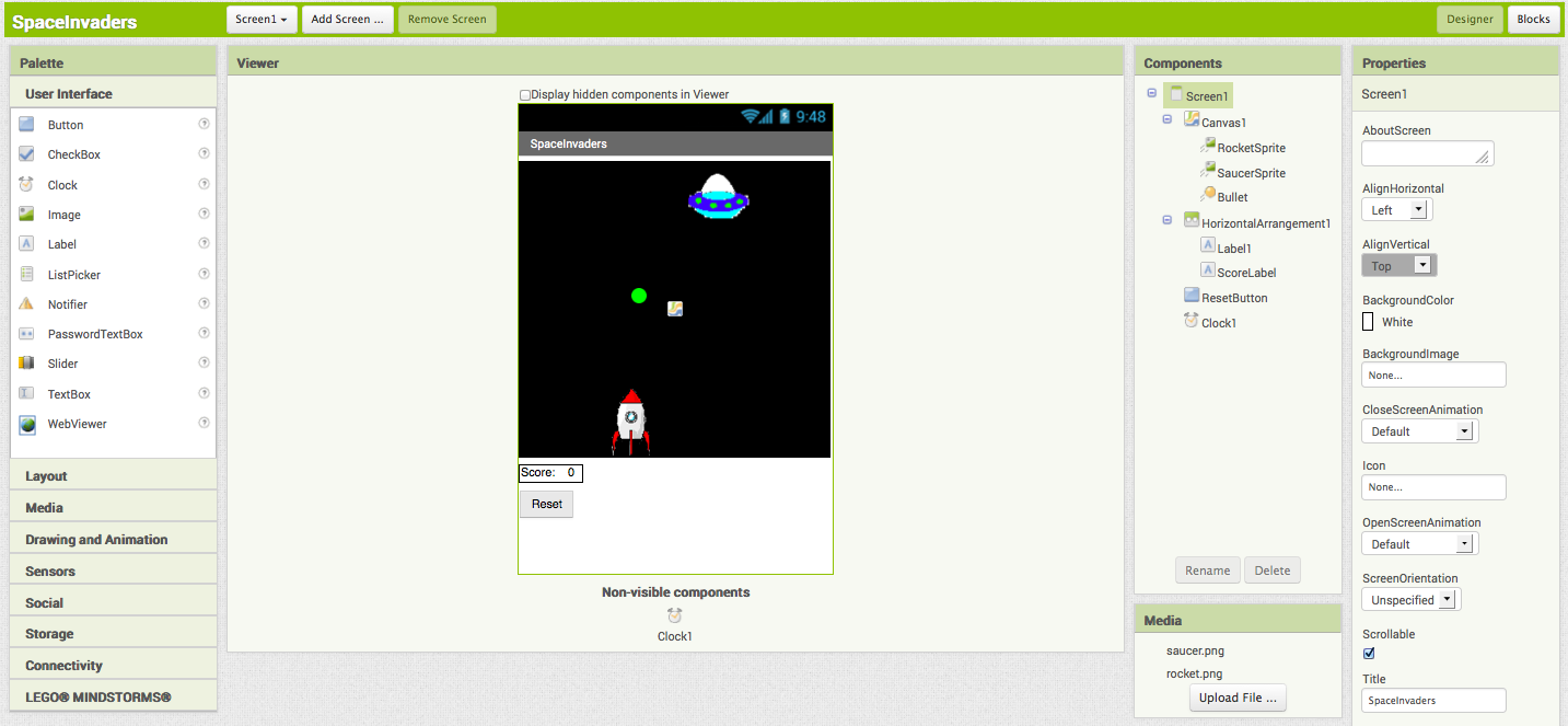
To create this interface, put the following components into the Designer by dragging them from the Component Palette into the Viewer and set the properties of the components as described below:
| Component Type | Palette Group | What you'll name it | Purpose of Component | Action |
| Canvas | Drawing and Animation | Canvas1 | The background that we will be putting our sprites on | Change Width property to "Fill parent" and Height property to 300. Set the BackgroundColor property to Black. |
| ImageSprite | Drawing and Animation | RocketSprite | The rocket ship in our game | Upload the rocketship image and set the Picture property to "rocket.png". Set the Y property to 230. This will place the rocket at the bottom of the canvas. |
| ImageSprite | Drawing and Animation | SaucerSprite | The flying saucer in our game | Upload the saucer image and set the Picture property to "saucer.png". |
| BallSprite | Drawing and Animation | Bullet | The bullet from the rocket ship. | Change PaintColor to Green and set the Radius property to 8. |
| Clock | User Interface | Clock1 | We use the Clock for its Timer method to move the the saucer | Change TimerInterval property to 3000. |
| Horizontal Arrangement | Layout | HorizontalArrangement1 | To contain Label1 and ScoreLabel | |
| Label | User Interface | Label1 | To contain the word "Score: " | Change Text property to "Score: ". |
| Label | User Interface | ScoreLabel | To contain the current numerical score | Change Text property to "0". |
| Button | User Interface | ResetButton | To reset the game so the player can play again | Change Text property to "Reset". |
Now that you have all the essential properties configured, feel free to change the colors of any components that you want to.
Moving the rocket
In this game, the user will move the rocket from side to side. This means we will only be changing the X-direction of the rocket sprite. To do this we will use the RocketSprite.Dragged event handler. When the rocket is dragged, we will adjust it's X property to be the currentX that we dragged the sprite to.
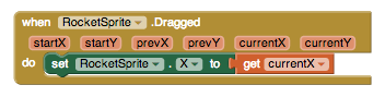
Once you put these blocks together, connect your phone and test this feature out!
Programming the Bullet's Behavior
There are several features we want our bullet to have in this game. We want it to shoot from the rocket, collide with the saucer, and be invisible after the collision and before being shot.
Let's start by using the Screen1.initialize block. When the screen is initialized, we will program the bullet to be invisible. We do this by setting the bullet's visibility property to False.
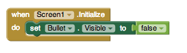
Next, we want to make sure that the bullet appears again when we shoot from the rocket. When we touch the rocket, we want the bullet to start heading towards the saucer. We will do this by using the RocketSprite.Touched event handler. When the rocket is touched, we not only want to set the rocket to be visible, but we also want to set the speed and heading of the rocket. Heading is a value from 0 to 360 that indicates what direction the sprite should be moving towards. 0/360 is to the left, 90 is up, 180 is right, and 270 is down. The speed is measured in pixels/sec.
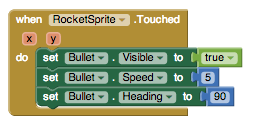
The last thing we need to program is what happens when the bullet hits the saucer. We will use the Bullet.CollidedWith event handler. This event is called whenever the bullet collides with another sprite. Since our rocket sprite is locked into a Y at the bottom of the screen, the bullet will never collide with the rocket and only with the saucer. On collision we want two things to happen. 1. The score should increase by 1. 2. The bullet should become invisible.
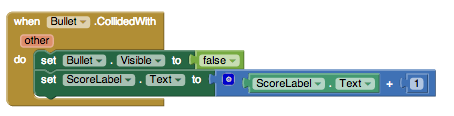
If you have started testing this game out, you may have noticed that once you shoot the bullet, it doesn't appear to let you shoot it again. We need to program the bullet to return to the place in front of the rocket when we shoot it. We can do this using the Bullet.MoveTo block.
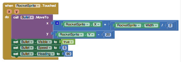
Now, test it out!
You may have noticed that if you miss the saucer, the bullet moves to the top of the screen and gets stuck there until you try shooting again. To make the bullet disappear when it hits the top edge of our canvas, we need to use the Bullet.EdgeReached event handler.
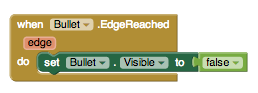
Programming the Reset Button
Sometimes, users might want to restart the game and reset their score. When this happens, we need to set the score back to 0.
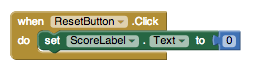
Increasing the Difficulty -- Changing the Position of the Saucer
Let's make the game a little more challenging! Now, when the bullet collides with the saucer, let's change the location of the saucer. The saucer will keep the same Y value so we'll only have to change the X. We can do this by using the random block.
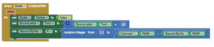
To make it even more difficult, we'll also change the position of the saucer when the Timer goes off.
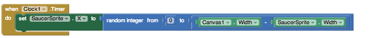
Complete Program
Here's the complete SpaceInvaders program.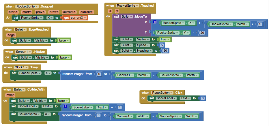
Tutorial Version:
Tutorial Difficulty:
- Intermediate
Tutorial Type:
- Sprites
- Drawing Canvas
- Game
No Text While Driving for AI2
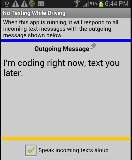
This tutorial, available on our partner site Appinventor.org, will demonstrate how to respond to an incoming text by sending an automatic text response, and also using Text-to-Speech to read the message out loud.
The following link will open a new window and take you away from MIT's site.
http://www.appinventor.org/notext-steps
Tutorial Version:
Tutorial Difficulty:
- Intermediate
Tutorial Type:
- SMS Texting
QuizMe for App Inventor 2
What you're building

QuizMe is a trivia game about baseball, but you can use it as a template to build quizzes on any topic. With QuizMe:
- The user steps through a series of questions, clicking a button to proceed to the next question.
- The user enters an answer for each question and the app reports whether each answer is correct or not.
With QuizMe, the quiz questions are always the same unless you, the programmer, change them. Later, you can create MakeQuiz & TakeQuiz, an app that lets users of the app create and modify the quiz questions.
This tutorial assumes you are familiar with the basics of App Inventor -- using the Component Designer to build a user interface, and using the Blocks Editor to specify event-handlers. If you are not familiar with the basics, try stepping through some of the basic tutorials before continuing.
Getting Started
Connect to the App Inventor web site and start a new project. Name it QuizMe, and also set the screen's Title to "QuizMe". Open the Blocks Editor and connect to the phone.
Also download the following pictures of baseball players and save them on your computer. Later, you'll load these images into your project.
Introduction
You'll design the quiz game so that the user proceeds from question to question by clicking a Next button, and receives simple correct/incorrect feedback on each answer.
This tutorial introduces:
- Defining and displaying lists of information.
- Sequencing through a list using an index variable -- a variable that keeps track of a position in a list.
- Conditional behaviors-- performing certain operations only when a condition is met.
- Switching an image to show a different picture at different times.
Set up the Components
Use the component designer to create the interface for QuizMe. When you finish, it should look something like the snapshot below (there are also more detailed instructions below the snapshot).
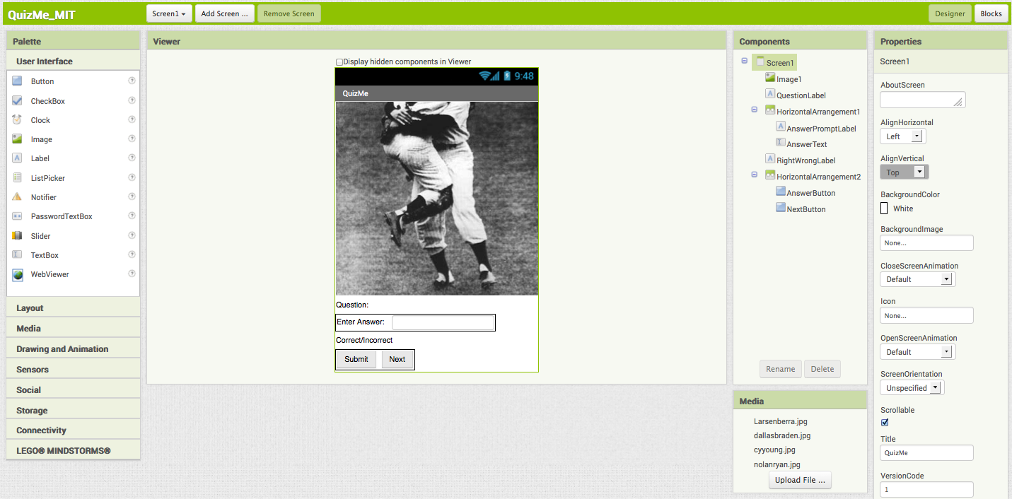
To create this interface, first load the images you downloaded into the project. Click on the "Upload File..." button in the Media area and select one of the downloaded files (e.g., Larsenberra.jpg). Then do the same for the other three images.
Next, create the following components by dragging them from the Palette into the Viewer and et the properties of the components as described below:
| Component Type | Palette Group | What you'll name it | Action | Purpose of Component |
| Image | User Interface | Image1 | Set its Picture property to "Larsenberra.jpg". This is the first picture that should appear. | The picture part of the question |
| Label | User Interface | QuestionLabel | Change Text property to "Question:" | Displays the current question |
| HorizontalArrangement | Layout | HorizontalArrangement1 | Organizes the AnswerPrompt and Text | |
| Label | User Interface | AnswerPromptLabel | Change Text property to "Enter Answer:". On the Viewer screen, move this label into HorizontalArrangement1. | Text prompting for an anwer |
| TextBox | User Interface | AnswerText | Change Hint to "Please Enter an Answer". On the Viewer screen, move AnswerText into HorizontalArrangement1. | User will enter answer here. |
| Label | User Interface | RightWrongLabel | Change Text property to "Correct/Incorrect". | Correct/Incorrect is displayed here. |
| HorizontalArrangement | Layout | HorizontalArrangement2 | Organizes the AnswerButton and NextButton | |
| Button | User Interface | AnswerButton | Change Text property to "Submit". On the Viewer, move the button into HorizontalArrangment2. | User clicks to submit an answer |
| Button | User Interface | NextButton | Change Text property to "Next". Move the button into HorizontalArrangement2. | User clicks to proceed to the next answer |
Add Behaviors to the Components
Open the Blocks Editor to add the behaviors for the app. First, you'll define two list variables, QuestionList to hold the list of questions, and AnswerList to hold the list of corresponding answers.
To define the two list variables, you'll need the following blocks:
| Block Type | Drawer | Purpose |
| initialize global name to | Variables | Defines the QuestionList variable (rename it) |
| initialize global name to | Variables | Defines the AnswerList variable (rename it) |
| make a list | Lists | Used to insert the items of the QuestionList |
| " " (3 of them) | Text | The actual questions |
| make a list | Lists | Used to insert the items of the AnswerList |
| " " (3 of them) | Text | The actual answers |
You create global variables by dragging in a initialize global name to block from the Variables drawer and double-clicking the default name "name" to change its name. The initialize global name to block has a slot for the initial value of the variable. The variable can represent a number or text, or even a list, for which you can plug in a make a list block into the variable definition.
The blocks should look like this:
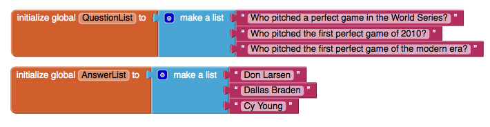
Define the Hidden Index Variable
Each time the user clicks the NextButton to proceed through the quiz, the app needs to remember which question it is on. In programming, to remember something, you define a new variable. In this case, the app needs to remember the current question number -- the index into the list QuestionList.
To create the variable currentQuestionIndex, you'll need the following blocks:
| Block Type | Drawer | Purpose |
| initialize global name to | Variables | Defines the currentQuestionIndex variable (rename it) |
| 0 (1) | Math | Set the initial value of currentQuestionIndex to 1 (renumber it) |
The blocks should look like this:
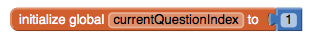
Display the first question
To start, you'll ignore the answers and just work on the behavior to sequence through the questions. The desired behavior is the following: when the app starts, the first question should appear in the label named QuestionLabel. When the user clicks the NextButton, the second question should appear. When the user clicks again, the third should appear. When the last question is reached, clicking the NextButton should result in the first question once again appearing in the QuestionLabel.
With App Inventor, you select particular items in a list with the select list item block. The block asks you to specify the list and an index--a position in the list. If a list has three items, the indexes 1, 2, and 3 are valid.For QuizMe, when the app starts, the app should choose the first question in the list and display it in the QuestionLabel component.
For this app initialization behavior, you'll need the following blocks:
| Block Type | Drawer | Purpose |
| when Screen1.Initialize | Screen1 | When the app begins, this event-handler is triggered. |
| set QuestionLabel.Text to | QuestionLabel | Need to put the first question in QuestionLabel |
| select list item | Lists | Need to select the first question from QuestionLabel |
| get | Variables | The list to select from. Select "global QuestionList" |
| 0 (1) | Math | Select the first question by using an index of 1. Set the value to be 1. |
The blocks should look like this:
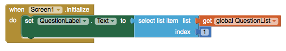
How the blocks work
The when Screen1.Initialize event is triggered when the app begins. The first item of the variable QuestionList is selected and placed into set QuestionLabel.Text. So when the app begins, the user will see the first question.
Test this behavior. Click Connect Phone if your phone is not already connected. What appears on the phone? If you created the QuestionList as described above, the first item of QuestionList, "Who pitched a perfect game in the World Series?", should appear in the QuestionLabel.
Iterating Through the Questions
Now program the behavior of the NextButton. You've already defined the currentQuestionIndex to remember the question the user is on. When NextButton is clicked, the app needs to increment this variable, e.g., change it from 1 to 2 or from 2 to 3, etc., and then use the resulting value to select the new "current" question. For this behavior, you'll need the following blocks:
| Block Type | Drawer | Purpose |
| when NextButton.Click | NextButton | When user clicks Next, this event-handler is triggered. |
| set currentQuestionIndex to | Variables | Need to put the first question in QuestionLabel |
| + | Math | Used to increment currentQuestionIndex |
| get global currentQuestionIndex | Variables | New value will be old value + 1 |
| 0 (1) | Math | For the + 1 |
| set QuestionLabel.Text to | QuestionLabel | Need to display the next question here |
| select list item | Lists | Need to select the first question from QuestionList |
| get global QuestionList | Variables | Plug into list slot of call select list item |
| get global currentQuestionIndex | Variables | Plug into index slot of call select list item, we want nth item |
The blocks should look like this:
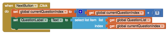
How the Blocks Work
The first row of blocks increments the variable currentQuestionIndex. If currentQuestionIndex has a 1 in it, it is changed to 2. If it has a 2, it is changed to 3, and so on. Once the currentQuestionIndex variable has been changed, the app uses it to select the "current" question.
Recall that in the Screen.Initialize event-handler, the app selected the first question to display:
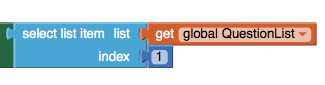
When the NextButton is clicked, the app doesn't choose the first item in the list, or the 2nd or 3rd, it chooses the currentQuestionIndex-th item.

The blocks are executed in a right-to-left manner. The app first evaluates the index parameter of select list item, which is the variable currentQuestionIndex. The number is stored in currentQuestionIndex is used as the index when the select list item is executed.
When the NextButton is clicked for the first time, the increment blocks will set currentQuestionIndex from 1 to 2, so the app will select the second item from QuestionList, "who pitched the first perfect game of 2010?". The second time NextButton is clicked, currentQuestionIndex will be set from 2 to 3, and the app will select the 3rd question in the list, "who pitched the first perfect game of the modern era?"
Test this behavior. Test the behavior of the NextButton to see if the app is working correctly thus far. To test, play the role of the user and click the NextButton on the phone. Does the phone display the second question, "Who pitched the first perfect game of 2010?" It should, and the third question should appear when you click the NextButton again. If this is working, pat yourself on the back quickly, and then go on.

Try clicking the NextButton again (a third time). You should see an error: "Attempting to get item 4 of a list of length 3". The app has a bug-- do you know what the problem is?
The problem with the app is that it always increments the currentQuestionIndex variable when the NextButton is clicked. When currentQuestionIndex is already 3 and the user clicks the NextButton, the app changes currentQuestionIndex from 3 to 4, then calls select list item to get the currentQuestionIndex-th , or in this case, the 4th item. Since there are only three items in the variable QuestionList, Android complains.
What the app needs to do is ask a question-- check a condition-- when the NextButton is clicked, and execute different blocks dependending on the answer. One way to ask the question is to ask, "is the variable currentQuestionIndex already 3?" If the answer is yes, you should set currentQuestionIndex back to 0 so the user is taken back to the first question.
You'll need the following blocks:
| Block Type | Drawer | Purpose |
| if then | Control | To ask if user is on last question |
| = | Math | to test if currentQuestionIndex is 3 |
| get global currentQuestionIndex | Variables | - |
| 0 (3) | Math | 3 is number of items in the list |
| set currentQuestionIndex to | Variables | set to 0 to go back to first question |
| 0 | Math | set to 0 because next blocks will increment to 1 |
The modified when NextButton.Click event-handler should look like this:
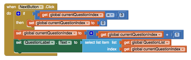
How the blocks work
When the NextButton is clicked, the app first checks to see if currentQuestionIndex has a 3 in it. If it does, currentQuestionIndex is set back to 0 so that when 1 is added to it with the blocks below, it will be 1 and the quiz will loop back to display the first question. Note that only the blocks inset within the if-then block are dependent on the condition-- the increment and set set QuestionLabel.Text to blocks are executed under all conditions.
A Maintainable App: Making it Easy to Modify the Questions
Next, you'll modify the app to make it easy to add and remove elements from the list. You'll rewrite the blocks so that they'll work on any list, not just one with exactly three items. To begin, add a fourth question to QuestionList and another answer into AnswerList. To do this, you will first need to expand the number of available slots by using the mutator. For more information on how to use the mutator, click here. The blocks should look like this:
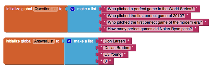
Test the modified app. Click the NextButton a number of times. You should see that the fourth question never appears, no matter how many times you click Next.
The problem is that the test to see if the user is on the last question is too specific: it asks if the currentQuestionIndex variable is 3:
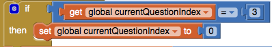
You could just change the number 3 to a 4, and the app would again work correctly. The problem with this solution, however, is that each time you modify the questions and answers, you also have to remember to make this change. Such dependencies in a computer program often lead to bugs, especially as an app grows in complexity. It's much better to set the program up so that it will work no matter how many questions there are. Such generality is even more important when the list you are working with changes dynamically, e.g., a quiz app that allows the user to add new questions.
The better solution is to ask the question in a more general way. You really want to know if the current question the user is on-- the value of currentQuestionIndex -- is as large as the number of items in QuestionList. If the app asks the question in this more general manner, it will work even when you add to or remove items from the QuestionList. To modify the when NextButton.Click event-handler you'll replace the previous test that referred directly to 3. You'll need the following blocks:
| Block Type | Drawer | Purpose |
| length of list | Lists | asks how many items are in QuestionList |
| get global QuestionList | Variables | put into list slot of length of list |
Your when NextButton.Click event-handler should now appear as:
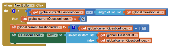
How the Blocks Work
The if now compares the currentQuestionIndex to the length of the QuestionList. So if currentQuestionIndex has a 4 in it, and the length of the QuestionList is 4, then the currentQuestionIndex will be set to 0 (and then 1 after the increment operation in the first row of blocks after the if). Note that, because the blocks no longer refer to 3 or any specific size, the behavior will work no matter how many items are in the list.
Test the modified behavior. When you click the NextButton, does the app now sequence through the four questions, moving to the first one after the fourth?Switching the Image for Each Question
The current app shows the same image, no matter what question is being asked. You can change this so an image pertaining to each question appears when the NextButton is clicked. Earlier, you added four pictures as media for the project. Now, you'll create a third list, PictureList, with the names of the image files as its items. and you'll modify the when NextButton.Click event-handler to switch the picture each time.
First, create a PictureList and initialize it with the names of the image files. Be sure that the names are exactly the same as the names of the files that were loaded in to the media of the project. Here's how the blocks for the PictureList should look:
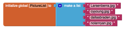
Next, you need to modify the when NextButton.Click event-handler so that it modifies the picture depending on what question the user is on. If you set the Image.Picture property to a file name of an image that has been loaded, that image will appear. To modify when NextButton.Click, you'll need the following blocks:
| Block Type | Drawer | Purpose |
| set Image1.Picture to | Image1 | set this to change the picture |
| select list item | Lists | need to select the picture corresponding to current question |
| get global PictureList | Variables | select a file name from this list |
| get global currentQuestionIndex | Variables | select the currentQuestionIndex-th item |
Here is how the blocks should look:
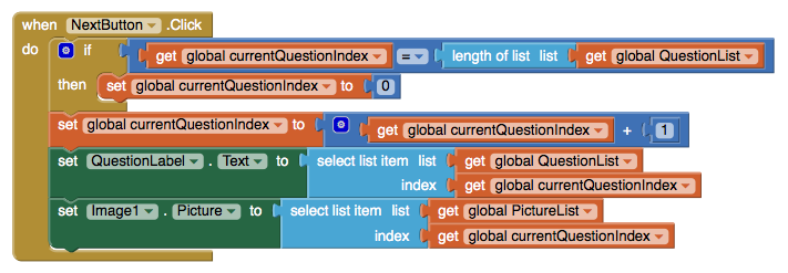
How the Blocks Work
The currentQuestionIndex serves as the index for the QuestionList and the currentQuestionIndex is 1, the app selects the first question and the first picture. When currentQuestionIndex is 2, the app selects the second question and second picture. Of course this scheme depends on the lists being in sync and indeed they are. For instance, the first picture, LarsenBerra.jpg, is a picture of Don Larsen, and Don Larsen is the answer to the first question, "Who pitched a perfect game in the World Series?" Test the modified behavior. Does a different image appear each time you click the NextButton?
Evaluating Answers
Next, you'll add blocks that report whether the user has answered a question correctly or not. The user enters the answer in AnswerText and then clicks the AnswerButton. The app must compare the user's entry with the answer to the "current" question, using an if then block to check. The RightWrongLabel should be modified to report whether or not the answer is correct. You'll need the following blocks for this behavior:
| Block Type | Drawer | Purpose |
| when AnswerButton.Click | AnswerButton | the behavior is triggered when user clicks the AnswerButton |
| if then | Control | Use the mutator to add an else. If answer is correct, do one thing, else do another |
| = | Math | to ask if answer is correct |
| AnswerText.Text | AnswerText | the user's answer is in this textbox |
| select list item | Lists | to select the current answer from AnswerList |
| get global AnswerList | Variables | The list to select from |
| get global currentQuestionIndex | Variables | the question number (and answer number) the user is on |
| set RightWrongLabel.Text to | RightWrongLabel | report the answer here |
| " " "Correct!" | Text | if answer is right |
| set RightWrongLabel.Text to | RightWrongLabel | report the answer here |
| " " "Incorrect" | Text | if answer is wrong |
The blocks should look like this:
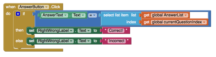
How the Blocks Work
The if test reads, "is the user's answer (AnswerText.Text) equal to the currentQuestionIndex-th item in the AnswerList?" If currentQuestionIndex is 1, the app will compare the user's answer with the first item in AnswerList, "Don Larsen". If currentQuestionIndex is 2, the app will compare the user's answer with the second answer in the list, "Dallas Braden", and so on. If the test result is positive, the then blocks are executed and the RightWrongLabel is set to "Correct!". If the test is false, the else blocks are executed and the RightWrongLabel is set to "Incorrect".
Test the modified app. Try answering one of the questions. It should report whether or not you answered the question exactly as is specified in the AnswerList. Test with both a correct and incorrect answer (because text is being compared, the test is case-sensitive).

Click the NextButton and answer a second question. Does it still work? It should, but you might notice that when you click the NextButton, the "correct"/"incorrect" text and the previous answer are still there. Though it's fairly innocuous, such user interface issues will definitely be noticed by the users of your app.
To blank out the RightWrongLabel and the AnswerText, you'll put the following blocks within the when NextButton.click event-handler:
| Block Type | Drawer | Purpose |
| set RightWrongLabel.Text to | RightWrongLabel | the label to blank out |
| " " | Text | When Next is clicked, erase old answer critique |
| set AnswerText.Text to | AnswerText | the user's answer from previous question |
| " " | Text | When Next is clicked, erase old answer |
The blocks should look like this:
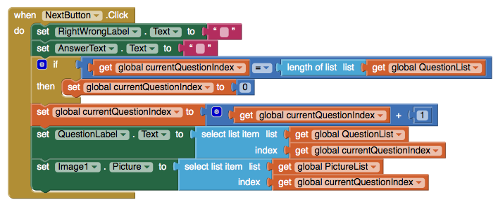
How the Blocks Work
When the NextButton is clicked, the user is moving on to the next question, so the top two rows of the event-handler blank out the RightWrongLabel and the AnswerText.
Test this behavior. Answer a question and click Submit, then click the NextButton. Does your previous answer and the apps critique disappear?
Final Program
QuizMe! Final Version:
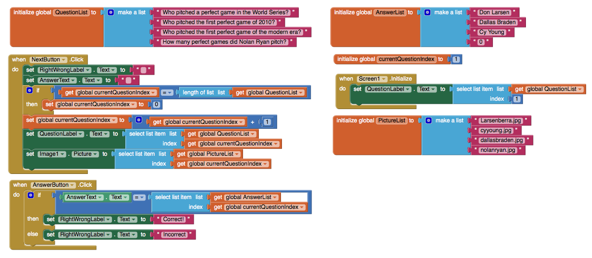
Package the final version of the app by choosing Build | App (provide QR code for .apk) from the Component Designer menu. When the barcode appears, use the barcode scanner on your phone to download and install the app.
Variations
Once you get a quiz working, you might want to explore some variations. For example,
- Instead of just showing images for each question, try playing a sound clip or a short video. With sound, you can turn your quiz app into a Name That Tune app.
- The quiz is very rigid in terms of what is accepted as a valid answer. There are a number of ways to modify this. One is to use the text.contains block to see if the user's answer is contained in the actual answer. Another is to provide multiple answers for each question, and check by iterating (using for each) through them to see if any match.
- Transform the quiz so that it is multiple-choice. The list of answers will need to be a list of lists, with each sub-list holding the answer choices. Use the ListPicker component to allow the user to choose an answer.
Review
Here are some of the ideas covered in this tutorial:
- Apps can be written in a general manner so that they work with any data list.
- Index variables are used to track the current position within a list. When you increment them, be careful about reaching the end of the list.
Scan the Sample App to your Phone
Scan the following barcode onto your phone to install and run the sample app. (or tap on the barcode if you're viewing this webpage on an Android device)

Download Source Code
If you'd like to work with this sample in App Inventor, download the source code to your computer, then open App Inventor, go to the My Projects page, and choose Project | Import project (.aia) from my computer ....
MIT and Google are grateful to Professor David Wolber, CS Professor at The University of San Francisco, for developing this tutorial.

Done with QuizMe? Return to the other tutorials here.
Tutorial Version:
Tutorial Difficulty:
- Intermediate
Sharing Component: send files and text with the app of your choice
In this 3-minute video, App Inventor Developer José Dominguez shows you how to use the File Sharing component to share text and/or files from your App Inventor app to any capable service on your device (e.g. Gmail, Twitter, G+, WhatsApp, Messaging, etc.).
Tutorial Version:
Tutorial Difficulty:
- Intermediate
Tutorial Type:
- File Sharing
Photo Booth App
This tutorial demonstrates how to develop a Photo Booth app. You’ll build an app that let’s you take pictures, assign pictures to canvases and share pictures via email.
Tutorial Version:
Tutorial Difficulty:
- Intermediate
Tutorial Type:
- Camera
LEGO ® EV3 Tilt-to-Drive Tutorial
This tutorial lets you make an app that drives around an EV3 LEGO robot by tilting a phone or tablet. Tilting forward makes the bot go forward, back --> back, right --> right, left -->left. A steeper pitch will make the robot drive faster… etc.
Go to tutorial.
Tutorial Version:
Tutorial Difficulty:
- Intermediate
Tutorial Type:
- LEGO® EV3
Colored Dots for App Inventor 2
This is an App Inventor 2 Tutorial (Need the App Inventor Classic version?)
Colored Dots: Creating Apps with Multiple Screens
This tutorial shows how to create apps that have multiple screens. In App Inventor, you can have a screen open a second screen. Later, the second screen can return to the screen that opened it. You can have as many screens as you like, but each screen closes by returning to the screen that opened it. The screens can share information by passing and returning values when they open and close. The screens also share the same TinyDB data, which they can use to store and share values.
Building an app with multiple screens is a lot like creating several individual apps. Every screen that you create has its own components in the Designer window. In the Blocks Editor, you will be able to see only the components of the screen currently selected in the Designer. Similarly, the blocks of code related to a screen cannot refer to blocks of code in another screen.
This program, ColoredDots, has two screens. ColoredDots is similar to PaintPot, but it uses a second screen to let the user create new colors by providing numerical values for the red, green, and blue color composition (RGB). In the PaintPot app, a user can only paint with one of the three predefined colors. Adding more colors to Paintpot would have required new buttons on the screen, reducing the amount of space available for painting. In ColoredDots, the new color is chosen on a second screen called Brush_Picker. Once a new color has been created in this second screen, its value is passed back to the first screen. You can also save and name the colors you create in the second screen, then use the saved colors later when painting. By using ListPicker to store the colors you create, it eliminates the need for the user to remember the name of the color they saved and spell it correctly in accessing it again. This makes the database of stored colors more accessible, making it easier to share the app among a group of people.
Here are the two screens for the ColoredDots app:
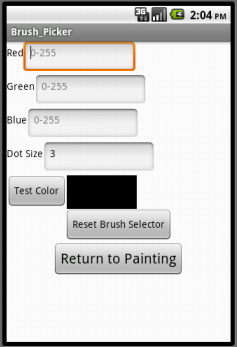
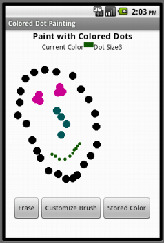
Objectives
By the end of this tutorial, you should have a understanding of:
- How to make an app with multiple screens.
- How to pass values from one screen to another via TinyDB.
- How to fill and use the ListPicker element.
Building the Main Screen (Screen1)
You start building a multiscreen app by creating a new project, just as with any other app. As usual, App Inventor automatically creates the main screen and names it Screen1 and you can add components. Here's the Designer and the Components panel when all the components for Screen1 have been added.
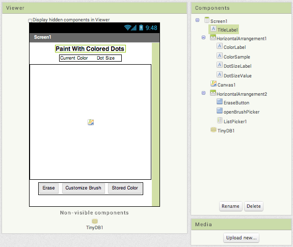
The components are:
| Component Type | Palette Group | What you'll name it | Purpose of Component | Component Settings |
| Label | User Interface | TitleLabel | Shows the title "Paint with Colored Dots" | Change Properties to FontBold and set FontSize to 16, TextAlignment to center, and Width to Fill parent |
| HorizontalArrangement | Layout | HorizontalArrangement1 | Holds the following 4 labels: | Set Width to Fill Parent and AlignHorizontal to Center |
| Label | User Interface | ColorLabel | Shows the text "Current Color" | |
| Label | User Interface | ColorSample | Blank label whose background color is the current color which we initialize to be black | |
| Label | User Interface | DotSizeLabel | Shows the text "Dot size" | |
| Label | User Interface | DotSizeValue | Shows the current dot size. We will initialize this to 3. | |
| Canvas | Drawing and Animation | Canvas1 | Shows dots at the places you touch | Set the width to Fill parent and the height to 300 pixels |
| HorizontalArrangement | Layout | HorizontalArrangement2 | Holds the following 2 Buttons and ListPicker | Set Width to Fill Parent and AlignHorizontal to Center |
| Button | User Interface | EraseButton | Clears the canvas | Set Text to "Erase" |
| Button | User Interface | openBrushPicker | Launches the second screen | Set Text to "Customize Brush" |
| ListPicker | User Interface | ListPicker1 | Loads the list of colors from the data base | Set Text to "Stored Colors" |
| TinyDB | Storage | TinyDB1 | Stores color names and values |
We'll look at the blocks for Screen1 below. But first let's add the other screen.
Adding a second screen
To add a new screen to your app, click the Add Screen button in the top toolbar of the Designer window. A dialog window will appear, in which you can provide a name for the new screen.
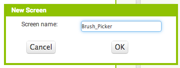
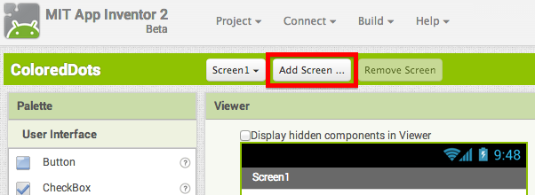
Note: You should make the name of the new screen something meaningful when you add it. Do that now, because once a screen has been added, its name cannot be changed -- the Rename button for the screen component itself is disabled -- it's good to have meaningful names for the parts of your program. One limitation here is that Screen1 cannot be renamed. Remember also that the screen's title (shown in the title bar when the app is running) is different from its name. You can change the screen title in the Properties pane.
When you create a new screen, the Designer window switches to display it. Initially there will be no components, just like with a new app, and you add new components by dragging them from the Palette, just as with any screen. Here's the Designer window for the second screen, named Brush_Picker, after the components have been added. Notice that Brush_Picker is selected in the dropdown on the top bar outlined in red. This is because it is the current screen.
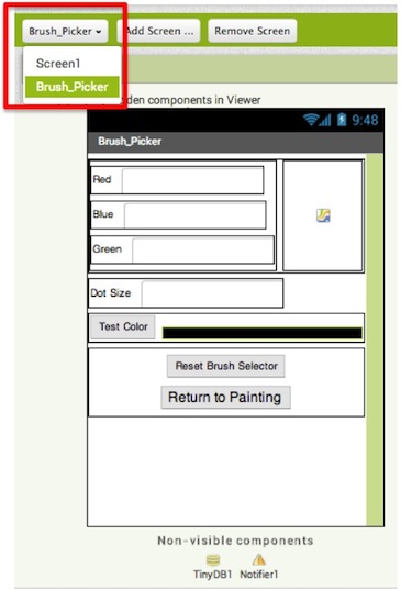
The components for the brush picker screen are:
| Component Type | Palette Group | What you'll name it | Purpose of Component | Component Settings |
| Label | User Interface | RedLabel | Shows the text "Red" | |
| TextBox | User Interface | Red | For entering the amount of red in the color (0-255) | Set NumbersOnly |
| HorizontalArrangement | Layout | RedHorizontalArrangement | Holds RedLabel and Red TextBox | |
| Label | User Interface | BlueLabel | Shows the text "Blue" | |
| TextBox | User Interface | Blue | For entering the amount of blue in the color (0-255) | Set NumbersOnly |
| HorizontalArrangement | Layout | BlueHorizontalArrangement | Holds BlueLabel and Blue TextBox | |
| Label | User Interface | GreenLabel | Shows the text "Green" | |
| TextBox | User Interface | Green | For entering the amount of green in the color (0-255) | Set NumbersOnly |
| HorizontalArrangement | Layout | GreenHorizontalArrangement | Holds GreenLabel and Green TextBox | |
| VerticalArrangement | Layout | VerticalArrangement1 | Holds Color HorizontalArrangements | |
| Canvas | Drawing and Animation | Canvas1 | Displays the size and color of the test color | Set Width and Height to Fill parent |
| HorizontalArrangement | Layout | HorizontalArrangement1 | Holds VerticalArrangement1 and Canvas1 | Set Width to Fill parent |
| Label | User Interface | DotRadius | Shows the text "Dot Size" | |
| TextBox | User Interface | RadiusTextBox | Shows the current dot size | Set NumbersOnly |
| HorizontalArrangement | Layout | RadiusHorizontalArrangement | Holds DotRadius and RadiusTextBox | |
| Button | User Interface | TestColorButton | Press to create the new color and prompts the user to store this color | Set Text to "Test Color" |
| Label | User Interface | LabelTestColorSample | Blank label whose background color is the new color | Set Width to Fill parent |
| HorizontalArrangement | Layout | TestHorizontalArrangement | Holds TestColorButton and LabelTestColorSample | Set Width to Fill parent |
| Button | User Interface | ResetColorButton | Resets all the values to the default color, black | Set Text to "Reset Brush Selector" |
| Button | User Interface | ReturnToPainting | Returns to the main screen with the new color and dot size | Set Text to "Return to Painting" and FontSize to 16 |
| VerticalArrangement | Layout | VerticalArrangement2 | Holds ResetColorButton and ReturnToPainting | Set Width to Fill Parent and AlignHorizontal to Center |
| Notifier | User Interface | Notifier1 | Shows a dialog for saving the color and entering a color name | |
| TinyDB | Storage | TinyDB1 | Stores color names and values |
Here and in general with multiple screen apps, only the components that belong to the current screen (in this case Brush_Picker) are shown in the Designer and the Components pane. You can switch between screens by toggling between Brush_Picker and Screen1 using the dropdown, and the view in the Designer will show the corresponding screen. The same is true for the Blocks Editor: When you're working on a screen you'll see only the blocks for that screen.
None of the components, variable definitions, and procedures that you define in one screen will be accessible from any other screen. We'll see below how to pass information between screens.
Blocks for the main screen (Screen1)
The Screen1 is essentially a drawing program. When you touch the Canvas, the app draws a dot of the current radius and color. The color is specified by the background of the ColorSample label. The erase button clears the canvas. When the screen opens, it initializes the radius to 3 and the color to black. Here are the corresponding blocks:
It is worth noting that the Initialize block uses the procedure TinyDB1.StoreValue. This action will be discussed in more detail later. Basically, when the screen starts, it stores the default color, Black.
Testing the behavior. Test to make sure the drawing behavior acts as you expect it to. You won't be able to add new colors yet, but see what happens when you try to draw dots of the page.
Communicating with the brush picker screen
The multiple screen aspect of the app involves getting the "new brush": the new color and the new dot radius. It's the job of Brush_Picker to create these values and return these to Screen1 as a list of three items: the color, the dotsize, and the total number of colors stored. The number of colors is necessary for creating the list that ListPicker will reference. We'll see how Brush_Picker does this below, but from the perspective of Screen1, all it needs to do is open Brush_Picker and get the result.
Here's how this happens: when the Customize Brush button is pressed, Screen1 uses open another screen with start value to open Brush_Picker. When the user finishes with Brush_Picker, it will signal the other screen closed event, which provides the name of the screen (here Brush_Picker) and the value returned (here the three-element list). The event handler for Screen1 extracts the three items from the list and sets the ColorSample background and the DotSizeValue text properties. Here are the blocks:
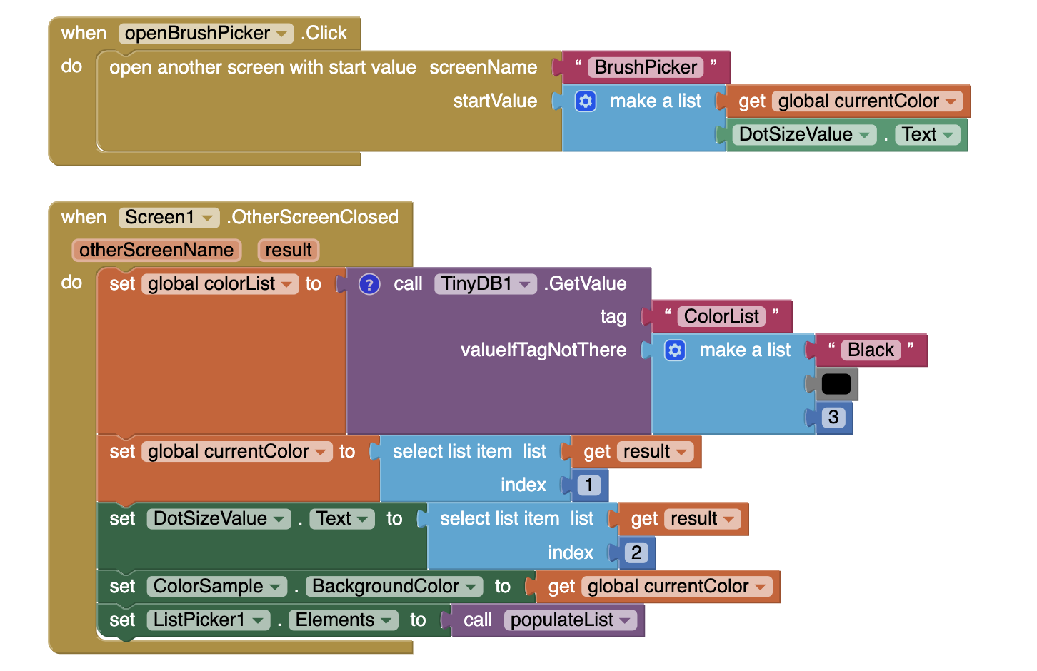
ColoredDots uses open another screen with value to open Brush_Picker with values passed to it from Screen1. The other screen then accesses these opening values using get start value blocks. In general, a screen opens another screen with open another screen and gets a result back through the when other screen closed event. In this case, the values are passed from Screen1 to Brush_Picker so the app can keep track of how many colors are stored and what the current values are.
Sharing data via TinyDB
Besides opening screens and returning values, the different screens in a multiple screen app can communicate through TinyDB. To do this, give every screen its individual TinyDB component. Even though these will be "different" TinyDB components, they will in fact all share the same keys and values: If one screen stores a value under a key, the other screen can get that value by using the same key.
ColoredDots uses TinyDB to let you name the colors you create and save them to later use. The saving and naming will be done in Brush_Picker, as shown in the blocks later. When you open ListPicker (labelled Stored Color) in Screen1, the app uses opens the list of colors that you have stored for you to choose one and then sets the drawing color to the result. The elements are added to this list by creating the procedure populateList. As shown in these blocks, populateList iterates through the all of the stored entries in the database up to the number of stored colors and adds them to the list tinyDBlist. It returns this list, which ListPicker1 points to.
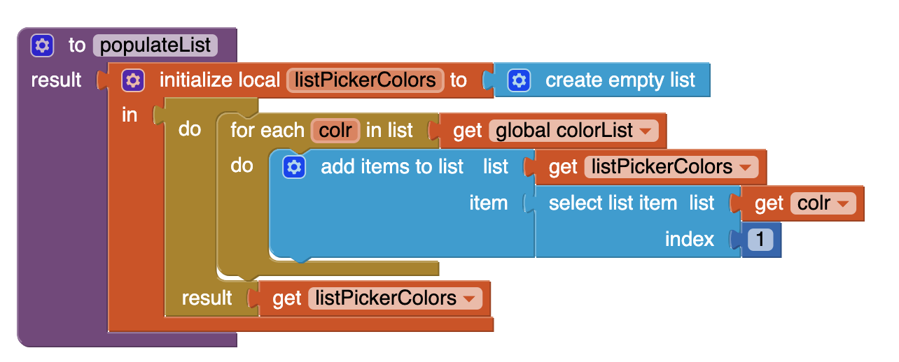
Now that populateList has been created, add the following to Screen1.Initialize and Screen1.OtherScreenClosed :
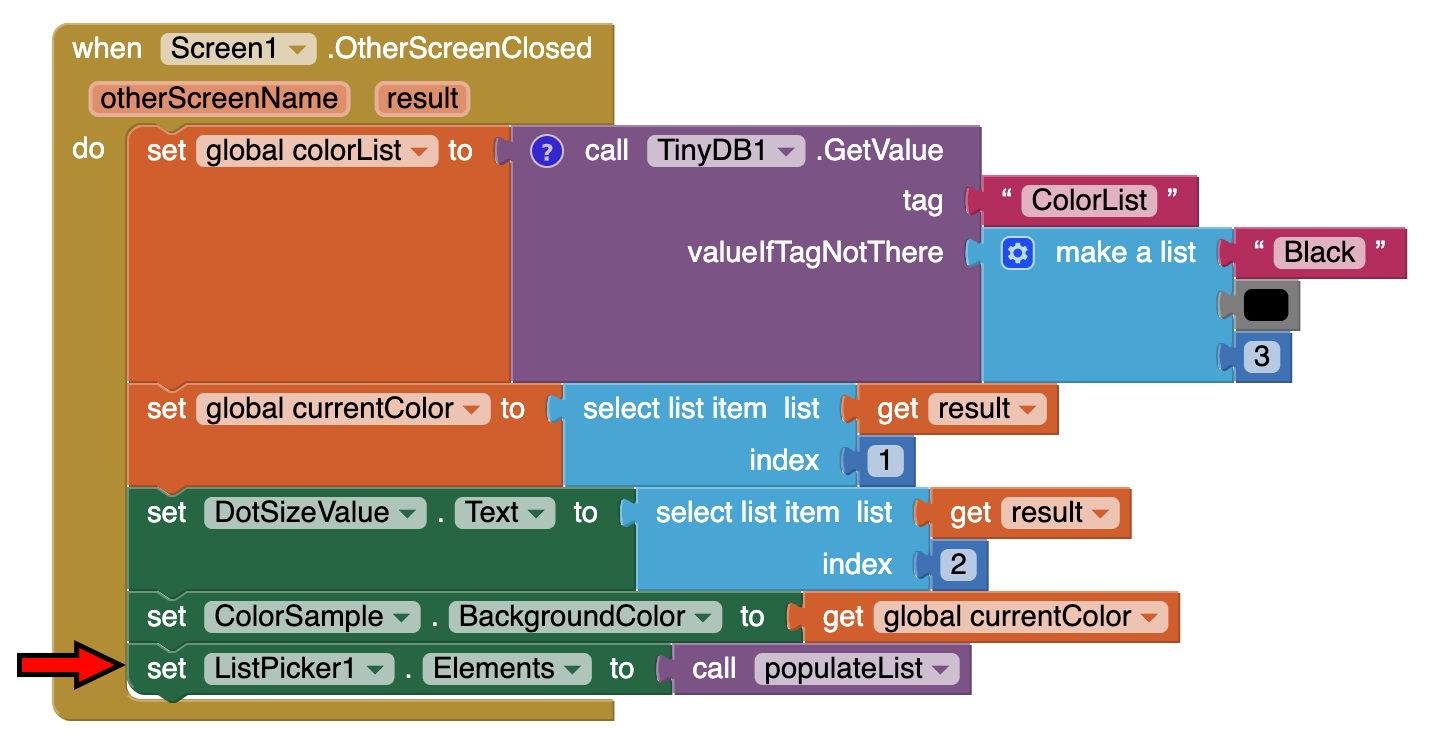
When ListPicker is opened, you will see a list of all the colors you created. ListPicker1.AfterPicking sets the Color value stored for that name to be the current drawing color and then sets the current color swatch to that color, as shown here.

Blocks for the Brush_Picker screen
The main job of Brush_Picker is to create a color from the red-green-blue values entered in the text boxes and provide that color to Screen1. One thing the Brush_Picker needs to check is that it's using good values for colors and dot size. Each of the red, green, blue values should be a number between 0 and 255. But you could have entered anything in those text boxes. The checkColor procedure takes a value and limits its range to between 0 and 255. If it's less than 0 (or not a number at all) the result will be 0. If it's greater than 255, the result will be 255.
The checkColor procedure calls the limitRange procedure. This is a general procedure that takes an input, a lower limit, and an upper limit, and restricts the input to lie within that range (and it returns the lower limit if the input is not a number). The procedure is simple, but tricky: To restrict the range, take the maximum of the input and the lower limit, then take the minimum of the result and the upper limit. This programming "trick" has little to do with multiple screens or App Inventor. You might want to take a few moments to convince yourself that it really works.
Below are the blocks for checkColor and limitRange. Remember that procedures are mutator blocks and we can use the mutator button to add (and change the names of) parameters to our procedure. To review mutators, check out the mutators page.
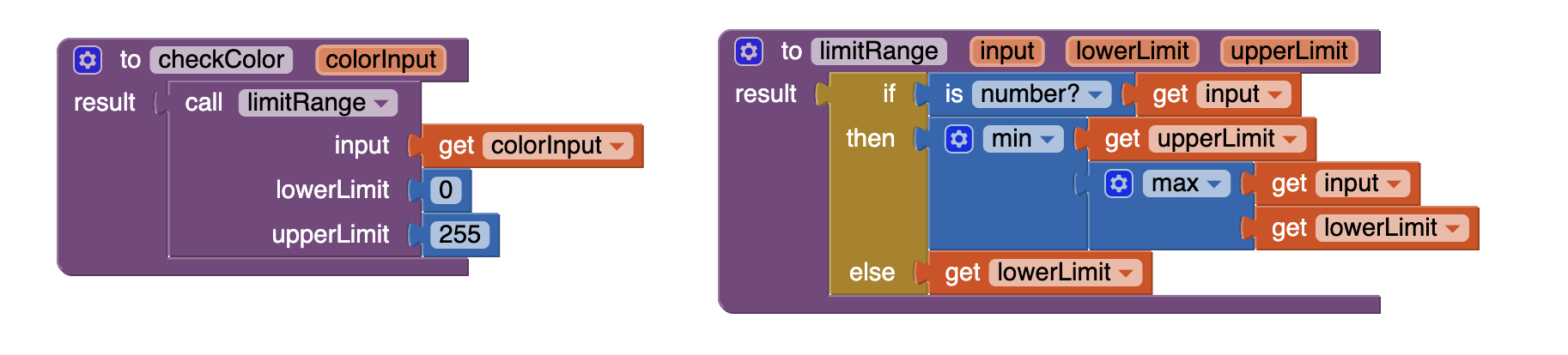

Now, we will use those two procedures to create the rest of the blocks for Brush_Picker. When you click ReturnToPainting, the new color, the new dot size (taken from the RadiusTextBox), and the total number of colors are returned to Screen1 as a three-item list. As mentioned before, when Brush_Picker is open, Screen1 passes its values of the current color, the number of colors, and the current dot radius size. Brush_Picker uses get start value when it is initialized to access these values.
When you click the TestColorButton, the color is created for you as the background of LabelTestColorSample and the Canvas shows a circle of the appropriate size and color. To return the list to Screen1, Brush_Picker uses close screen with value, which takes as an argument the value to be returned (in this case, the list). When a screen closes, the app returns to the screen that opened it.
Here are the blocks that do this. Brush_Picker uses the procedures CheckColor and LimitRange to ensure that the values entered in the text boxes are valid numbers for colors and dot size.

When TestColorButton is clicked, is displays the created color. Notifier1 is then used to give you a choice to save the color or cancel using the Notifier1.ShowChooseDialog block. The response from this will trigger further Notifier events so that you can save the color.
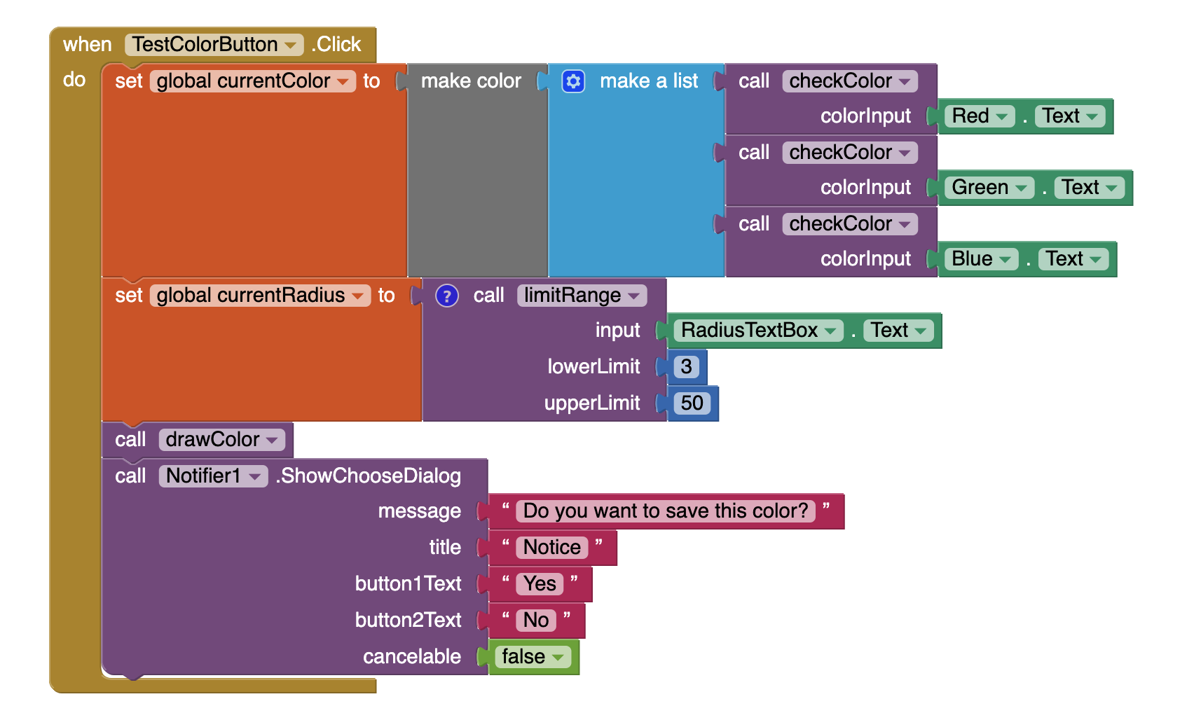
The next blocks show how Brush_Picker associates a name with a color for use by Screen1. The Notifier1.ShowChooseDialog block triggers a Notifier1.AfterChoosing event. In these blocks, the ifelse block checks the response to whether or not the color should be saved. If the response is "OK," Notifier1.AfterChoosing calls Notifier1.ShowTextDialog which prompts you to store a name for this color.
Once you make your entry, the color is stored with two tags two ways in TinyDB1. First, it stores the name with the current number of colors as the key. This is used when iterating through the list of colors for ListPicker in Screen1 so that the names will be displayed for the user. Secondly, the color is stored in TinyDB, using the name you entered as a key. Screen1 can then retrieve the color using its own TinyDB component and access it via the stored name as chosen in ListPicker.
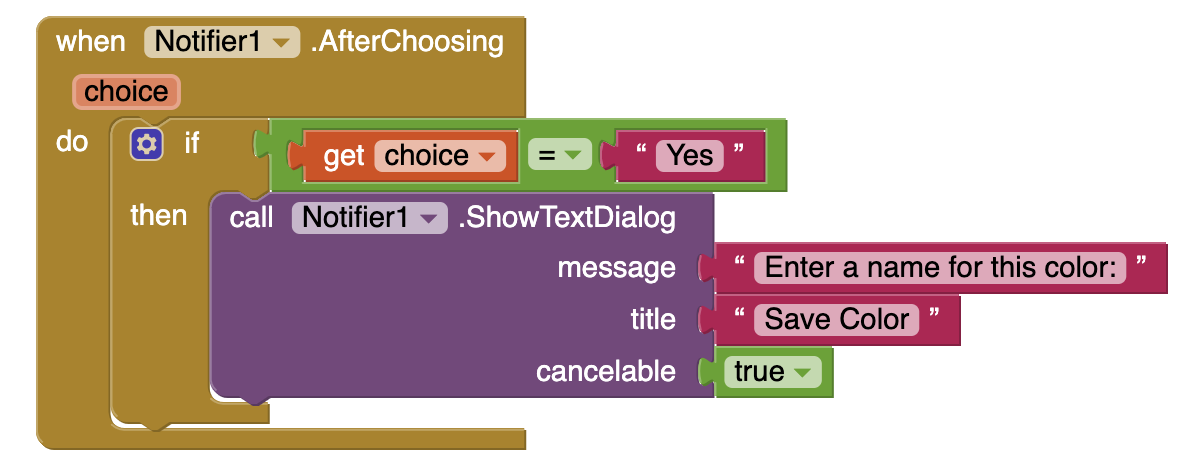
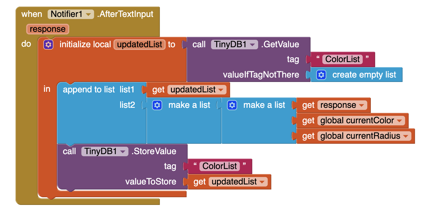
The Reset button allows the user to clear all of the entries in the red, green, and blue fields so they can start over easily. The blocks for this are shown here:
Note: you can use copy paste (ctl-v and ctl-c) after creating the first set Red.Text then you can use the dropdown to change from red to green to blue.
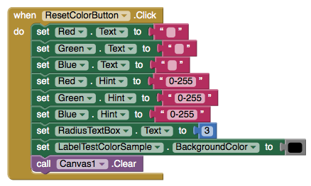
Comments on multiple screens
You can have many screens in an App Inventor app, but a screen always returns to the screen that opened it. On the other hand, you can get the effect of screens switching to arbitrary other screen by setting up a "manager screen" that is used for opening all the other screens. When a screen wants to switch, it returns to the manager with a value saying which screen to open next.
Testing the behavior. App Inventor 2 allows multi-screen app testing during live development, however it is not fully functional when passing values between screens. REMEMBER, you actually have to package the app to your phone or emulator to test the multi-screen switching behavior.
Further exploration
Now that you are able to create your own colors and access them for drawing, try some variations!
- Make Brush_Picker warn the user if they are trying to store a color with the same name as something that has already been stored (e.g. don't let them make two colors named "red").
- Have the starting color be the last one that the user was using in the app instead of always starting with black.
Summary
In this tutorial you have learned:
- How to make an app with multiple screens
- How to share data between those two screens using TinyDB
- How to use a counter to add all of the values in TinyDB to add to a list.
- How to use ListPicker to select from a list of items
This tutorial is based on work by Eni Mustafaraj of Wellesley College.

Done with Colored Dots? Return to the other tutorials here.
Tutorial Version:
Tutorial Difficulty:
- Advanced
Tutorial Type:
- Drawing Canvas
- Multiple Screens
- Data Storage
Pizza Party with Fusion Tables for App Inventor 2
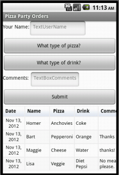

In this tutorial, you will create an app that allows people to enter food orders for a pizza party. Orders are stored in a Fusion Table, providing one easy-to-access place for the data. By reading from the table, the app can easily display the orders that have been entered.
A Fusion Table is a Google service to support the gathering, managing, sharing, and visualizing of data. Data is stored in Google's cloud. All of the data are stored in a public table (or tables) that can be accessed via Google Drive, and allows different users to add information to the tables.
For example, coupled with a location sensor, an App Inventor app could post periodic updates of each user's location to a public fusion table. Users could post notes to mark noteworthy locations, such as a team of botanists could use a Fusion Table app to create an annotated catalog of the trees or plants within a certain geographical area. See the Google Documentation on Fusion Tables for more information.
This tutorial introduces:
- Using the FusionTables component
- Using a WebViewer component
This tutorial assumes you are familiar with the basics of App Inventor, including using the Component Designer to build a user interface, and using the Blocks Editor to specify the app's behavior. If you are not familiar with the basics, try stepping through some of the basic tutorials before continuing.
IF YOU DOWNLOAD THE SOURCE CODE you will need to supply your own service account keyfile and email, and your own Table URL and Table ID in the global variables in the blocks editor. This source code will not work without these additions.
Setting up a Service Account
Before App Inventor can access any fusion tables you create, you need a special "Service Account Email Address." This special account and its keyfile allows your users to edit your Fusion Tables without logging in- your service account handles all the access. Instructions are here:
How to create a Service Account for Fusion Tables
Creating your own Fusion Table
Creating your own Fusion Tables is as easy as creating a Google document.
- On the web, login to your Gmail account.
- Go to Google Drive and click the red New button and navigate to More. Select Google Fusion Tables in the list of choices. (If you do not see Google Fusion Tables in the menu, click +Connect more apps. Scroll down until you find Fusion Tables and hover over it. Click the + Connect button, then click OK. Now, when you click the New button, Fusion Tables should appear. If not, then you may need to contact your school's network administrator. See Troubleshooting section at the bottom of this page.)
- You will be given a few different options for the new table. Select Create empty table.
- You will see that the new table automatically comes with four columns. Change the column names for your pizza party app by going to Edit > Change Columns.You'll rename the four default columns to Date (type=Date), Name (type=Text), Pizza (type=Text), Drink (type=Text). Click save and then add a fifth column by going to the Edit > Add Column. Name this fifth column Comment (type=Text).
- Leave this window open so that you can come back and get the URL, which you'll need when you set up the properties of the WebViewer component in your app.
Share the Fusion Table with the Service Account
The service account acts as a virtual user who can read and edit the table. This prevents your user from having to log in.
- In the Fusion Table, click "Share"
- Find "Invite people"
-
Enter your service account email, from the Developer Console (e.g.
)
- Ensure "Can Edit" is selected.
- Unlick "notify people" (the service account isn't a real person so it doesn't care about the notification)
- Click "OK", and when it says "skip sending notification?" click "OK".
Building the App
Connect to the App Inventor web site and start a new project. Name the new project PizzaParty, set the screen's orientation to Portrait and uncheck the Screen's scrollable property. You may also wish to set the Screen's Title property to something other than 'Screen 1'.
The User Interface
In addition to the FusiontablesControl component, the Pizza Party app makes use of several other types of components. It is assumed that you have learned how to use these in previous tutorials. Use the designer window to create the interface for the Pizza Party. When completed, the designer should look like this:
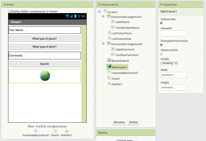
The components are:
| Component Type | Palette Group | What you'll name it | Purpose of Component | Settings of Component |
| Label | User Interface | LabelName | Shows the text "Your Name:" | |
| TextBox | User Interface | TextBoxUserName | Gets input from user | Set the width property to Fill Parent |
| HorizontalArrangement | Layout | HorizontalArrangement1 | Contains Name Label and Textbox | |
| ListPicker | User Interface | ListPickerPizza | Accesses the list of available pizza types. |
Set the Width property to Fill Parent Set the Text property to "What type of pizza?" Set the ElementsFromString to "Cheese, Pepperoni, Anchovies, Hawaiian" |
| ListPicker | User Interface | ListPickerDrink | Accesses the list of available drinks. |
Set the Width property to Fill Parent Set the Text property to "What type of drink?" Set the ElementsFromString to "Coke, Diet Coke, Sprite, Ginger Ale" |
| Label | User Interface | LabelComment | Shows the text "Comments:" | |
| TextBox | User Interface | TextBoxComments | Takes user input | Set the width property to Fill Parent |
| HorizontalArrangement | Layout | HorizontalArrangement2 | Contains Comments Label and Textbox | |
| Button | User Interface | ButtonSubmit | Adds new data to the public fusion table |
Set the Text to "Submit" Set the width property to Fill Parent |
| WebViewer | User Interface | WebViewer1 | Displays Fusion Table |
Set width property to Fill Parent Set height property to Fill Parent |
| FusiontablesControl | Storage | FusiontablesControl1 | Manages interactions with the app's Fusion Table | |
| Clock | User Interface | Clock1 | Used to provide a timestamp each time an order is placed. | |
| Notifier | User Interface | Notifier1 | Notifies the user of any errors |
Determining your Fusion Table URL and Table ID
In the blocks editor, you will set the WebViewer component's HomeURL property to point to the URL of your table. To find your Fusion Table's URL:
- In your browser, navigate to the Fusion Table you just created.
- Go to the menu and select Tools > Publish.
- You'll see a notice saying: "This table is private and will not be visible". Click the blue link that says "Change Visibility".
- In the list of "Who Has Access", click the blue "Change..." link next to "Private - Only people listed below..."
- Choose"Public on the Web" or "Anyone with the link". Either of these settings will work for this tutorial. In the future, you should decide this setting based on the sensitivity of your data.
- Click the green Save button, then the blue Done button.
- Back on the Fusion Table page, go to the menu bar and select Tools > Publish. Select the URL from the top text box (labeled "Send in an email or IM"), copy the URL and return to App Inventor. You will paste the URL into the definition block for the TABLE_URL (see below).
- You can find the Table ID by browsing to your table, then selecting File > About this table in the menu.
Upload your .p12 key file
In the designer, upload the the key file you downloaded from the Developer Console. Upload it under Media, the same way you would upload an image file.
Click on the FusiontablesControl1 component, and find the KeyFile property. Click where it says "none" under KeyFile, and select the .p12 file you previously uploaded.
Blocks Editor
Open the Blocks Editor so you can program the app's behavior. First, you will describe the app's variables. Variables whose names are ALL_CAPS are constants -- that is, variables whose values do not change while the program is running. It is good to get into the habit of using this naming convention. Define the following variables and give them the initial values shown in the table.
| Block type | Drawer | Purpose |
| initialize global TABLE_URL | Variables | Initialize this global variable to the "published" URL of your fusion table. See instructions above. |
| initialize global TABLE_ID | Variables | Initialize this global variable to your table ID (e.g. a long string of characters unique to your fusion table). See instructions above. |
| initialize global SERVICE_ACCOUNT_EMAIL | Variables | Initialize this global variable to the own service account ID (email address) for you service account. To find this, go to your developer console and select IAM & Admin from the three horizontal lines menu at the upper left. You should see your service account listed (there might be only one) together with its email address (service account id). |
| initialize global UserName | Variables | Records the name of the user. (Starts off as an empty text string.) |
| initialize global pizza | Variables | Stores the pizza choice input by the user. (Starts off as an empty text string.) |
| initialize global drink | Variables | Stores the drink choice input by the user. (Starts off as an empty text string.) |
| initialize global comment | Variables | Stores the comment input by the user. (Starts off as an empty text string.) |
Initializing the App
It is important to perform some initialization steps whenever the app is started. These are done in the Screen1.Initialize block. For this app we need to set the initial values for the FusionTable component's service account property (set to global SERVICE_ACCOUNT_EMAIL) and the WebViewer component's HomeURL property (set to global TABLE_URL).
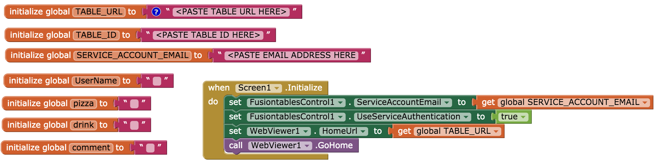
Set up the resetForm procedure as shown below. After recording an entry, this procedure resets the interface back to the original state.
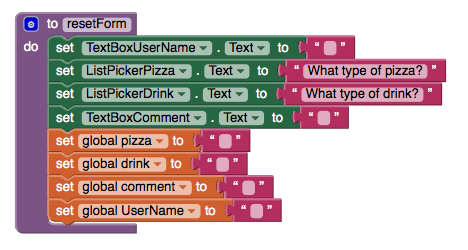
List Picker Blocks
In the designer, you set the choices for the pizza and drink types by filling in the "Selection" property with comma separated lists. These pre-programmed choices will be displayed on the user interface so the user can select their food and drink. Their selections are stored in the pizza and drink variables.
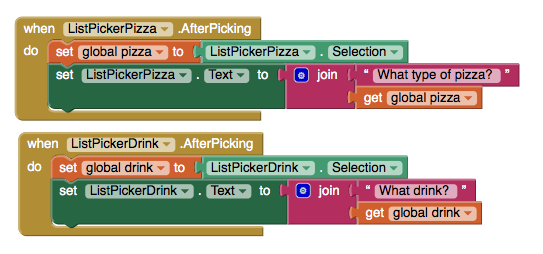
Inserting Data into the Fusion Table
The FusiontablesControl component is used to send the data to the Fusion Table. This action will create a new row in the Fusion Table, setting the values of the various columns involved. App Inventor makes this easy to do, but you have to be careful that the insert query is formatted correctly.
First there is a list of column names, followed by a list of values. The order of the column names and value names must be in the same order so that they match up. An example of what this might look like is shown below.
First, setup a new Procedure With Result that takes a string as an argument and returns that same string surrounded by single quotes. The procedure quotify is used in the InsertDataInTable procedure to place quotes around all of the values in the query. It also takes care of "escaping" any single quotes or apostrophes that are input by the user. You can send single apostrophes as part of a value in the query, so the "replace all" block adds an extra single quote. Two single quotes in a row are interpreted as one single quote. The figures below show how to make the procedure. Notice that you have to tell the procedure block to add a parameter. You do this with the blue icon that pops up a small window where you specify how many items you need to act as parameters. In this case, you just need one. App Inventor will automatically name the parameter "x" but you can rename it to "str" by clicking on the x and typing directly into the block. Similarly, you can rename the procedure from "procedure" to "quotify" by typing directly into the block.
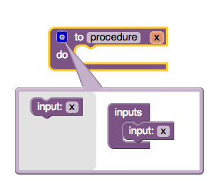
Use the Fusion Table component's InsertRow block. To construct the list of values, we use App Inventor's join text block.
For this app, the column names must match the column names of the table we created earlier (with columns Date, Name, Pizza, Drink, Comment). Their respective values are taken from the procedure's global variables. Note: If you did not use these exact words for your table's columns, then be sure to use your table's column names when you build your query.
Submitting Data
Once the user has entered their name, food choices, and comments, they will click the Submit button. The app tests to make sure that the name, pizza, and drink fields have values in them, and prompts the user to try again if any of the required answers are missing. Notice that the compare texts block is used (find it under Built-in palette, Text drawer). This block compares two strings of text to see if they are equal. If all required information is present, it calls the procedure InsertDataInTable (see below). The blocks for the ButtonSubmit.Click are shown here:

A note about Invalid Query/Parse Error Messages: There are a few different reasons your app may get a response from Fusion Tables that gives an Error related to Parsing or Invalid Query. This could be because you are missing spaces in the query string or have not handled single quotes (see the quotify procedure above). It may also be that you have used one of the Fusion Table RESERVED WORDS as a column name (More info about reserved words).
Handling the Response from the Fusion Tables Service
The FusiontablesControl.GotResult event will be fired when the app receives a response from Google's Fusion Tables Service. For an insert query, the service will return the rowID of the new row that was inserted or an error message if something went wrong. In this simple example, we use the "contains" block (find it under Built-in palette, Text drawer) to check whether the result string has the rowID in it. If so, then we know that the rowID was received, and we then invoke the WebViewer.GoHome procedure, which reloads the "HomeURL" as specified in the WebViewer's properties. Note that this set of blocks also calls the resetForm procedure. After recording an entry, it resets the interface back to the original state.
You're done! Package the app by going to Package for Phone on the Designer. You can now test the app for the purposes of the pizza party. Once you understand this tutorial, you'll be ready to make new Fusion Tables and modify the app to collect different types data from users.
Challenges
This app has the Fusion Table hard-coded into the blocks. Find a way to let users specify their own Fusion Table ID so that they can host their own Pizza Party.
Variations
Now that you have a simple app that uses Fusion Tables and a WebViewer, you might want to build some other apps with Fusion Tables. For example:
- Include a LocationSensor so that the user's location can be added to the Fusion Table to create a map with notes.
- Make the WebViewer display something other than the table of stored values, like a map or a chart.
Troubleshooting
If you are using a Google Apps for Education account, and you are not able to create a new Fusion Table (in the "Create" menu of Google Drive you won't even see an option for Fusion Tables), you will need to ask your system administrator to turn this option on for you. Or, you can switch to a standard Gmail account. Fusion Tables are not automatically turned on for Google Apps for Education Accounts, your system administrator must make Fusion Tables available to the accounts in your domain.
If you are receiving errors when trying to submit to the Fusion Table, especially if the error mentions Authentication, be sure that you have put the correct service account email address in set, either as a variable that is set during Screen1.Initialize, or in the property field on the FusionTables component in the Design Window. Also make sure the key file (.p12) is uploaded as media, and the KeyFile property in the Design Window is set to that file.
If you are getting an error that says "403 Forbidden" with no other detail, make sure the fusion table is shared with your service account email. The service account email comes from your developer console, and looks like
. It is not the same as your usual google account email.
To familiarize yourself with Fusion Tables, have a look around the Fusion Tables Web Site. Check out the example gallery to see what kinds of things are possible. Work through this Fusion Table tutorial, which shows how import some data, create a Fusion Table, and view the data on a map with your browser. You'll need to log in with your Google account.
STILL HAVING TROUBLE? Check out the FusionTables Help put together by Taifun Bär: http://puravidaapps.com/fusionerror.php
Done with PizzaParty? Return to the other tutorials.
Download Source Code
If you'd like to work with this sample in App Inventor, download the source code to your computer, then open App Inventor, click Projects, choose Import project (.aia) from my computer..., and select the source code you just downloaded.
Tutorial Version:
Tutorial Difficulty:
- Advanced
Tutorial Type:
- Clock Timer
- Data Storage
NFC Cup Game for AI2
Introduction
This tutorial will demonstrate App Inventor's Near Field Communication (NFC) capabilities. You'll build an application that will simulate the shell game by writing messages to NFC tags in setup mode and reading them in play mode. In order to get the full experience from this application, you will need to purchase readable, writable, NFC tags.
IMPORTANT: Applications built with the NFC component will not respond to tags while in live development mode. To test your application, you must build your app and download the APK to your phone. (How do I build an APK?)
Getting Started
Go to the App Inventor website, begin a new project titled 'BallShuffle', and connect your phone. Download the following images onto your computer and upload them into your project. (Right-click or ctrl-click and choose Save Image. Remember where you put them!)

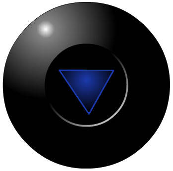
Set up the Components
The user interface will consist of a menu at the top that lets you switch between the “setup” and “play” modes, a menu that will appear during setup mode and disappear during play mode, and in image that will change based on NFC input and output.
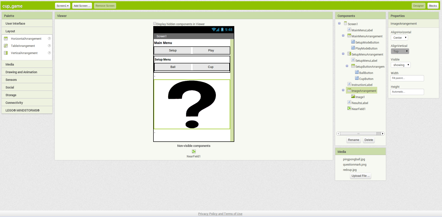
| Component Type | Palette Group | What You'll Name It | Purpose of Component | Component Settings |
| Label | User Interface | MainMenuLabel | Title bar for main menu | Text: Main Menu; Font: Bold; Fontsize: 16 |
| HorizontalArrangement | Layout | MainMenuArrangement | Line up two "mode" buttons side by side | Width: Fill Parent; Height: Automatic |
| Button | User Interface | SetupModeButton | Change to setup mode | Text: Setup; Width: Fill Parent |
| Button | User Interface | PlayModeButton | Change to play mode | Text: Play; Width: Fill Parent |
| VerticalArrangement | Layout | SetupArrangement | Width: Fill Parent; Height: Fill Parent | |
| VerticalArrangement | Layout | SetupMenuArrangement | Line up the setup menu options | Width: Fill Parent; Height: Fill Parent |
| Label | User Interface | SetupMenuLabel | Title bar for setup menu | Text: SetupMenu; Font: Bold |
| HorizontalArrangement | Layout | SetupButtonArrangement | Hold the buttons for setup menu | Width: Fill Parent; Height: Fill Parent |
| Button | User Interface | BallButton | Lets user define NFC tag as "ball" | Text: Ball; Width: Fill Parent |
| Button | User Interface | CupButton | Lets user define NFC tag as "cup" | Text: Cup; Width: Fill Parent |
| Label | User Interface | InstructionLabel | Give the user instructions for the mode they are in | Text: -; Width: Fill Parent |
| Image | User Interface | Image1 | Place holder for images | Height: 200 pixels; Width: Fill Parent; Picture: questionmark.png |
| Horizontal Arrangement | Layout | ImageArrangement | Allows you to center the image | AlignHorizontal: Center; Width: Fill Parent; |
| Label | User Interface | ResultsLabel | Show results of user's actions | Text: -; Width: Fill Parent |
| NearField | Sensors | NearField1 | Gives access to NFC capabilities | ReadMode: checked; |
Add Behaviors to the Components
We're going to build all of the menus and make the menus work, then we'll modify them to incorperate the NearField component.
To start, we're going to create several variables to make it easier to reference text that will be reused throughout the application:
Next we're going to define the initialization behavior and define the button behavior:
When the screen is initialized, we want the app to display the question mark picture and the setup instructions. Since the SetupMenuArrangement is initially set to visible, we don't have to address it in the Screen1.Initialize block. When the user clicks on the SetupModeButton or on the PlayModeButton, then we want to change the SetupMenuArrangement to visible or invisible respectively. In addition, when the user clicks one of these two buttons, we want to make sure that the correct instructions for that mode is displayed and that the image resets to the question mark picture. When the user clicks on BallButton, we want the image to a change picture of the ball and the CupButton should change the image to a picture of the cup.
The blocks should look like the image below and the buttons should correctly toggle all of the images
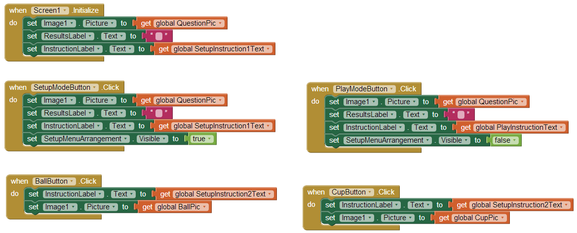
Now that the interface works correctly, we're going to add the NFC functionality to the app. We're going to modify the 5 blocks by adding the correct NFC behavior to each one. This will make the buttons turn on read mode when the
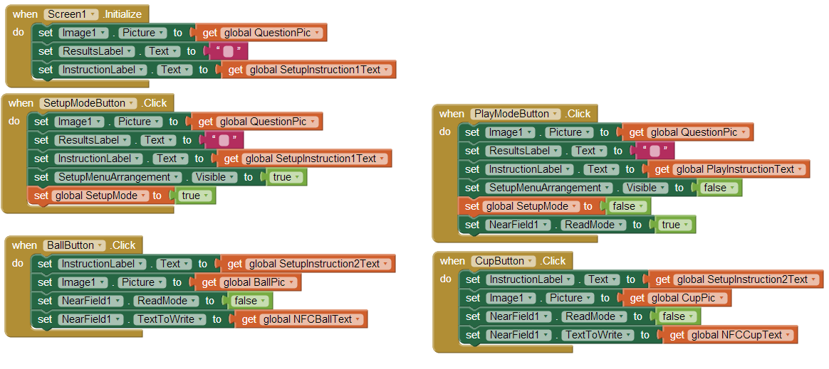
Now, we define the app's behavior when a tag is written. When the app writes a tag, we want the the instructions to update, we want the picture to reset, and we want to change NearField1.ReadMode to true so that the tag isn't accidentally overwritten.
Finally, we're going to define the tag read block which contains the majority of the logic for the app. If the app is in play mode and it reads a tag that says "ball," then it will display the victory message and show a picture of a ball. If it reads "cup," then it will display the loss message and show a picture of a cup. Finally, if it doesn't recognize the message, it will display an error message and append the message to the end.
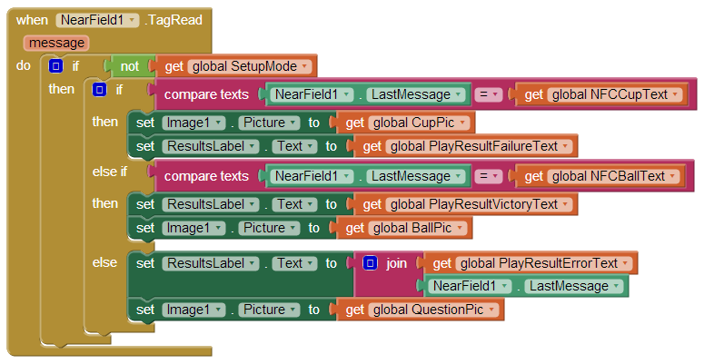
Finally, here's a screen shot of the entire completed app
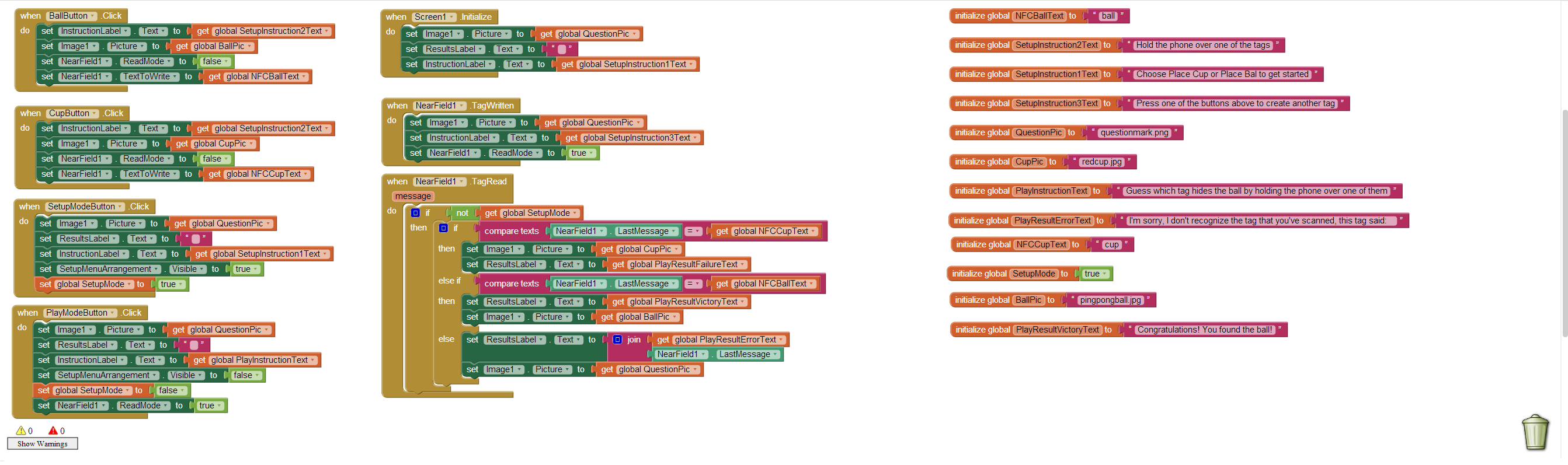
Download Source Code
If you'd like to work with this sample in App Inventor, download the source code to your computer, then open App Inventor, go to the My Projects page, and choose More Actions | Upload Source.
Done with CupGame? Return to to the other App Inventor 2 tutorials here.
Tutorial Version:
Tutorial Difficulty:
- Advanced
Tutorial Type:
- NFC (Near Field Comm.)
- Game
Android, Where's My Car? for App Inventor 2
Android, Where's My Car?
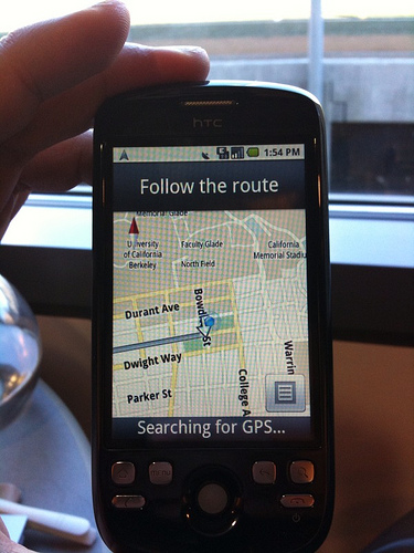
You parked somewhere near the stadium, but when the concert ends you don't have a clue where the car is. The friends you came with are equally as clueless.
Fortunately you haven't lost your Android phone that never forgets anything, and you remember you have the hot new app, Android, Where's My Car?. With this app, you click a button when you park your car, and the Android uses its location sensor to record the car's GPS coordinates and address. Later, when you reopen the app, it shows you a map from where you are to the remembered location-- problem solved!
Photo licensed under Creative Commons
Getting Started
The app demonstrates how to communicate with the Android location sensor, how to record data in the phone's long-term memory (database), and how you can open the Google Maps app from your app to show directions from one one location to another. It makes use of the following App Inventor components:
- Location Sensor
- TinyDB -- to store the data
- ActivityStarter -- to open a map
The User Interface
Here are the components for the Android, Where's My Car? app, as shown in the Component Designer:
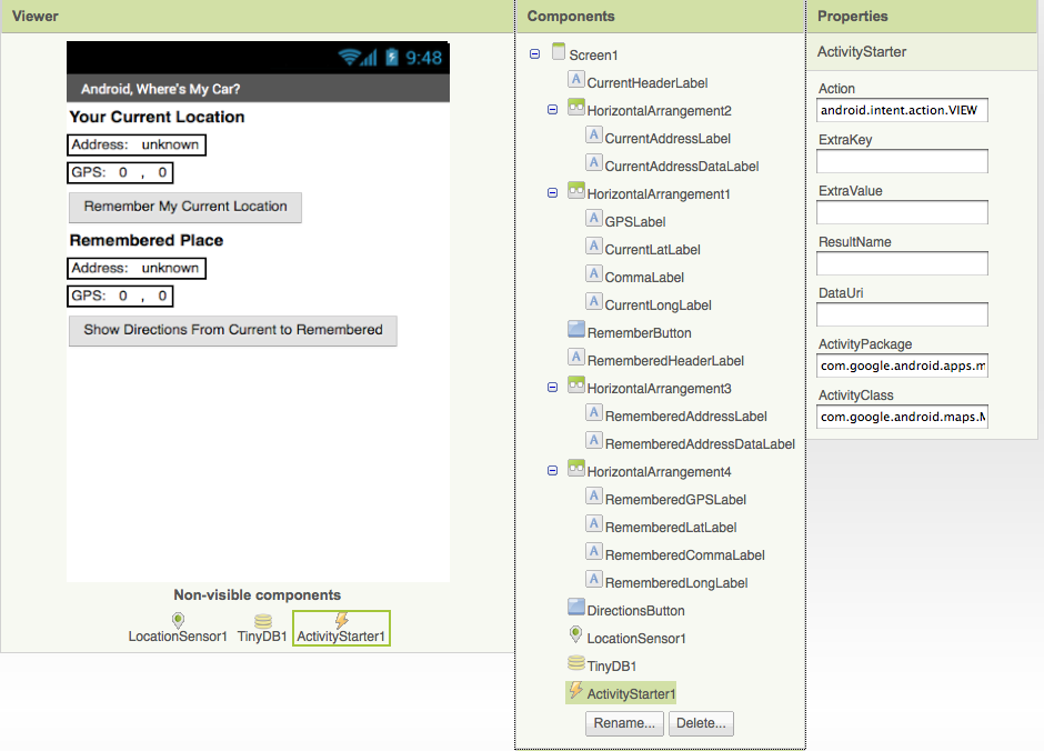
The user interface consists of labels to show location data and buttons to initiate events. Some labels just show static text, e.g., GPSLabel is the text "GPS:" that appears in the user interface. Others, such as CurrentLatLabel, will display dynamic data one the location sensor gets its readings. For these labels, a default value is set (0) here in the Component Designer.
The ActivityStarter1 component is used to launch the map when the user asks for directions. Its properties are only partially shown above. Here is how they should be specified:
| Property | Value |
| Action | android.intent.action.VIEW |
| ActivityClass | com.google.android.maps.MapsActivity |
| ActivityPackage | com.google.android.apps.maps |
The App's Behavior
Here are the blocks for the Android, Where's My Car app (the yellow annotations will also appear when you load this app into App Inventor):
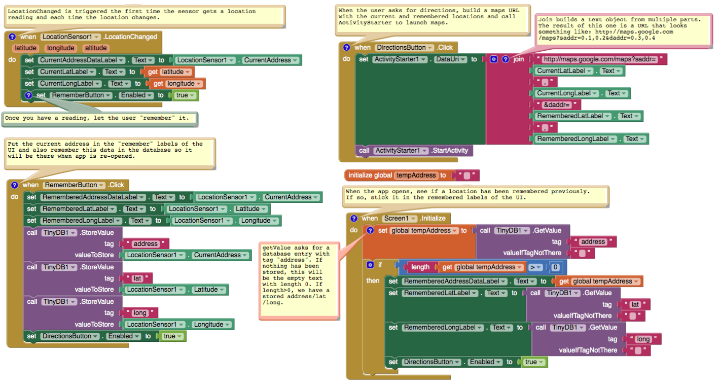
Let's examine the four different event-handlers of the app, starting in the top-left and working around in counter-clockwise order.
LocationSensor1.LocationChanged: This event occurs when the phone's location sensor first gets a reading, or when the phone is moved to produce a new reading. The event-handler just places the readings--latitude, longitude, and current (street) address-- into the corresponding "Current" labels so that they appear on the phone. The RememberButton is also enabled in this event-handler. Its enabled setting should be unchecked in the Component Designer because there is nothing for the user to remember until the sensor gets a reading.
RememberButton.Click: When the user clicks the RememberButton , the location sensor's current readings are put into the "remember" labels and stored to the database as well. The DirectionsButton is enabled as it now makes sense for the user click on it to see a map (though it will make more sense once the user changes location).
DirectionsButton.Click: When the user clicks the DirectionsButton , the event-handler builds a URL for a map and calls ActivityStarter to launch the Maps application and load the map. join is used to build the URL to send to the Maps application. The resulting URL consists of the Maps domain along with two crucial parameters, saddr and daddr , which specify the start and destination for the directions. For this app, the saddr is set to the latitude and longitude of the current location, and the daddr is set to the latitude and longitude of the location that was "remembered" (the location of your car!).
Screen1.Initialize: This event is always triggered when an app opens. To understand it, you have to envision the user recording the location of the car, then closing the app, then later re-opening the app. When the app re-opens, the user expects that the location remembered earlier should appear on the phone. To facilitate this, the event-handler queries the database (call TinyDB.GetValue). If there is indeed a remembered address stored in the database-- the length of the stored address is greater than zero--the remembered latitude, longitude, and street addres are placed in the corresponding labels.
Variations
- Create "Android, Where is Everyone?", an app that lets a group of people track each other's whereabouts. Whether your hiking or at the park, this app could help save time and even lives.
- Create a "breadcrumb" app that tracks your (phone's) whereabouts by recording each location change. One interesting refinement would be to only record a new "breadcrumb" if the location has changed by a certain amount.
Review
Lines and paragraphs break automatically.
Here are some of the ideas covered in this tutorial:
- The LocationSensor component can report the phone's latitude, longitude, and current street address. Its LocationChanged event is triggered when sensor gets its first reading and when the reading changes (the phone has moved).
- The ActivityStarter component can launch any app including Google Maps. For Maps, you set the DataUri property to the URL of the map you want to display. If you want to show directions, the URL will be of the form: http://maps.google.com/maps/?saddr=0.1,0.1&daddr=0.2,0.2, where the numbers are GPS coordinates.
- join is used to piece together (concatenate) separate text items into a single text object. It allows you to concatenate dynamic data with static text. With the Maps URL, the GPS coordinates are the dynamic data.
- TinyDB allows you to store data persistently in the phone's database. Whereas the data in a variable or property is lost when an app closes, the data you store in the database can be loaded into your app each time it is opened.
Scan the Sample App to your Phone
Scan the following barcode onto your phone to install and run the sample app.

Download Source Code
If you'd like to work with this sample in App Inventor, download the source code to your computer, then open App Inventor, click Projects, choose Import project (.aia) from my computer..., and select the source code you just downloaded.
Tutorial Version:
Tutorial Difficulty:
- Advanced
Tutorial Type:
- Activity Starter
- Data Storage
- GPS
Map It: Displaying Locations on a Google Map
This tutorial shows how you can develop an app that allows you to record list of addresses and view the address on the Google Maps. It will also show you how view your current location on the Google Map. This tutorial assumes you have completed the basic tutorials of App Inventor. For basic and intermediate tutorials, click here.
Introduction
This tutorial introduces:
- List manipulation – creating lists, appending items to lists
- ListPicker – adding items to lists, saving list data
- LocationSensor – detecting current location for displaying on Google Maps
- ActivityStarter – used to start-up Google Maps for current or predefined address
- Notifier – displaying messages
- TinyDB – saving data into a persistent database
- Misc. – text manipulation, basic validation
We will be working toward the design shown in figure blow:
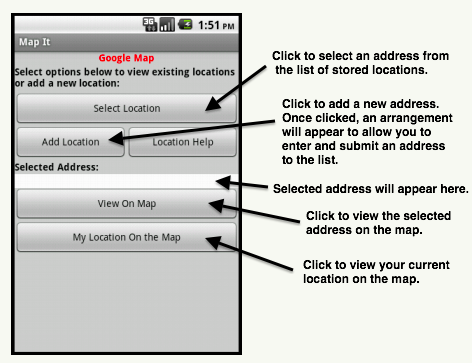
The figure below shows how the components are arranged in the design editor. It also shows you the non-visible components (e.g. TinyDb, ActivityStarter, LocationSensor, Notifier) that are used in the app.
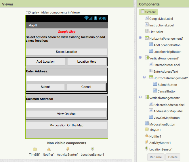
Blocks
We define 2 global variables.
- tagAddress – a variable that is a constant and will be used, as a tag, for storing and retrieving data from our database.
- listLocations – a variable that can be used to store and manipulate list of addresses.
We now create a procedure that can be invoked when the app is started (initialized). The procedure sets up the initial state of some of the components. Some of these settings could have been done from the design editor, but for demo purpose and clarification, we are using a procedure. In the procedure, we also check our database to find out if there are any stored addresses. If no data, then we just use an empty list.
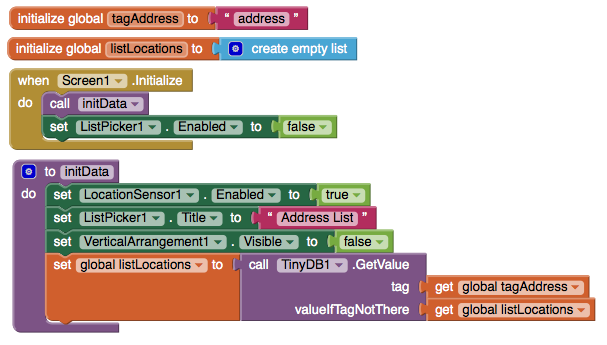
Adding a New Addresses
We use AddLocationButton to add a new address, CancelButton to cancel the process of adding, and LocationHelpButton to display what type of addresses can be entered. The blocks to make these actions work are here:
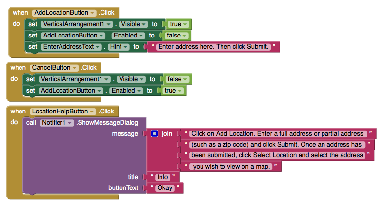
When AddLocationButton is clicked, we make our address data entry visible (using screen arrangement), allowing user to enter address. If user clicks on Cancel, we make the arrangement hidden again. Using this approach, we keep the screen simple and avoid the clutter. We also provide the SubmitButton to allow the user to indicate that they want to store data.
When the user clicks on SubmitButton, we perform basic validation to ensure data has been submitted. If validation does not pass, we display an error message. Otherwise, we invoke a procedure that appends the new address to our list. We also store the updated list into our database. Once address is added, we hide our arrangement again. The blocks below show how this logic is done:
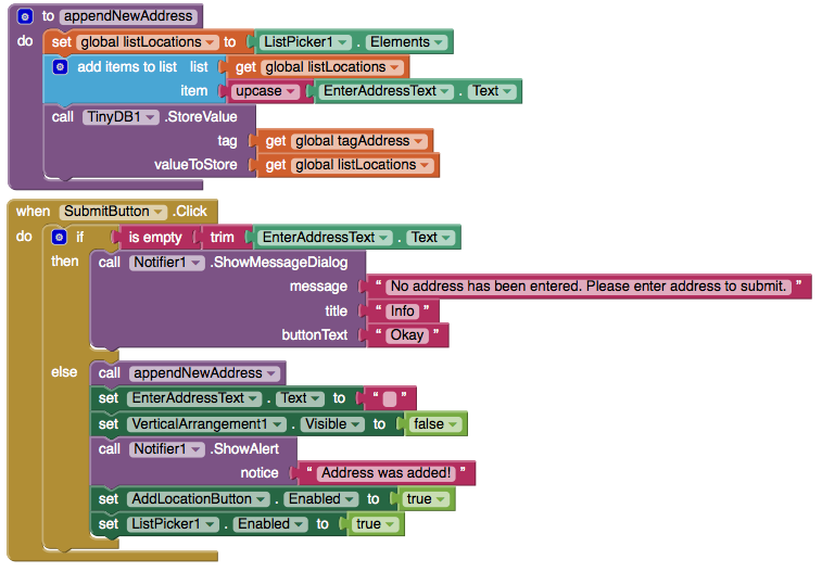
Selecting an Addresses
When the user clicks on ListPicker1 ‘Select Location’ and selects an address, this action calls the blocks below:
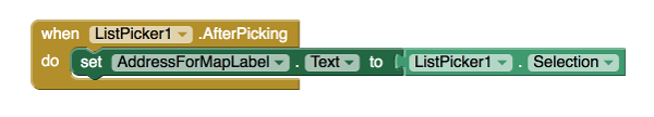
This displays the address in the device and allow the user to tap on ViewOnMapButton to see the blocks selected address on the Google Map — see the figure below:
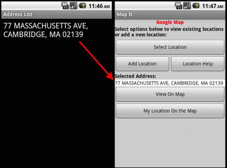
When ViewOnMapButton is clicked, we validate to ensure that an address already has been selected. If not, an error message is displayed. Otherwise, we use blocks below to show address:
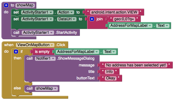
The above blocks will open the map and the output will be like image below:
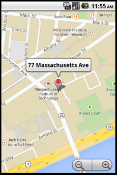
Viewing Current Location On the Map
We have dropped in a button, MyLocationButton ‘My location On the Map’ that can be clicked to view one's current location. It will use
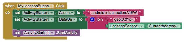
Download Source Code
If you'd like to work with this sample in App Inventor, download the source code to your computer, then open App Inventor, click Projects, choose Import project (.aia) from my computer..., and select the source code you just downloaded.
MIT App Inventor expresses its gratitude to M. Hossein Amerkashi for developing this tutorial. Visit Hossein's blog to find out more about him and his App Inventor support materials.
Tutorial Version:
Tutorial Difficulty:
- Advanced
Tutorial Type:
- ListPicker
- Data Storage
- Activity Starter
- External API
- Location Sensor
- GPS
Exploring with Location Sensor in AI2
Tutorial Version:
Tutorial Difficulty:
- Advanced
Tutorial Type:
- Location Sensor
- GPS
Oh My Spikes
This tutorial by Saj Dutta shows how to create a complete game from scratch. The game is variant of the popular spikes games and uses App Inventor sprites.
Tutorial Version:
Tutorial Difficulty:
- Advanced
Tutorial Type:
- Game
WebView Javascript Processor for App Inventor
This tutorial is written by Rich Interdonato, MIT Master Trainer.
App Inventor allows users to write powerful programs using blocks instead of “traditional” programming languages. It also allows advanced users to include traditional Java code in their apps by means of its new Extensions feature. What you might not know is that there is another, even older way for you to incorporate “traditional” programming into your apps. The technique involves using the WebViewer component as a javascript processor, and this blog post will show you how it can be done using a simple example. In it, an HTML file is sent input text from an App Inventor program, it reverses the text using javascript, and then it sends the result back to the App Inventor program as output that the app can use (show to the user in a Message Dialog).
Our example requires an HTML file that includes javascript that can reverse text. The file is included below, and the javascript command that reverses the text is highlighted in yellow. The javascript in this file is like the other javascript you might find on the Web, except in one way. It includes two special App Inventor Only functions, window.AppInventor.getWebViewString() and window.AppInventor.setWebViewString(). It is these two, App Inventor Only functions that allow your apps to communicate with the javascript that runs inside the WebViewer component. By using them creatively, you can leverage the vast number of javascript programs that are freely available on the Web, and some of them can be really useful.
For now, let’s keep things simple and create a file called javascriptWebViewProcessor.html. The complete text of the file follows:
HTML file (included as media/asset: javascriptWebViewProcessor.html)
<!doctype html>
<head>
<title>WebView Javascript Processor</title>
</head>

<body onload="processJavascript();">
<b>This page includes a javascript function that reverses text.</b>
<p>The javascript function incorporates a special App Inventor feature called <i>window.AppInventor.getWebViewString()</i>, which allows App Inventor apps to communicate with the WebViewer component's internal processing of javascript.
<p>This simple example shows how to use the <i>window.AppInventor.getWebViewString()</i> function to pass data to and from the WebViewer component, and thereby an App Inventor app.

<script>
    var result = new Date().toString();
    var appInventorInput = window.AppInventor.getWebViewString();
        function processJavascript() {
        if (appInventorInput.length > 0) {
            document.write( "WebView InputString received FROM app:
" + appInventorInput );
            result = appInventorInput.split("").reverse().join("");
            document.write( "<p/>WebView InputString sending BACK TO app:<br/>" +
            result );
        } else {
            document.write( "No WebView InputString set by app at: <br/>" + result );
        }
        window.AppInventor.setWebViewString( result );
    }
</script>

</body>
</html>
Designer
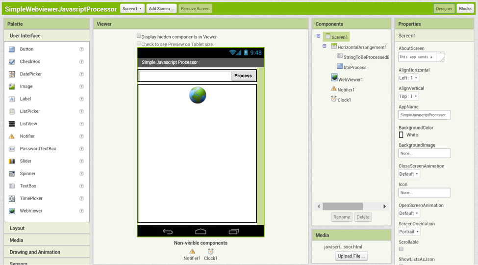
Once the javascriptWebViewProcessor.html has been created, make a new App Inventor app called SimpleWebviewerJavascriptProcessor, and upload the HTML file as an app media asset. Add a HorizontalArrangement with a:
- TextBox named StringToBeProcessedByJavascriptFile
- Button named btnProcess
Also, using the default names and properties for each, add a:
- WebViewer component
- Notifier component
- Clock component
Blocks Overview
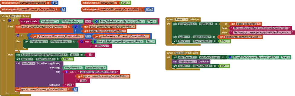
As you can see, the blocks for this app are quite simple. There are 4 variables and 3 event handlers. Each will be explained in individual sections.
Variables

processingIntervalMillis: sets the frequency of calls to the WebViewer component from the App Inventor app
debugMode: used to specify the location of the HTML file that is used by the WebViewer because App Inventor apps use different directories for development and running apps
currentProcessingDurationMillis: tracks the amount of time (in milliseconds) that the WebViewer has been working as it processes the javascript in the HTML file
maximumProcessingDurationMillis: controls the number of milliseconds that the app will wait for a reply from the WebViewer component before determining that it is unresponsive
Screen1.Initialize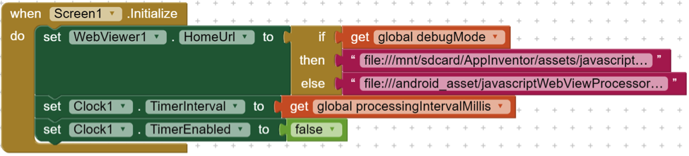
This block sets the WebViewer1.HomeUrl property to either file:///mnt/sdcard/AppInventor/assets/javascriptWebViewProcessor.html (when debugMode is TRUE), or file:///android_asset/javascriptWebViewProcessor.html (when debugMode is FALSE). It then sets the Clock1.TimerInterval property to the value of processingIntervalMillis (50ms), and disables the Clock1 component so it does not start triggering events as soon as the app starts.
btnProcess.Click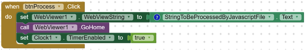
The javascriptWebViewProcessor.html file processing begins once the user activates the app. This activation is captured by the btnProcess.Click event handler block, which sets the WebViewer1.WebViewString component to the value of the StringToBeProceesedByJavascriptFile.Text. Then the WebViewer1.GoHome procedure is called, which causes the WebViewer to load the javascriptWebViewProcessor.html page, thereby starting the javascript processing. Once the javascript processing has begun, the app needs to monitor progress, and so the Clock1.TimerEnabled property is set to TRUE.
Clock1.Timer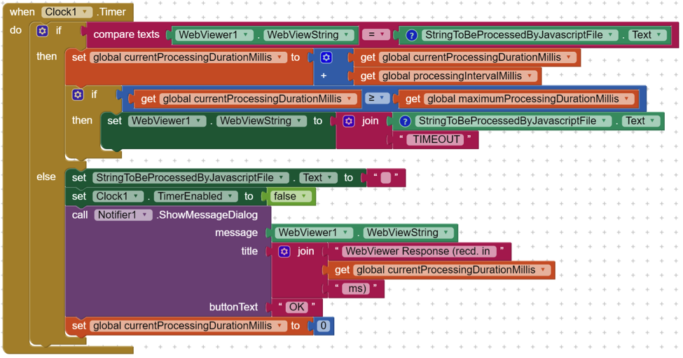
As soon as the Clock1.TimerEnabled property is set to TRUE, the Clock1.Timer event begins to fire at an interval set by the processingIntervalMillis value in the Screen1.Initialize event. Each time the Clock1.Timer event is triggered, the app first checks to see if the value of the WebViewer1.WebViewString is the same as the StringToBeProcessedByJavascriptFile.Text. If they are the same, this means that the WebViewer component is still processing the javascript, and it increments the currentProcessingDurationMillis by the processingIntervalMillis and then checks to see if the new currentProcessingDurationMillis value is greater than or equal to the maximumProcessingDurationMillis value. If it is, the app changes to value of the WebViewer1.WebViewString property (by concatenating adds the text “ TIMEOUT” to the current value of StringToBeProcessedByJavascriptFile.Text to make it different from the value of the StringToBeProcessedByJavascriptFile.Text, and thereby ensure that the next time the Clock1.Timer event is triggered, the first check will fail.
As soon as the first check fails (i.e. WebViewer1.WebViewString differs from StringToBeProcessedByJavascriptFile.Text), the app will reset the StringToBeProcessedByJavascriptFile.Text to an empty string (“”), set Clock1.TimerEnabled to FALSE, and then display a message to the user in a Message Dialog that includes the result of the javascript processing, as well as how long it took to do it. The output of the processing is available to the app in the WebViewer1.WebViewString property, which is set inside the javascript processing file. As a final “cleanup” action, the currentProcessingDurationMillis is reset to 0, so the next time the user clicks on btnProcess, the app will properly calculate the processing duration.
Conclusion
In this article, we have explored how the WebViewer component can be used to process javascript in your App Inventor apps. Our example was simple, but it demonstrated the fact that App Inventor can communicate with running javascript, and this provides you with a foundation for more advanced and useful javascript processing. There is a LOT of javascript code available on the web, and some of it can be used immediately by you to implement advanced features in your apps. In my next blog post, I will explore an advanced application of WebView javascript processing that you can use right away to freely make your apps much more secure. Until then, keep inventing!
Tutorial Version:
Tutorial Difficulty:
- Advanced
Tutorial Type:
- WebViewer
Firebase Authentication in App Inventor Using Javascript
This tutorial is written by MIT Master Trainer Rich Interdonato.
The Firebase component that is provided by App Inventor is super useful, especially when you need to update any number of apps with fresh data. In addition to using Firebase as a datastore, you can also leverage its website authentication in your apps to take care of your user management needs. This means, sign-up, email verification, and login. What is more, all the user information is stored and maintained on Firebase’s servers, so the most difficult problems of user authentication are solved for you.
Firebase provides the javascript code that handles all the necessary steps to setup, and then log in, new and existing users. Read more about the details here. This javascript code can be included in a static HTML file, which you can then add to the apps you create with App Inventor, so long as you also incorporate a WebViewer component to process it for you, AND you make a few simple modifications to it so App Inventor can “look inside” the running javascript. All of this will be explained in the sections that follow. But first you must set up a Firebase account and set it to allow users to authenticate using an email and their password.
Set Up Firebase to use Email/Password Authentication
Setting up a datastore is really easy once you have a Firebase account. Once you create one and log in, there are only 4 steps required to use Firebase authentication.
Step 1
The first thing you must do to use Firebase authentication is to create a project. This can be completed at https://console.firebase.google.com/. Simply click on the Add project button and you will be presented with the Create a project dialog. Complete the dialog’s fields and then click on the CREATE PROJECT button.
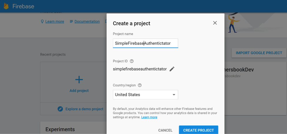
Step 2
Second, click on the Add Firebase to your web app button that is shown in the image below:
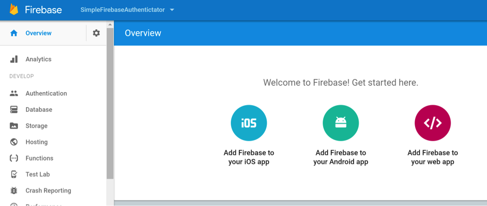
Step 3
The Add Firebase to your web app dialog shows you all the necessary information that you will need to use Firebase’s website security in your App Inventor apps. This information includes:
- apiKey
- databaseURL
- storageBucket
- messageSenderId
These values are presented as comma delimited, key:”value” pairs, surrounded by curly braces {}. You will use this information as the value for the firebaseCredentials variable in the App Inventor Blocks Editor.
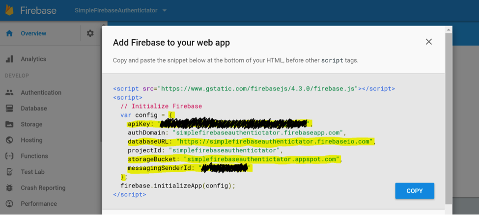
PLEASE NOTE: you can delete the authDomain and projectId key value pairs if you like because they are optional. However, you must remember the surrounding curly braces and the quotes around all the keys and values, as shown below:
	{
		"apiKey":"YOUR_apiKey_HERE",
		"databaseURL":"YOUR_databaseURL_HERE",
		"storageBucket":"YOUR_storageBucket_HERE",
		"messagingSenderId":"YOUR_messagingSenderId_HERE"
	}
Note that all the key/value pairs must have quotes around them. If you copy/paste from the Firebase window, you may have to add quotes. All of this information can be compressed into a single line and it will work just fine:

Step 4
Lastly you must enable the Email/Password SIGN-IN METHOD on Firebase’s Authentication page. This simply involves selecting the Authentication menu option (on the left) and then clicking on the pencil icon at the end of the Email/Password row as shown below:
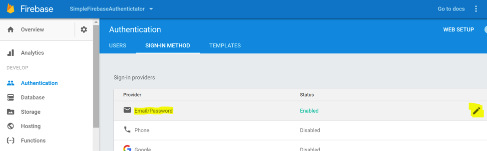
Doing so will display the Email/Password dialog as follows:
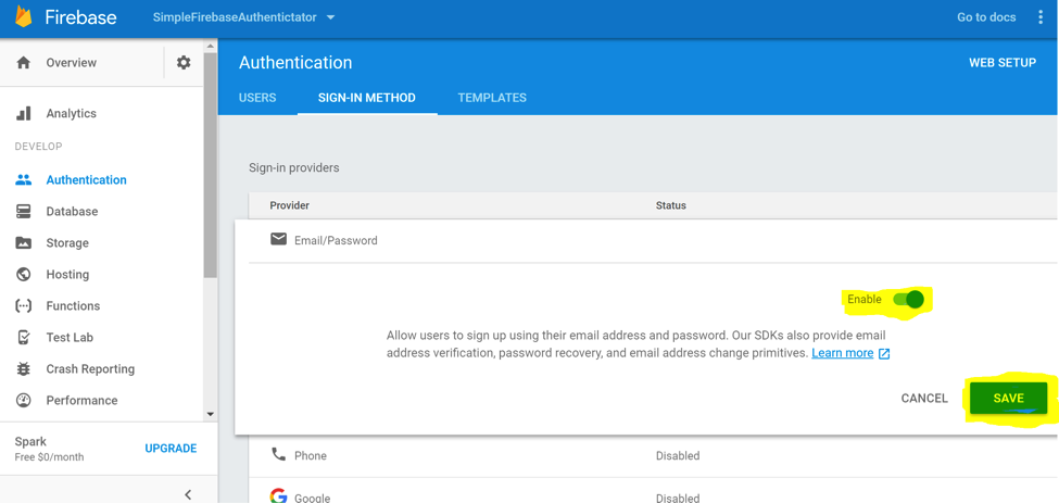
After enabling the Email/Password Authentication, click SAVE and Firebase will then allow your website – and your App Inventor apps that use the FirebaseAuthenticator.html page (below) – to make use of the features and power of Firebase’s own security. And that is pretty awesome!
More information about fine tuning Firebase’s authentication can be found here.
Edit the Firebase Website Authentication HTML file (FirebaseAuthenticator.html)
This example file is almost an exact copy of the original one that can be found here. The changes that have been made are highlighted in yellow below. The reason the changes are necessary is that the WebViewer component understands some special, App Inventor only javascript that allows it to communicate with the javascript as it runs inside web pages. By using Firebase’s website authentication inside a WebViewer, App Inventor apps can show users a login page as if the app were a real website, and once the user is logged in, the WebViewer can tell the app that the user has been authenticated (or not).
<html>
<head>
  <meta charset=utf-8 />
  <meta name="viewport" content="width=device-width, initial-scale=1.0">
  <title>Email/Password Authentication Example</title>

  <!-- Material Design Theming -->
  <link rel="stylesheet" href="https://code.getmdl.io/1.1.3/material.orange-indigo.min.css">
  <link rel="stylesheet" href="https://fonts.googleapis.com/icon?family=Material+Icons">
  <script defer src="https://code.getmdl.io/1.1.3/material.min.js"></script>

  <!-- Firebase -->


<script src="https://www.gstatic.com/firebasejs/3.7.2/firebase.js"></script>
<script>
  // Initialize Firebase

  // Get the Firebase configuration from App Inventor via the WebViewer.WebViewString property
  var config = JSON.parse(window.AppInventor.getWebViewString());

  firebase.initializeApp(config);
</script>

  <script type="text/javascript">
    function tellAppInventor(message) {
        try {
            window.AppInventor.setWebViewString( message );
        } catch(e) {
            console.log("App Inventor Communication Error",e)
        }
    }

    /**
     * Handles the sign in button press.
     */
    function toggleSignIn() {
      if (firebase.auth().currentUser) {
        // [START signout]
        firebase.auth().signOut();
        // [END signout]
      } else {
        var email = document.getElementById('email').value;
        var password = document.getElementById('password').value;
        if (email.length < 4) {
          tellAppInventor('Please enter an email address.');
          return;
        }
        if (password.length < 4) {
          tellAppInventor('Please enter a password.');
          return;
        }
        // Sign in with email and pass.
        // [START authwithemail]
        firebase.auth().signInWithEmailAndPassword(email, password).catch(function(error) {
          // Handle Errors here.
          var errorCode = error.code;
          var errorMessage = error.message;
          // [START_EXCLUDE]
          if (errorCode === 'auth/wrong-password') {
            tellAppInventor('Wrong password.');
          } else {
            tellAppInventor(errorMessage);
          }
          console.log(error);
          document.getElementById('quickstart-sign-in').disabled = false;
          // [END_EXCLUDE]
        });
        // [END authwithemail]
      }
      document.getElementById('quickstart-sign-in').disabled = true;
    }
    /**
     * Handles the sign up button press.
     */
    function handleSignUp() {
      var email = document.getElementById('email').value;
      var password = document.getElementById('password').value;
      if (email.length < 4) {
        tellAppInventor('Please enter an email address.');
        return;
      }
      if (password.length < 4) {
        tellAppInventor('Please enter a password of 4 or more characters.');
        return;
      }
      // Sign in with email and pass.
      // [START createwithemail]
      firebase.auth().createUserWithEmailAndPassword(email, password).catch(function(error) {
        // Handle Errors here.
        var errorCode = error.code;
        var errorMessage = error.message;
        // [START_EXCLUDE]
        if (errorCode == 'auth/weak-password') {
          tellAppInventor('The password is too weak.');
        } else {
          tellAppInventor(errorMessage);
        }
        console.log(error);
        // [END_EXCLUDE]
      });
      // [END createwithemail]
    }
    /**
     * Sends an email verification to the user.
     */
    function sendEmailVerification() {
      // [START sendemailverification]
      firebase.auth().currentUser.sendEmailVerification().then(function() {
        // Email Verification sent!
        // [START_EXCLUDE]
        tellAppInventor('Email Verification Sent!');
        // [END_EXCLUDE]
      });
      // [END sendemailverification]
    }
    function sendPasswordReset() {
      var email = document.getElementById('email').value;
      // [START sendpasswordemail]
      firebase.auth().sendPasswordResetEmail(email).then(function() {
        // Password Reset Email Sent!
        // [START_EXCLUDE]
        tellAppInventor('Password Reset Email Sent!');
        // [END_EXCLUDE]
      }).catch(function(error) {
        // Handle Errors here.
        var errorCode = error.code;
        var errorMessage = error.message;
        // [START_EXCLUDE]
        if (errorCode == 'auth/invalid-email') {
          tellAppInventor(errorMessage);
        } else if (errorCode == 'auth/user-not-found') {
          tellAppInventor(errorMessage);
        }
        console.log(error);
        // [END_EXCLUDE]
      });
      // [END sendpasswordemail];
    }
    /**
     * initApp handles setting up UI event listeners and registering Firebase auth listeners:
     *  - firebase.auth().onAuthStateChanged: This listener is called when the user is signed in or
     *    out, and that is where we update the UI.
     */
    function initApp() {
      // Listening for auth state changes.
      // [START authstatelistener]
      firebase.auth().onAuthStateChanged(function(user) {
        // [START_EXCLUDE silent]
        document.getElementById('quickstart-verify-email').disabled = true;
        // [END_EXCLUDE]
        if (user) {
          // User is signed in.
          var displayName = user.displayName;
          var email = user.email;
          var emailVerified = user.emailVerified;
          var photoURL = user.photoURL;
          var isAnonymous = user.isAnonymous;
          var uid = user.uid;
          var providerData = user.providerData;

          if (emailVerified && !isAnonymous) {
                tellAppInventor( uid + ',' + email + ',' + displayName + ',' + photoURL );
            } else if (!emailVerified) {
                tellAppInventor( 'Please click the Send Email Verification button to confirm your account.' );
            }

          // [START_EXCLUDE]
//          document.getElementById('quickstart-sign-in-status').textContent = 'Signed in';
//          document.getElementById('quickstart-sign-in').textContent = 'Sign out';
//          document.getElementById('quickstart-account-details').textContent = JSON.stringify(user, null, '  ');
          if (!emailVerified) {
            document.getElementById('quickstart-verify-email').disabled = false;
          }
          // [END_EXCLUDE]
        } else {
          // User is signed out.
          // [START_EXCLUDE]
//          document.getElementById('quickstart-sign-in-status').textContent = 'Signed out';
//          document.getElementById('quickstart-sign-in').textContent = 'Sign in';
//          document.getElementById('quickstart-account-details').textContent = 'null';
          // [END_EXCLUDE]
        }
        // [START_EXCLUDE silent]
        document.getElementById('quickstart-sign-in').disabled = false;
        // [END_EXCLUDE]
      });
      // [END authstatelistener]
      document.getElementById('quickstart-sign-in').addEventListener('click', toggleSignIn, false);
      document.getElementById('quickstart-sign-up').addEventListener('click', handleSignUp, false);
      document.getElementById('quickstart-verify-email').addEventListener('click', sendEmailVerification, false);
      document.getElementById('quickstart-password-reset').addEventListener('click', sendPasswordReset, false);
    }
    window.onload = function() {
      initApp();
    };
  </script>
</head>
<body>
<div class="demo-layout mdl-layout mdl-js-layout mdl-layout--fixed-header">

  <!-- Header section containing title
  <header class="mdl-layout__header mdl-color-text--white mdl-color--light-blue-700">
    <div class="mdl-cell mdl-cell--12-col mdl-cell--12-col-tablet mdl-grid">
      <div class="mdl-layout__header-row mdl-cell mdl-cell--12-col mdl-cell--12-col-tablet mdl-cell--8-col-desktop">
        <a href="/"><h3>Firebase Authentication</h3></a>
      </div>
    </div>
  </header>
  -->

  <main class="mdl-layout__content mdl-color--grey-100">
    <div class="mdl-cell mdl-cell--12-col mdl-cell--12-col-tablet mdl-grid">

      <!-- Container for the demo -->
      <div class="mdl-card mdl-shadow--2dp mdl-cell mdl-cell--12-col mdl-cell--12-col-tablet mdl-cell--12-col-desktop">
        <div class="mdl-card__title mdl-color--light-blue-600 mdl-color-text--white">
          <h2 class="mdl-card__title-text">Sign In or Sign Up</h2>
        </div>
        <div class="mdl-card__supporting-text mdl-color-text--grey-600">
          <p>Enter an email and password below and either sign in to an existing account or sign up</p>

          <input class="mdl-textfield__input" style="display:inline;width:auto;" type="text" id="email" name="email" placeholder="Email"/>
          <p/><p/>
          <input class="mdl-textfield__input" style="display:inline;width:auto;" type="password" id="password" name="password" placeholder="Password"/>
          <p/>
          <button disabled class="mdl-button mdl-js-button mdl-button--raised" id="quickstart-sign-in" name="signin">Sign In</button>

          <button class="mdl-button mdl-js-button mdl-button--raised" id="quickstart-sign-up" name="signup">Sign Up</button>
          <p/>
          <button class="mdl-button mdl-js-button mdl-button--raised" disabled id="quickstart-verify-email" name="verify-email">Send Email Verification</button>
          <p/>
          <button class="mdl-button mdl-js-button mdl-button--raised" id="quickstart-password-reset" name="verify-email">Send Password Reset Email</button>
          <p/>

          <!-- Container where we'll display the user details -->
          <div class="quickstart-user-details-container" style="display:none">
            Sign-in status: <span id="quickstart-sign-in-status">Unknown</span>
            <div>Authorization <code>currentUser</code> object value:</div>
            <pre><code id="quickstart-account-details">null</code></pre>
          </div>
        </div>
      </div>

    </div>
  </main>
</div>
</body>
</html>
Create an App Inventor App to Use Firebase Website Authentication
Designer
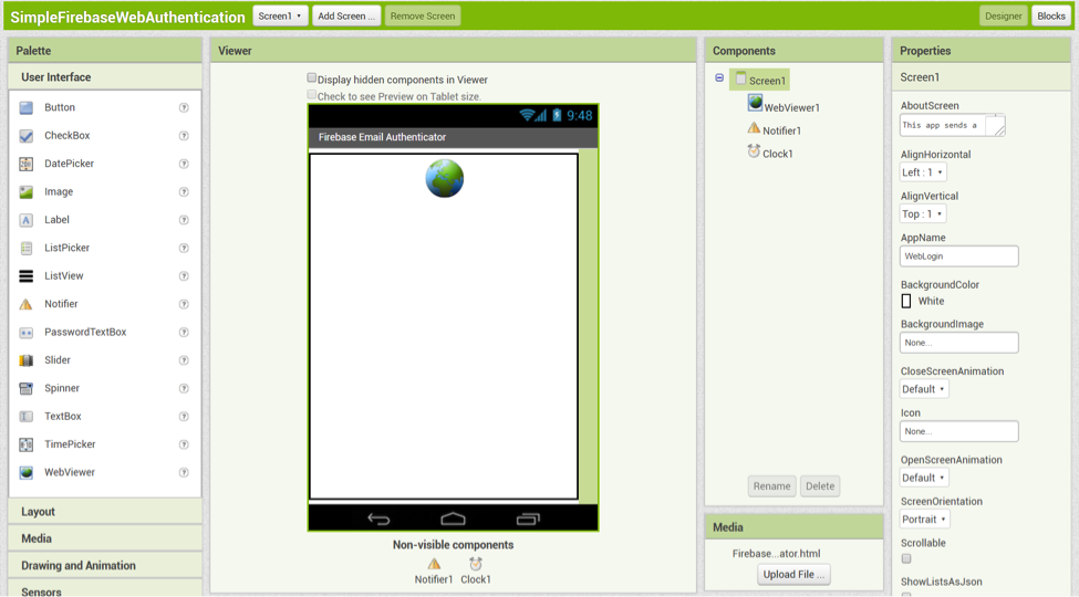
The Designer is really quite simple. There are only three components on Screen1: a WebViewer, a Notifier, and a Clock. There is also an included asset file, FirebaseAuthenticator.html.
- WebViewer – loads the FirebaseAuthenticator.html file, and uses the javascript it contains to access Firebase’s website authentication system.
- Notifier – displays alert messages to the user about the status of the login process, and reports when the user is successfully logged in.
- Clock – periodically checks the status of the WebViewer’s javascript that handles logging in to Firebase.
You may notice that there are no Buttons or other components needed to start the login process from our App Inventor app. This is because the web page (FirebaseAuthenticator.html) has its own buttons to do that as part of Firebase’s ready-made login screen!
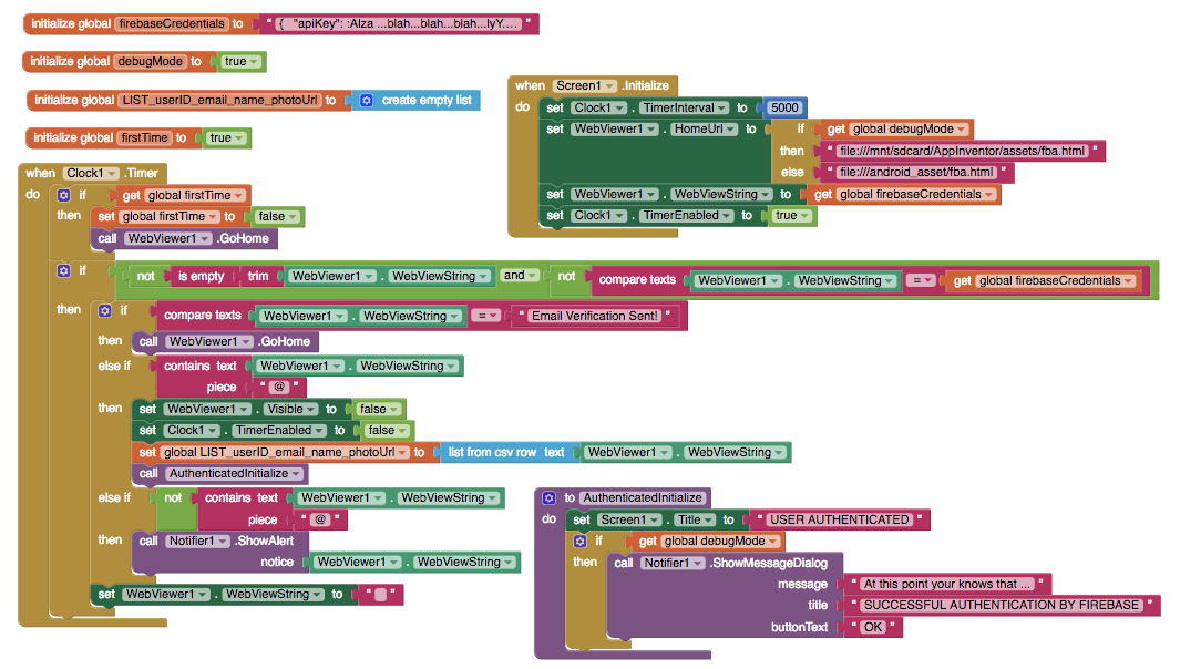
As you can see, the blocks for this app are also quite simple. There are only 3 variables, 2 event handlers, and 1 procedure needed to incorporate Firebase’s website authentication into an App Inventor app. Each will be explained in individual sections below.
Variable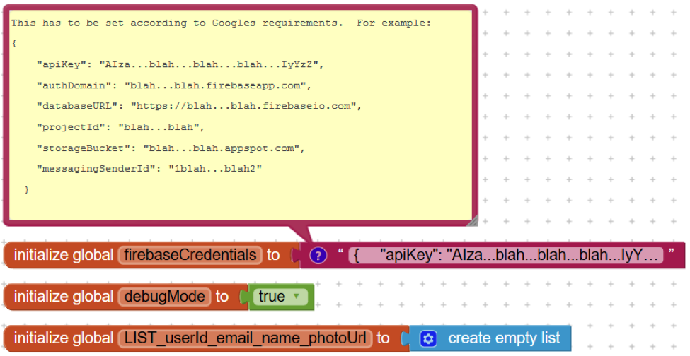
The variables needed by the app are as follows:
- firebaseCredentials – contains the information needed to connect to your Firebase database. Firebase expects these credentials to be submitted as a JSON string composed of your apiKey, authDomain, databaseURL, projectId, storageBucket, and messagingSenderId (see comment in the image above). All of these values can be found here on Firebase’s website, and the authDomain and projectId values are technically optional, but it doesn’t hurt to include them as well.
- debugMode – used to set the location of the HTML file that is used by the WebViewer because App Inventor apps use different directories for development and running apps.
- LIST_userId_email_name_photoUrl – holds the user credentials obtained after a user successfully logs in via the WebViewer component.
- firstTime – used to test if the Clock timer is firing for the first time, to allow for a time lag when displaying the WebViewer on app start.
Screen1.Initialize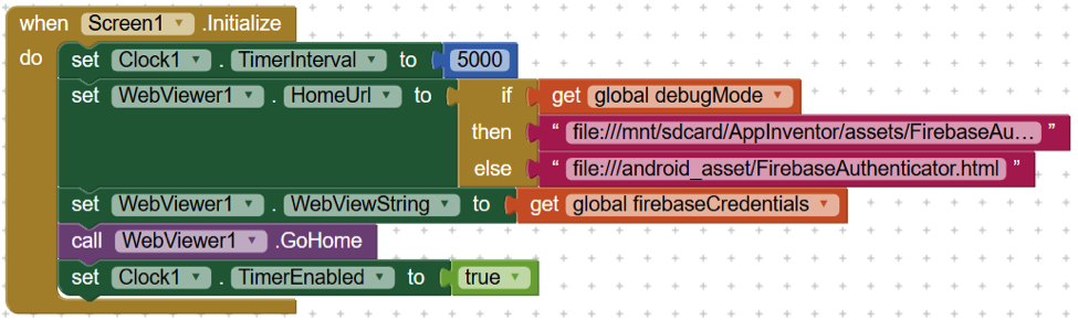
As soon as the app opens, the Screen1.Initialize event is triggered and the following occurs, in order:
- The Clock1.TimerInterval property is set to 5000 milliseconds. This causes the Clock1.Timer event to fire every 5 seconds. This value can be adjusted based on your own needs and experience with the app, but the Firebase authentication process seems to work with this setting.
- Based on the value of the debugMode variable, the directory that the app looks for the FirebaseAuthenticator.html is set so the app will work in both debug and run modes.
- WebViewer1.WebViewString is set to the value of the firebaseCredentials variable, so that the WebViewer will have the necessary configuration to work with your Firebase instance. This information includes your apiKey, databaseURL, storageBucket, and messagingSenderId.
- The WebViewer is instructed to go to its home page, which means load the FirebaseAuthenticator.html file.
- The Clock1.TimerEnabled property is set to true, which starts the Clock1.Timer event firing.
Clock1.Timer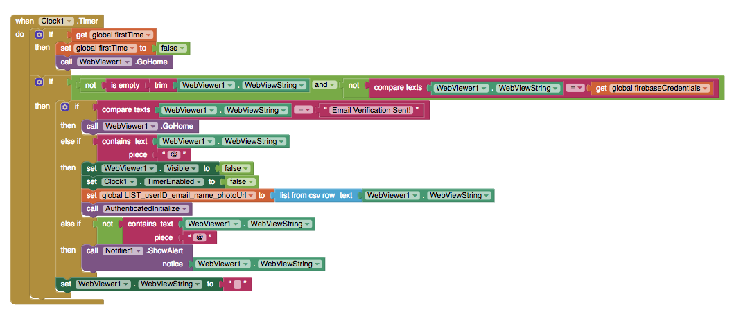
The first time the Clock timer goes off, we want to call WebViewer.GoHome to run the javascript code. Due to time lag, we can’t count on Screen1.Initalize to do this, so the 5 second time lag is enough to load the code. We only want this to happen the first time, so we’ll set firstTime to false and continue.
This event is where App Inventor repeatedly checks the state of the javascript code that is running in the WebViewer component. Each time the event is triggered, it checks to see if the WebViewer1.WebViewString is not empty and that it is different from the text in the firebaseCredentials variable. If so, then it checks to see if the text is “Email Verification Sent!”. If it is, then the app knows that the user is setting up an account and Firebase is waiting for the user to confirm their email address, so the app tells the WebViewer component to GoHome, where the rest of the login process can occur.
If the WebViewer1.WebViewString contains an “@” symbol, then this means that the login was successful, so the WebViewer.Visible and Clock1.TimerEnabled properties are set to false. Also, as soon as the user is authenticated by Firebase, the WebViewer1.WebViewString property contains a comma separated value list of the user’s userId, email address, user name, and photo URL, and this text is stored in the variable LIST_userId_email_name_photoUrl. Since the user has been authenticated, another procedure is called: AuthenticatedInitialize, and this is where you insert the code you want your app to run immediately after a user logs in. In short, your app really should START with the AuthenticatedInitialize event.
If the WebViewer1.WebViewString does not contain an “@” symbol, then this means that some other message has been sent from the javascript inside the FirebaseAuthenticator.html file, and it should be shown to the user. These messages are usually about incorrect passwords or user names.
Finally, if the WebViewer1.WebViewString was not empty and did not match the text in the firebaseCredentials variable when the Clock1.Timer event was triggered, it is reset to an empty string ("") so that the next time the Clock1.Timer event is triggered, it will only take action if the javascript running inside the FirebaseAuthenticator.html file has set it to some non-empty value.
AuthenticatedInitialize Procedure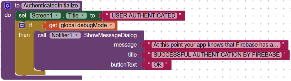
The AuthenticatedInitialize procedure is where the App Inventor app really begins, once a user has been authenticated by Firebase. In our example, this means that the app changes the Screen1.Title property to "AUTHENTICATED USER" to remind you that the user’s credentials have been authenticated. It also displays a reminder to you in a Notification dialog, so that you remember to add your own blocks.
Conclusion
With 3 components, 2 events, and 1 procedure, we have been able to leverage Firebase’s website security infrastructure for an Android app created with App Inventor. This is enormously powerful, secure, and useful. Thank you Firebase for doing all the “heavy lifting” for us with your website authentication javascript, and thank you App Inventor for providing the WebViewer component with the ability to “look inside” any javascript that is running on an HTML page!
*One last pro-tip for all you App Inventors out there: make sure you set the debugMode variable correctly. While you are developing your app using App Inventor, it should be set to true. When you build your apk file, it should be set to false. If you set it incorrectly the app will display an error message about how the FirebaseAuthenticator.html file cannot be found – and nobody likes that. :)
Tutorial Version:
Tutorial Difficulty:
- Advanced
Tutorial Type:
- WebViewer